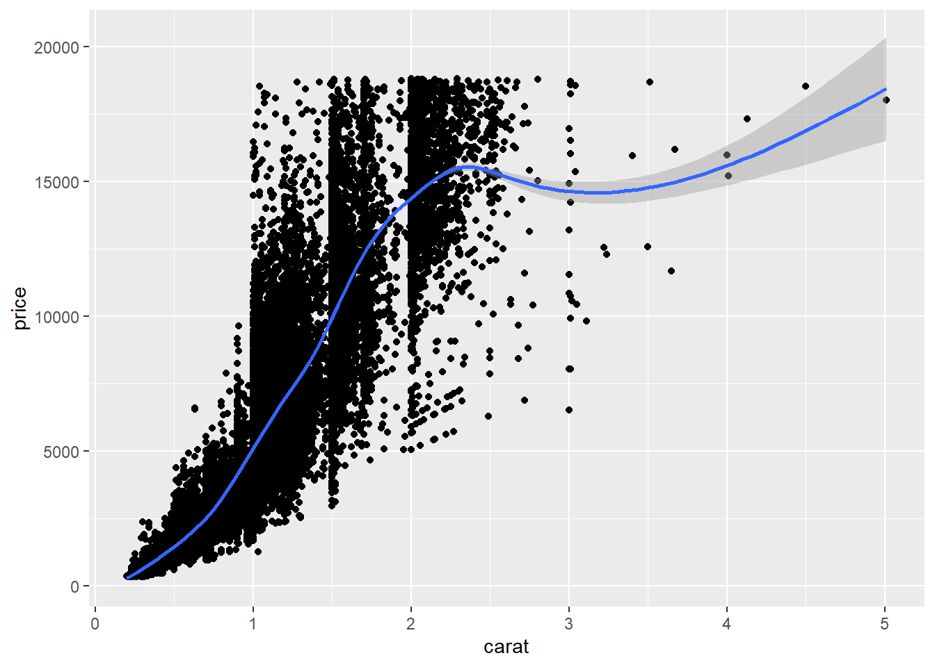
`geom_smooth()` using method = 'gam' and formula = 'y ~ s(x, bs = "cs")'
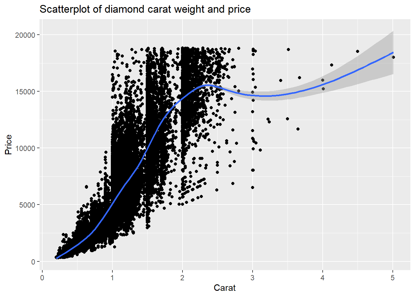
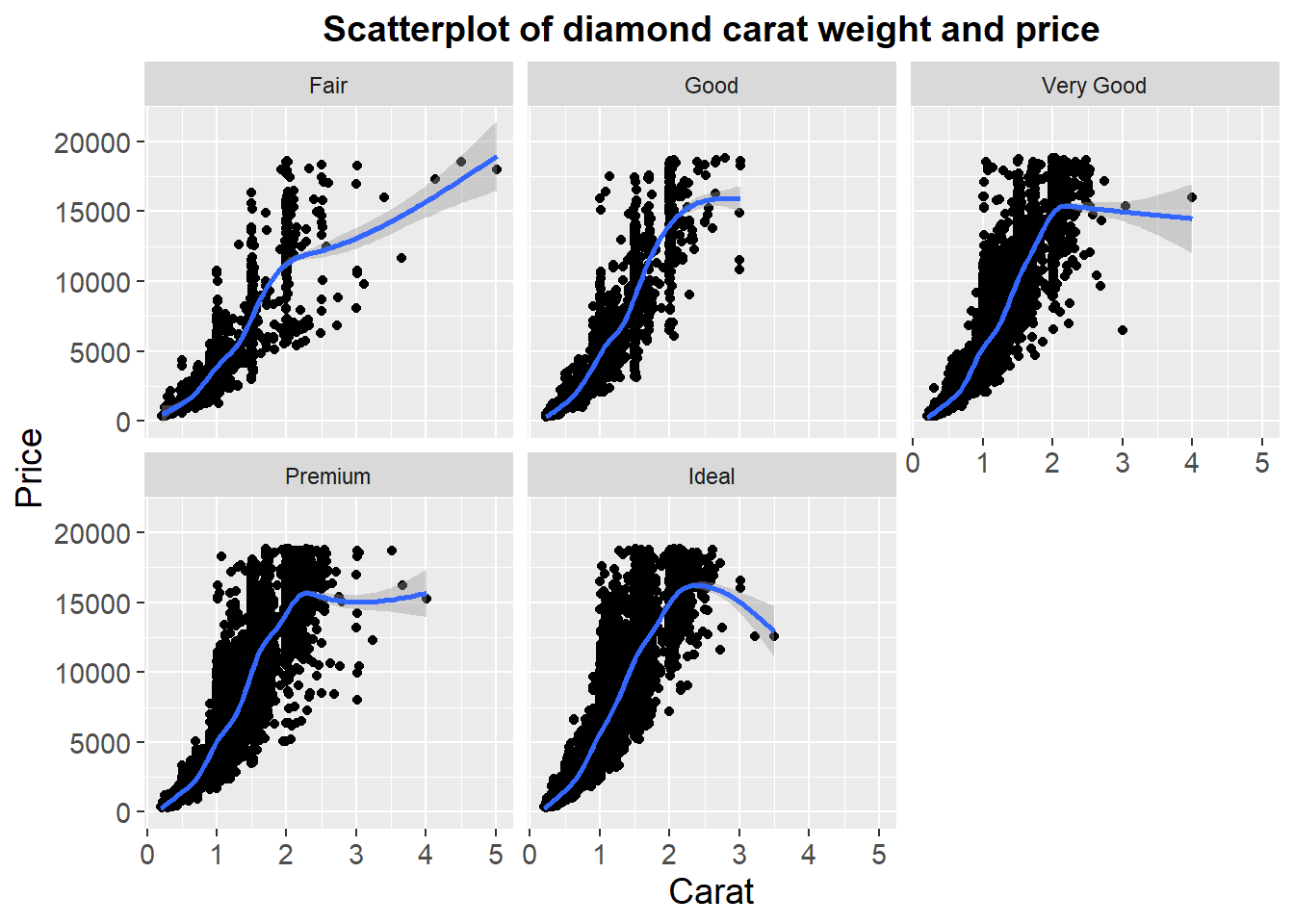
3.0.3 Add labels to plot
ggplot(data=diamonds, aes(x=carat, y=price))+geom_point()+geom_smooth()+labs(title ="Scatterplot of diamond carat weight and price", x ="Carat", y ="Price")
`geom_smooth()` using method = 'gam' and formula = 'y ~ s(x, bs = "cs")'
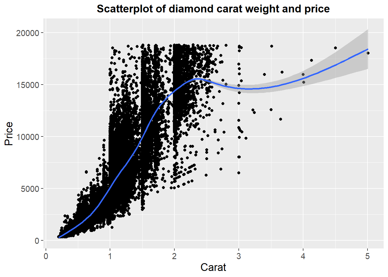
`geom_smooth()` using method = 'gam' and formula = 'y ~ s(x, bs = "cs")'
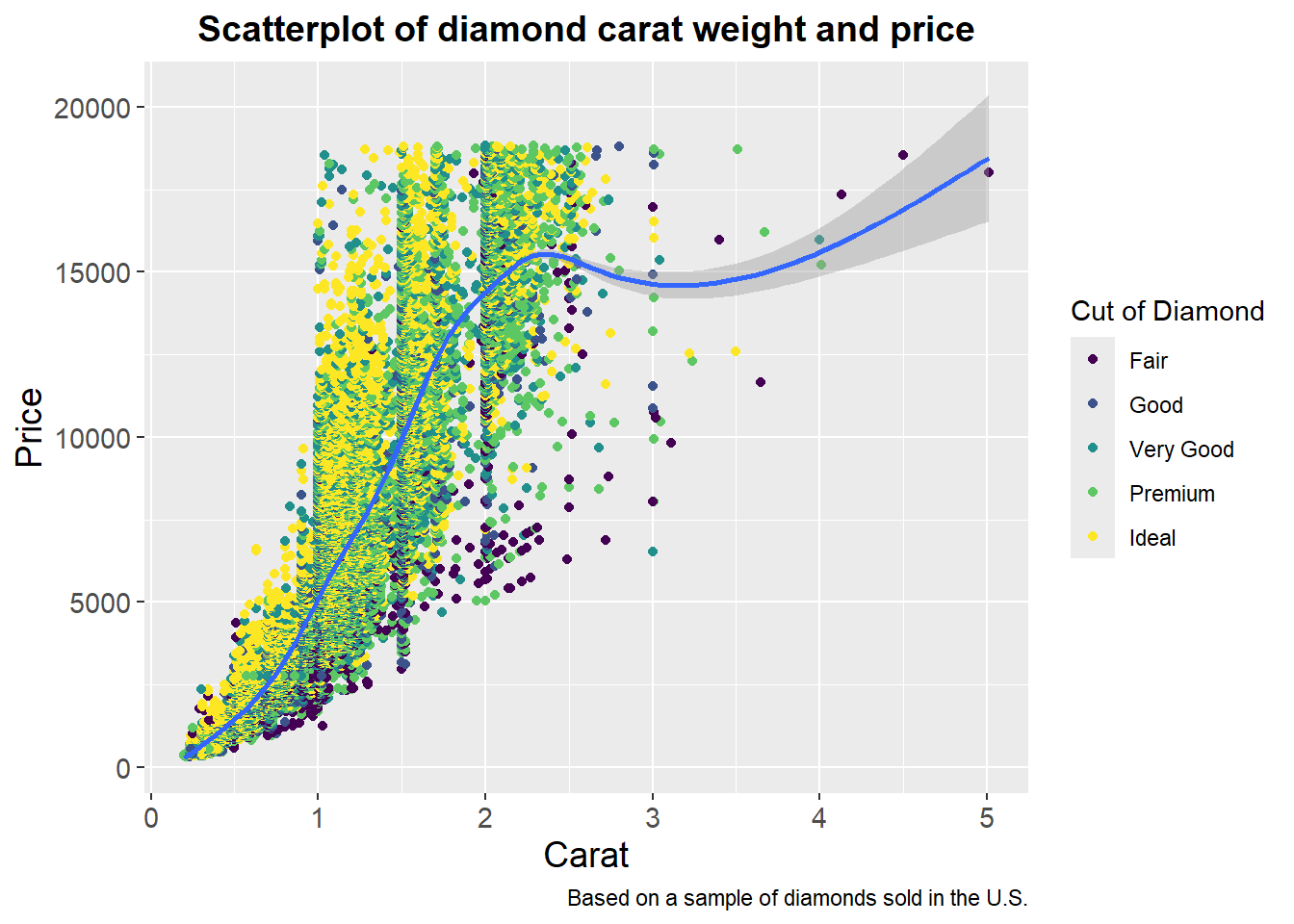
Example plot showing grouping
ggplot(data=diamonds, aes(x=carat, y=price))+geom_point(aes(color=cut))+geom_smooth()+labs(title ="Scatterplot of diamond carat weight and price", x ="Carat", y ="Price", caption ="Based on a sample of diamonds sold in the U.S.", color ="Cut of Diamond")+theme(plot.title=element_text(size=14, face="bold", hjust =0.5), axis.text.x=element_text(size=11), axis.text.y=element_text(size=11), axis.title.x=element_text(size=14), axis.title.y=element_text(size=14))
`geom_smooth()` using method = 'gam' and formula = 'y ~ s(x, bs = "cs")'
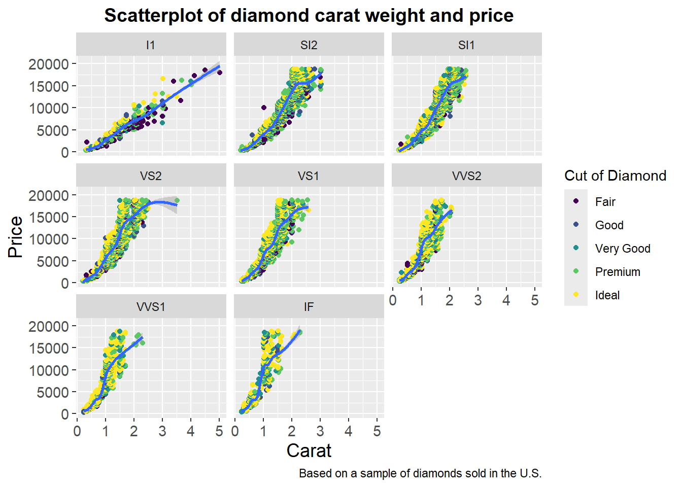
Example plot showing grouping and faceting
ggplot(data=diamonds, aes(x=carat, y=price))+geom_point(aes(color=cut))+geom_smooth()+labs(title ="Scatterplot of diamond carat weight and price", x ="Carat", y ="Price", caption ="Based on a sample of diamonds sold in the U.S.", color ="Cut of Diamond")+theme(plot.title=element_text(size=14, face="bold", hjust =0.5), axis.text.x=element_text(size=11), axis.text.y=element_text(size=11), axis.title.x=element_text(size=14), axis.title.y=element_text(size=14))+facet_wrap(~clarity)
`geom_smooth()` using method = 'gam' and formula = 'y ~ s(x, bs = "cs")'