In this Chapter we will go through some fundamentals of Exploratory Data Analysis (EDA) process of with two single continuous example features: Age and rand_age. In Section Section 6.0.1 we define a new feature rand_age as by randomly sampling from the Age distribution.
And discuss how these statistical analyses can be used to detect statistically significant differences between groups and the role they play in Two Factor Classification between our two primary groups: patient’s with and without diabetes. We will also showcase some supportive graphics to accompany each of these statistical analysis.
Our EDA will show that while rand_age and Age originate from the same distribution, that distribution is not the same across members with diabetes.
In section Section Section 6.5 We will review the Logistic Regression classification model. Along with associated correspondence between coefficients of the logistic regression and the the so called Odds Ratio. We will also review the Wald test in Section Section 6.5.2.
In Section Section 6.6 we will use R to train a logistic regression to predicting Diabetes one with feature Age. We will perform an in-depth review of the glm logistic regression model outputs in Section Section 6.6.1 and showcase how to utilize a model object to predict on unseen data in Section Section 6.7.
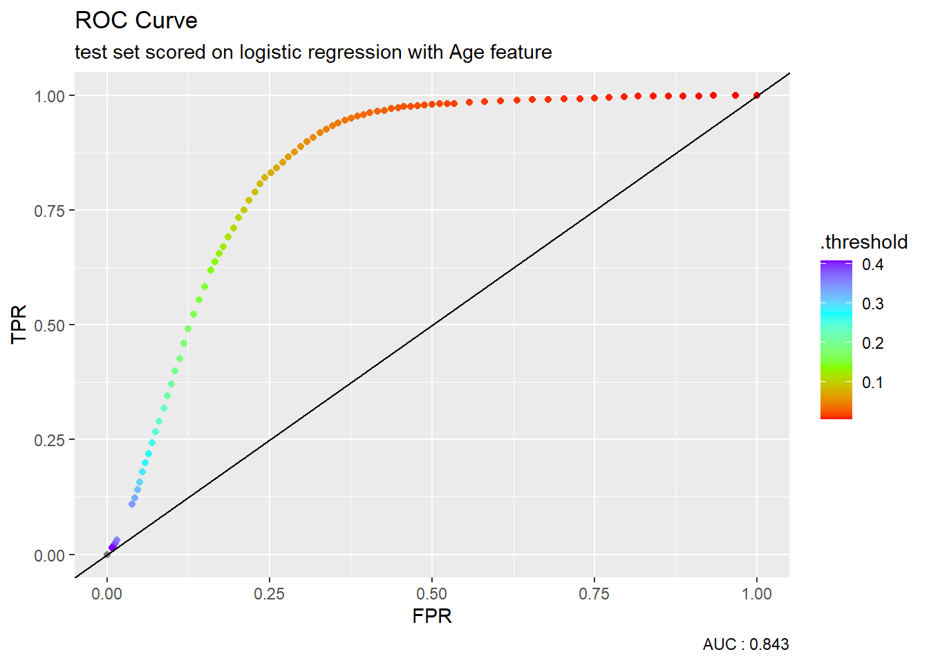
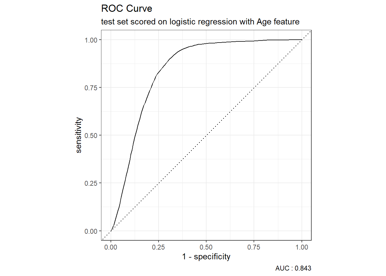
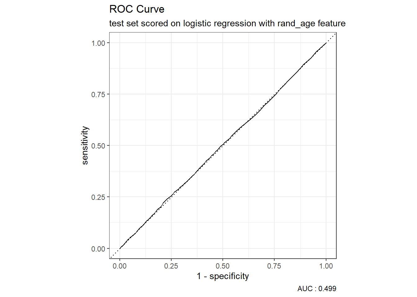
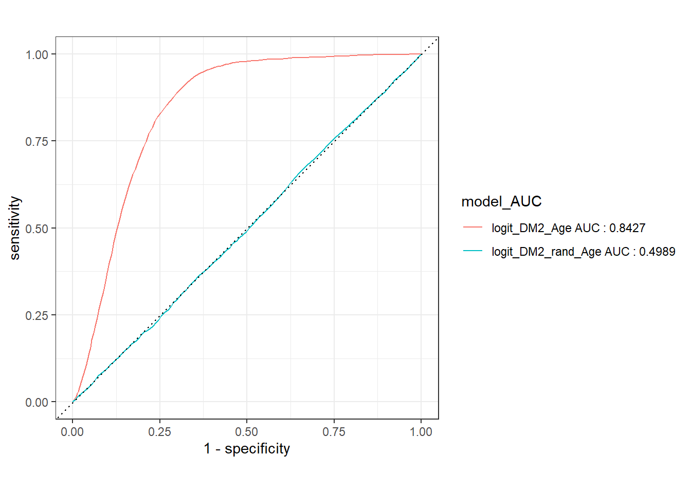
As a first example of a Model Evaluation Metric the Receiver Operating Characteristic (ROC) Curve in Section Section 6.8 is created by plotting the true positive rate (TPR) against the false positive rate (FPR) at various threshold settings.
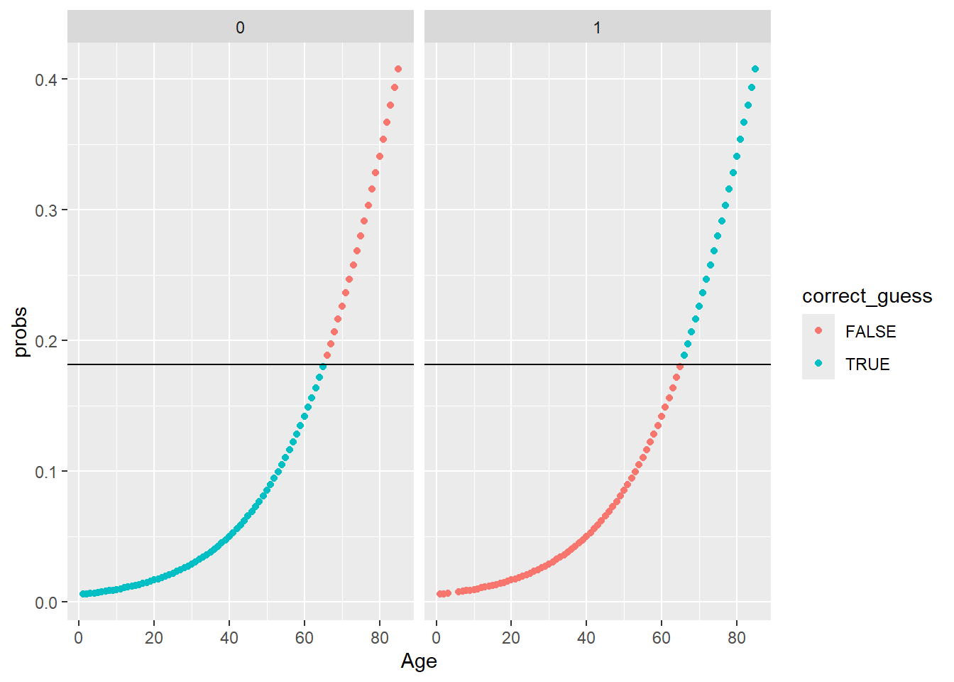
In Section Section 6.12.2 we use the model object and the training data to obtain a threshold estimate and define predicted classes. This will lead us to review the Confusion Matrix in Section Section 6.10 and a variety of Model Evaluation Metrics including: Accuracy, Precision, Recall, Sensitivity, Specificity, Positive Predictive Value (PPV), Negative Predicted Value (NPV), f1-statistic, and others we will showcase in Section Section 6.11.
We will demonstrate that the difference between features distributions is what enables predictive models like logistic regression to effectively perform in two factor classification prediction tasks. While the p-value from the Wald statistic, is often used as an indication of feature importance within a logistic regression setting; the principals we will discuss over these next few Chapters of the EDA process will often be highly effective in determining feature selection for use in a variety of more sophisticated predictive modeling tasks going forward.
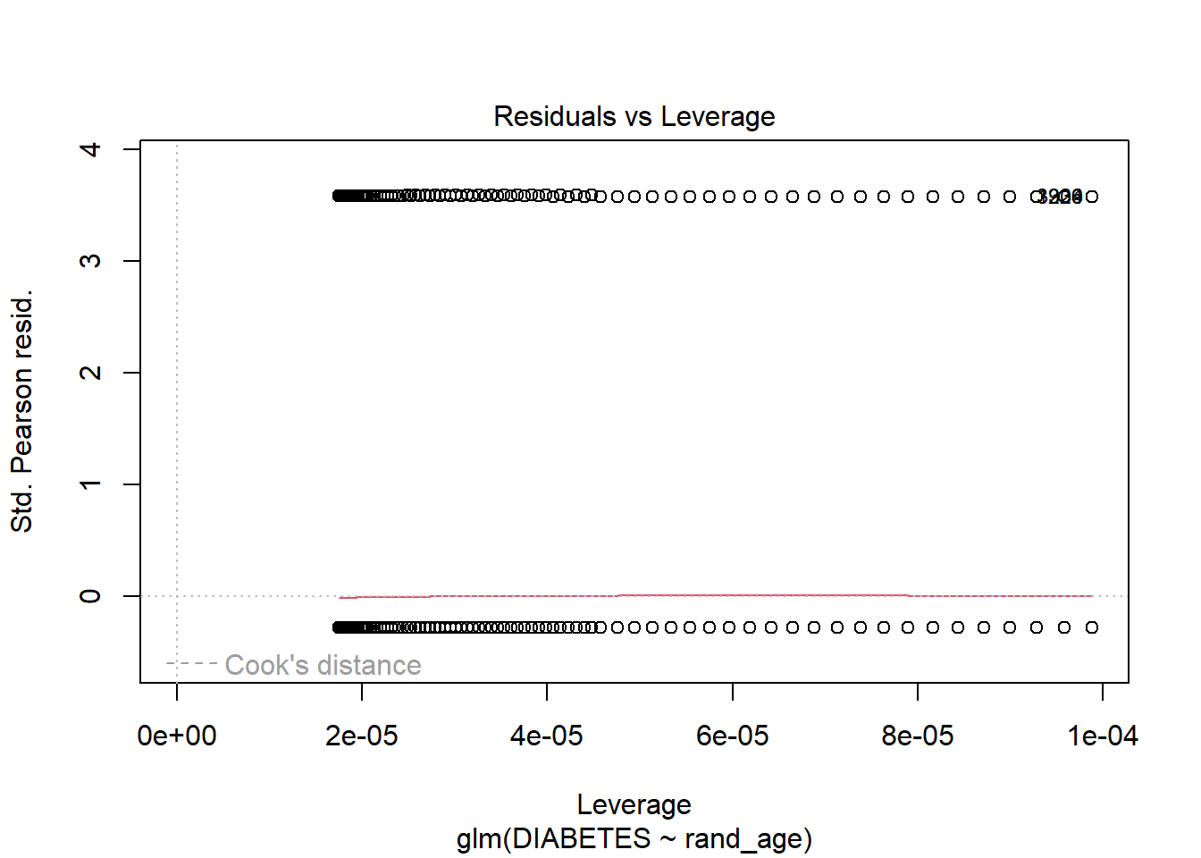
We will train a second logistic regression model with the rand_age feature in Section Section 6.12.
Lastly, will again utilize the Confusion Matrix and a variety of Model Evaluation Metrics to measure model performance and develop an intuition by comparing and contrasting:
Model Evaluation Metrics Graphs - Section Section 6.18
between our two logistic regression model examples.
Our goal primary goal with this chapter will be to compare and contrast these the logistic regression models and connect them back to our EDA analysis of the features to develop a functional working framework of the process that spans EDA and has impact on feature creation and selection selection, following this all the way down the line to feature impact (or lack thereof) on model performance.
First, we will load our dataset from section Section 4.15:
As a comparison, we are going to add a feature rand_age to the data-set. rand_age will be sampled from the Age column in the A_DATA dataframe with replacement.
Above rand_age is defined by randomly selecting values from Age; we will show that while rand_age and Age originate from the same distribution, that distribution is not the same across members with diabetes:
We notice that the mean_age of the diabetics appears to be twice as much as the mean_rand_Age.
We can perform some statistical analyses to confirm these two means are in-fact different, in this chapter we will review:
The t-test may be used to test the hypothesis that twonormalish sample distributions have the same mean.
The Kolmogorov–Smirnov or ks-test may be used to test the hypothesis that two sample distributions were drawn from the same continuous distribution.
Lastly, Analysis of Variance (ANOVA) also may be used to test if two or morenormalish distributions have the same mean.
\(~\)
\(~\)
6.1 t-test
The t-test is two-sample statistical test which tests the null hypothesis that two normal distributions have the same mean.
\[H_O: \mu_1 = \mu_2 \]
where \(\mu_i\) are the distribution means.
The \(t\)-statistic is defined by:
\[ t = \frac{\mu_1 - \mu_2}{\sqrt{S^{2}_{X_1}+S^{2}_{X_2}}}\] where \(S^{2}_{X_i}\) is the standard error, for a given sample standard deviation.
Once the t value and degrees of freedom are determined, a p-value can be found using a table of values from a t-distribution.
If the calculated p-value is below the threshold chosen for statistical significance (usually at the 0.05, 0.10, or 0.01 level), then the null hypothesis is rejected in favor of the alternative hypothesis, the means are different.
\(~\)
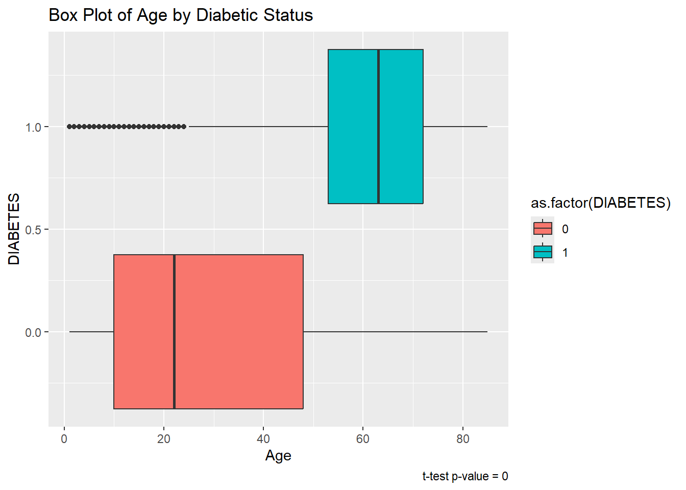
Now we will use the t-test on Age between groups of DIABETES. First we can extract lists of Ages for each type of DIABETES:
Let’s compare the mean ages between the Diabetic and non-Diabetic populations with the t-test:
Code
tt_age<-t.test(non_dm2_age, dm2_age, alternative ='two.sided', conf.level =0.95)
Here’s a look at the output
Code
tt_age
    Welch Two Sample t-test

data:  non_dm2_age and dm2_age
t = -160.7, df = 9709.2, p-value < 2.2e-16
alternative hypothesis: true difference in means is not equal to 0
95 percent confidence interval:
 -31.86977 -31.10167
sample estimates:
mean of x mean of y
 30.04079  61.52652
The output displays that the means are: 30.0407933, 61.5265168 and the p-value is 0
Recall the p-value of the t-test between two sample distributions.
Null and alternative hypotheses
The null-hypothesis for the t-test is that the two population means are equal.
The alternative hypothesis for the t-test is that the two population means are not equal.
If the p-value is
greater than .05 then we accept the null-hypothesis - we are 95% certain that the two samples have the same mean.
less than .05 then we reject the null-hypothesis - we are not 95% certain that the two samples have the same mean.
Since the p-value is tt_age$p.value = 0 < .05 we reject the null-hypothesis of the t-test.
The sample mean ages of the Diabetic population is statistically significantly different from the sample mean ages of the non-Diabetic population.
We can tidy-up the results if we utilize the broom package. Recall that broom::tidy tells R to look in the broom package for the tidy function. The tidy function in the broom library converts many base R outputs to tibbles:
We see that broom::tidy has transformed our list output from the t-test and made it a tibble, since it has now become a tibble we can use any other dplyr function:
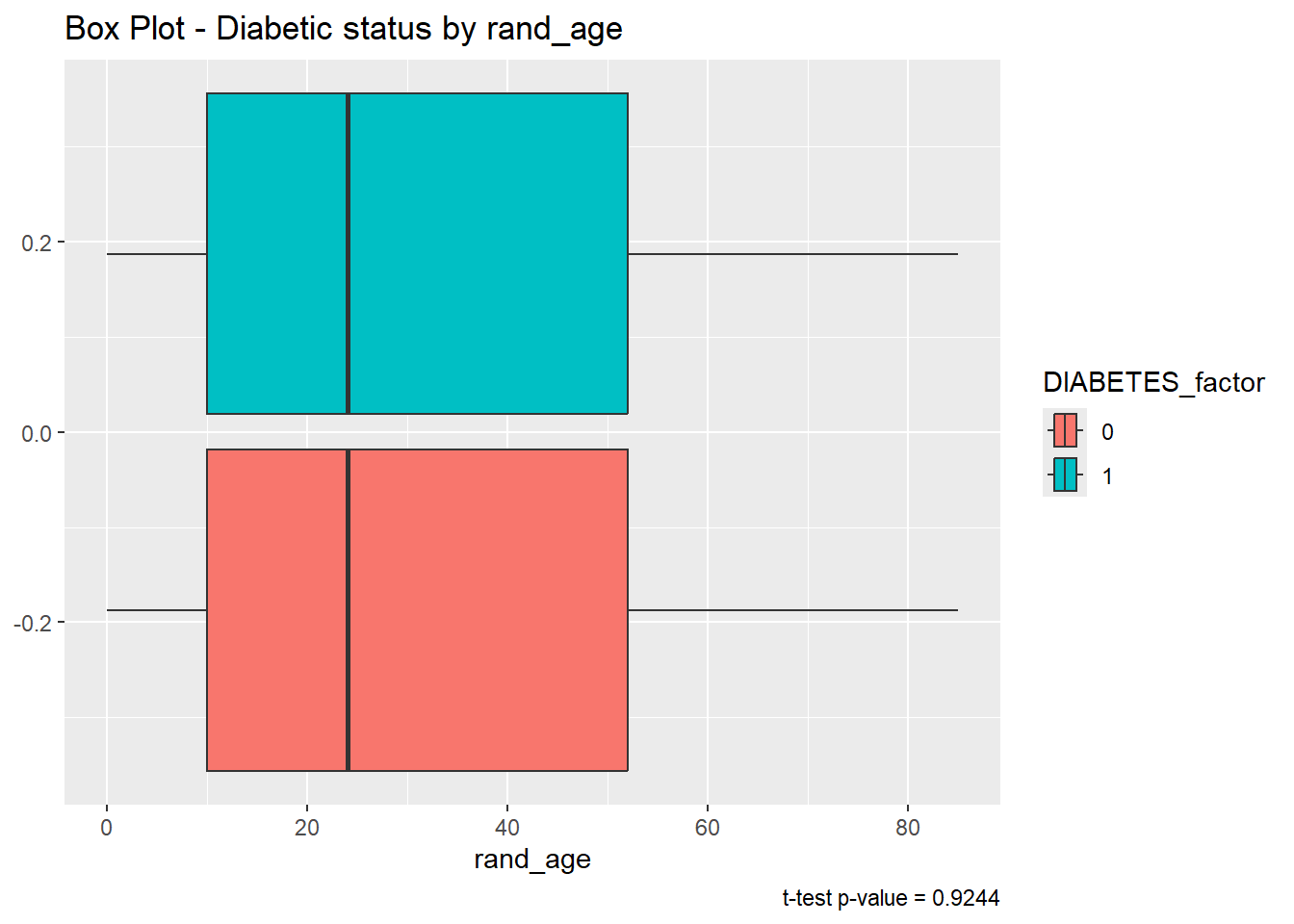
tt_rand_age<-t.test(non_dm2_rand_age, dm2_rand_age, alternative ='two.sided', conf.level =0.95)tt_rand_age
    Welch Two Sample t-test

data:  non_dm2_rand_age and dm2_rand_age
t = 0.094855, df = 7878.6, p-value = 0.9244
alternative hypothesis: true difference in means is not equal to 0
95 percent confidence interval:
 -0.5874002  0.6471383
sample estimates:
mean of x mean of y
 31.25243  31.22257
The story here is different, since tibble_tt_rand_age$p.value = 0.9244321 is greater than .05 we accept the null-hypothesis and assume the sample mean of rand_age is the same for both the Diabetic and non-Diabetic populations.
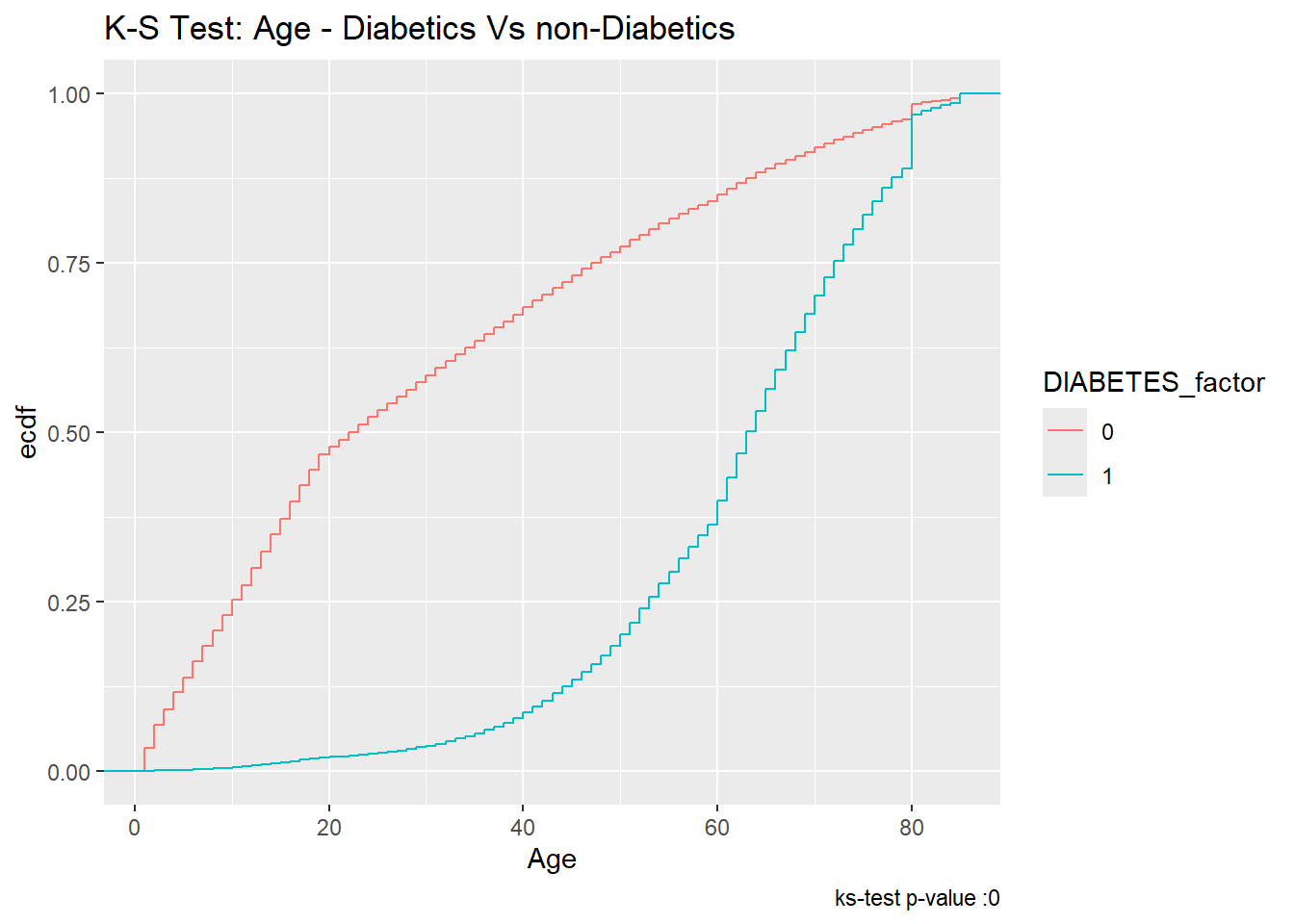
The two-sample Kolmogorov-Smirnov Test or ks-test will test the null-hypothesis that the two samples were drawn from the same continuous distribution.
The alternative hypothesis is that the samples were not drawn from the same continuous distribution. The ks-test can be called in a similar fashion to the t.test in section Section 6.1. Additionally, while the default output type of ks.test is a list again the tidy function in the broom library can be used to convert to a tibble.
Code
tibble_ks_age<-ks.test(non_dm2_age, dm2_age, alternative ='two.sided')%>%broom::tidy()tibble_ks_age
# A tibble: 1 × 4
  statistic p.value method                                        alternative
      <dbl>   <dbl> <chr>                                         <chr>
1     0.599       0 Asymptotic two-sample Kolmogorov-Smirnov test two-sided
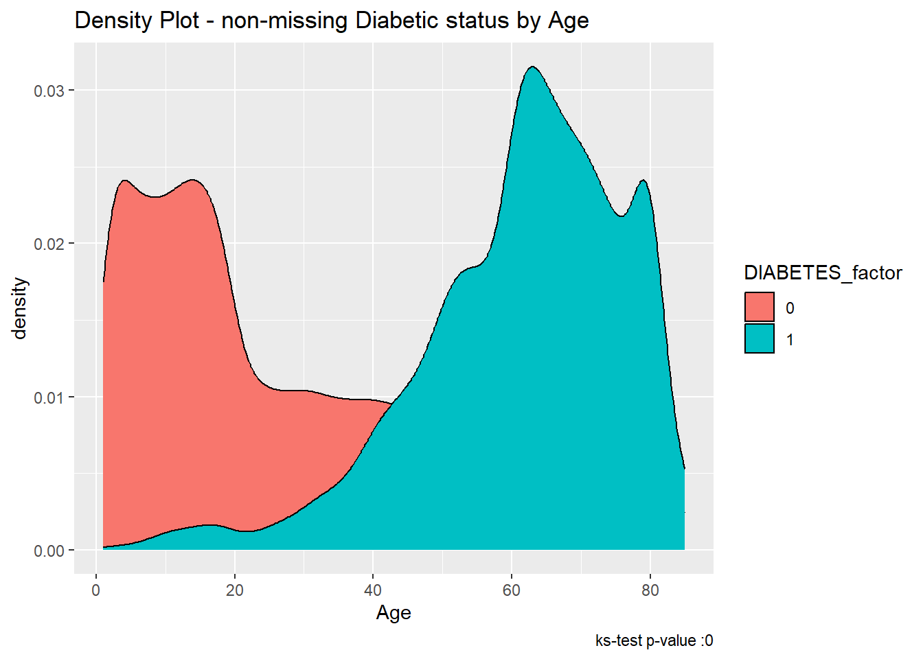
Since the p.value is less than .05 we accept the alternative hypothesis, that the Age of Members with Diabetes was not drawn from the same distribution as Age of Members with-out Diabetes.
We can see the difference between the distributions, most clearly by the density plot:
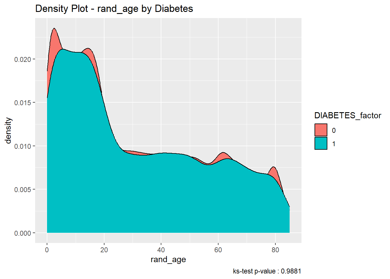
As we did with the t-test, we will contrast the results of the ks.test test for rand_age:
Code
tibble_ks_rand_age<-ks.test(non_dm2_rand_age, dm2_rand_age, alternative ='two.sided')%>%broom::tidy()tibble_ks_rand_age
# A tibble: 1 × 4
  statistic p.value method                                        alternative
      <dbl>   <dbl> <chr>                                         <chr>
1   0.00563   0.988 Asymptotic two-sample Kolmogorov-Smirnov test two-sided
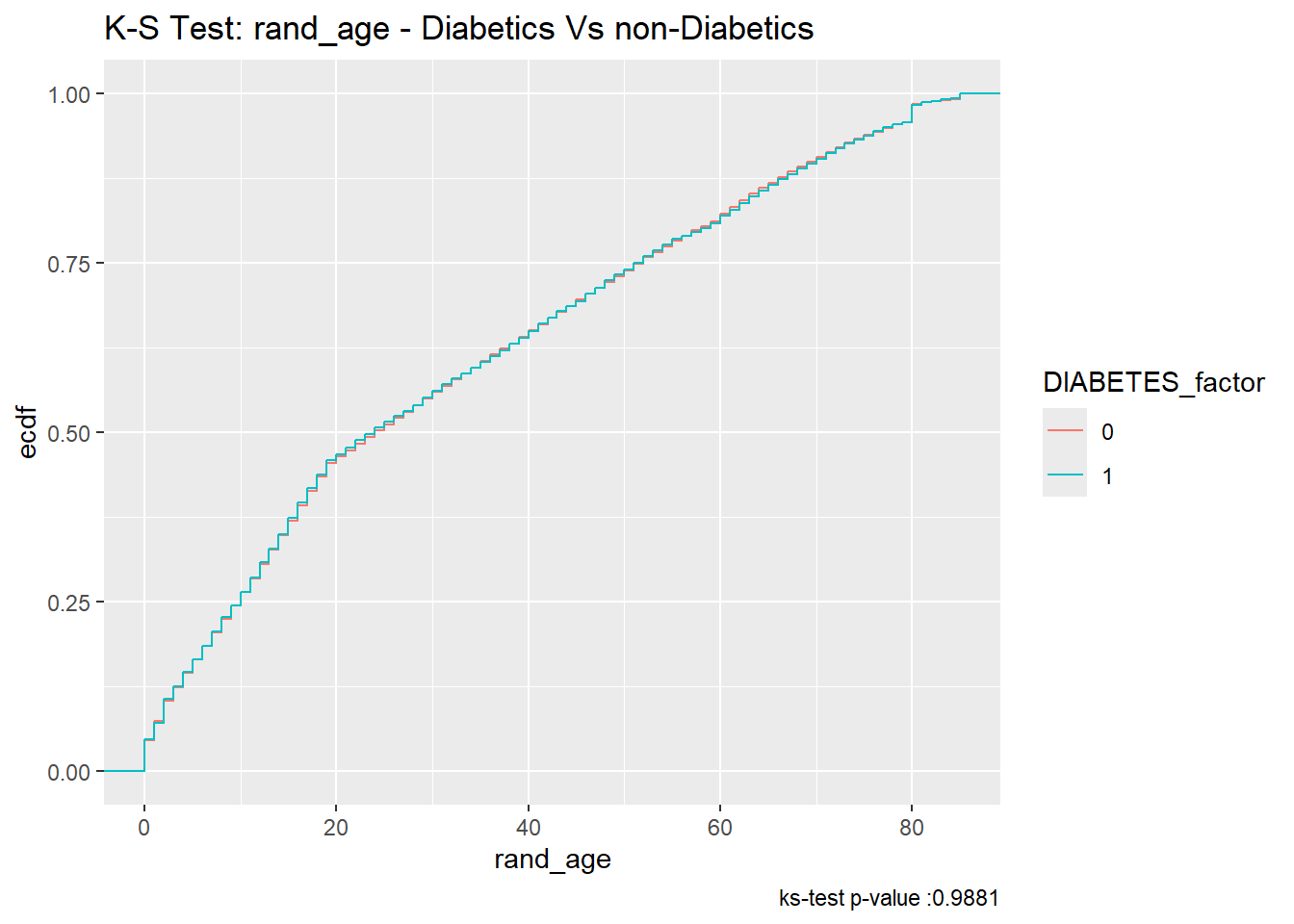
Furthermore, since the p.value of the ks.test is 0.9881447 we accept the null-hypothesis; and assume the distributions of rand_age of both the diabetics and non-diabetics were sampled from the same continuous distribution
We can see in the density plot the distributions are not much different:
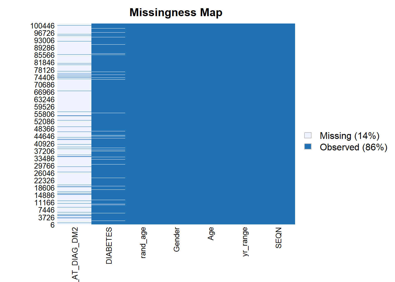
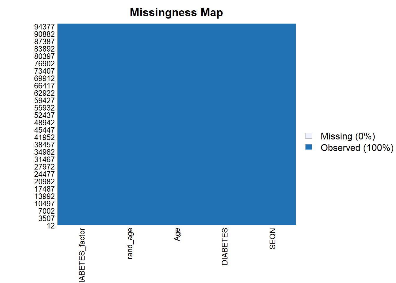
For some analyses and models we need to remove missing data to prevent errors from R, for the reminder of this chapter, we will work with only the records that have non-missing values for SEQN, DIABETES, Age, and rand_age:
Much like the t-test, Analysis of Variance (ANOVA) is used to determine whether there are any statistically significant differences between the means of two or more independent (unrelated) groups.
ANOVA compares the means between two or more groups you that are interested in and determines whether any of the means of those groups are statistically significantly different from each other. Specifically, ANOVA tests the null hypothesis:
\[H_0 : \mu_1 = \mu_2 = \mu_2 = \cdots = \mu_f\]
where \(\mu_i =\) are the group means and \(f =\) number of groups.
If, however, the one-way ANOVA returns a statistically significant result (\(<.05\) normally), we accept the alternative hypothesis, which is that there are at least two group means that are statistically significantly different from each other.
Code
res.aov<-aov(DIABETES~Age, data =A_DATA.no_miss)res.aov.sum<-summary(res.aov)res.aov.sum
               Df Sum Sq Mean Sq F value Pr(>F)
Age             1    691   691.2   11729 <2e-16 ***
Residuals   95545   5631     0.1
---
Signif. codes:  0 '***' 0.001 '**' 0.01 '*' 0.05 '.' 0.1 ' ' 1
Since this p-value is 0 \(<.05\) we accept the alternative hypothesis, there is a statistically significantly difference between the two Age groups, just as we found when we performed the t-test.
When we perform ANOVA for rand_age on the data-set we find:
Code
aov(DIABETES~rand_age, data =A_DATA.no_miss)%>%broom::tidy()
# A tibble: 2 × 6
  term         df       sumsq   meansq statistic p.value
  <chr>     <dbl>       <dbl>    <dbl>     <dbl>   <dbl>
1 rand_age      1    0.000599 0.000599   0.00905   0.924
2 Residuals 95545 6322.       0.0662    NA        NA
and, yes, broom::tidy also transformed our ANOVA output into a tibble
this p-value for ANOVA with rand_age is 0.9241969, NA \(>.05\); therefore, we accept the null hypothesis that the two group means are approximately the same, and, again; this matches with what we found when we performed the t-test.
6.4.1 Split Data
To test different models it is standard practice Kuhn and Johnson (2013) to split your data into at least two sets. training set and a testing set, where:
the training set will be used to train the model and
the testing set or hold-out set will be used to evaluate model performance.
While, we could also compute model evaluation metrics on the training set, the results will be overly-optimistic as the training set was used to train the model.
In this example, we will sample 60% of the non-missing data’s member-ids without replacement:
Code
set.seed(123)sample.SEQN<-sample(A_DATA.no_miss$SEQN, size =nrow(A_DATA.no_miss)*.6, replace =FALSE)# we can check that we got approximately 60% of the data:length(sample.SEQN)/nrow(A_DATA.no_miss)
[1] 0.5999979
Recall that the set.seed is there to ensure we get the same training and test set from run to run. We can always randomize if we use set.seed(NULL) or set.seed(Sys.time())
The training set will consist of those 57328 the 60% we chose at random:
Let’s suppose our data-set contains a binary column \(y\), where \(y\) has two possible values: 1 and 0. Logistic Regression assumes a linear relationship between the features or predictor variables and the log-odds (also called logit) of a binary event.
This linear relationship can be written in the following mathematical form:
Where \(\ell\) is the log-odds, \(\ln()\) is the natural logarithm, and \(\beta_i\) are coefficients for the features (\(x_i\)) of the model. We can solve the above equation for \(p\):
The above formula shows that once \(\beta_i\) are known, we can easily compute either the log-odds that \(y=1\) for a given observation, or the probability that \(y=1\) for a given observation. See also, (James et al. 2021)
6.5.1 Odds Ratio
The odds of the dependent variable equaling a case (\(y=1\)), given some linear combination the features \(x_i\) is equivalent to the exponential function of the linear regression expression.
This exponential relationship provides an interpretation for the coefficients \(\beta_j\):
For every 1-unit increase in\(x_j\), the odds multiply by\(e^{\beta_j}\).
6.5.2 Wald Statistic
The Wald Statistic is used to assess the significance of coefficients. (Dupont 2009)
The Wald statistic measures the ratio of the estimated coefficient to its standard error and tests whether this ratio is significantly different from zero. If the ratio is significantly different from zero, then we can conclude that the predictor is associated with the response variable and is important in predicting the response.
To calculate the Wald statistic, we first estimate the coefficients of the logistic regression model. Next, we compute the standard errors of the coefficients. Finally, we divide the coefficient estimate by its standard error to obtain the test statistic.
The Wald statistic is the ratio of the square of the regression coefficient to the square of the standard error of the coefficient; it is asymptotically distributed as a \(\chi^2\) distribution:
\[ W_i = \frac{\beta_i}{SE_{\beta_i}^2} \]
The Wald statistic is a commonly used test in logistic regression analysis to assess the significance of individual predictors. This test is based on the maximum likelihood estimates of the coefficients and their standard errors.
The Wald statistic follows a chi-squared distribution with degrees of freedom equal to the number of coefficients being tested. We can use this distribution to determine the p-value for each predictor. A small p-value indicates that the predictor is significantly associated with the response, while a large p-value suggests that the predictor is not significant.
It is important to note that the Wald test assumes that the logistic regression model is correctly specified and that the data are independent and identically distributed. Violations of these assumptions can lead to incorrect results. Therefore, it is important to carefully assess the validity of these assumptions before interpreting the results of the Wald test.
The Wald statistic is a useful tool in logistic regression analysis for testing the significance of individual predictors. It provides a quick and straightforward way to determine the importance of predictors in predicting the response and to identify those predictors that are most relevant for further study.
6.6 Train logistic regression with Age feature
In this example we will use the glm (General Linear Model) function, to train a logistic regression. A typical call to glm might include:
Code
glm(formula, data, intercept =TRUE, family ="#TODO" ,...)
Where:
formula - an object of class “formula” EX ( y ~ m*x + b , y ~ a + c + m*g + x^2)
data - dataframe
intercept - should an intercept be fit? TRUE/ FALSE
… - glm has many other options see ?glm for others
family - a description of the error distribution and link function to be used in the model. For glm this can be a character string naming a family function, a family function or the result of a call to a family function. Family objects provide a convenient way to specify the details of the models used by functions such as glm. Options include:
binomial(link = "logit")
the binomial family also accepts the links (as names): logit, probit, cauchit, (corresponding to logistic, normal and Cauchy CDFs respectively) log and cloglog (complementary log-log);
gaussian(link = "identity")
the gaussian family also accepts the links: identity, log , and inverse
Gamma(link = "inverse")
the Gamma family the links inverse, identity, and log
inverse.gaussian(link = "1/mu^2")
the inverse Gaussian family the links "1/mu^2", inverse, identity, and log.
poisson(link = "log")
the poisson family the links log, identity, and sqrt; and the inverse
quasi(link = "identity", variance = "constant")
quasibinomial(link = "logit")
quasipoisson(link = "log")
And the quasi family accepts the links logit, probit, cloglog, identity, inverse, log, 1/mu^2 and sqrt, and the function power can be used to create a power link function.
Below we fit our Logistic Regression with glm
Code
toc<-Sys.time()logit.dm2_age<-glm(DIABETES~Age, data =A_DATA.train, family ="binomial")tic<-Sys.time()cat("Logistic Regression with 1 feature Age \n")
Logistic Regression with 1 feature Age
Code
cat(paste0("Dataset has ", nrow(A_DATA.train), " rows \n"))
Dataset has 57328 rows
Code
cat(paste0("trained in ", round(tic-toc, 4) , " seconds \n"))
trained in 0.3944 seconds
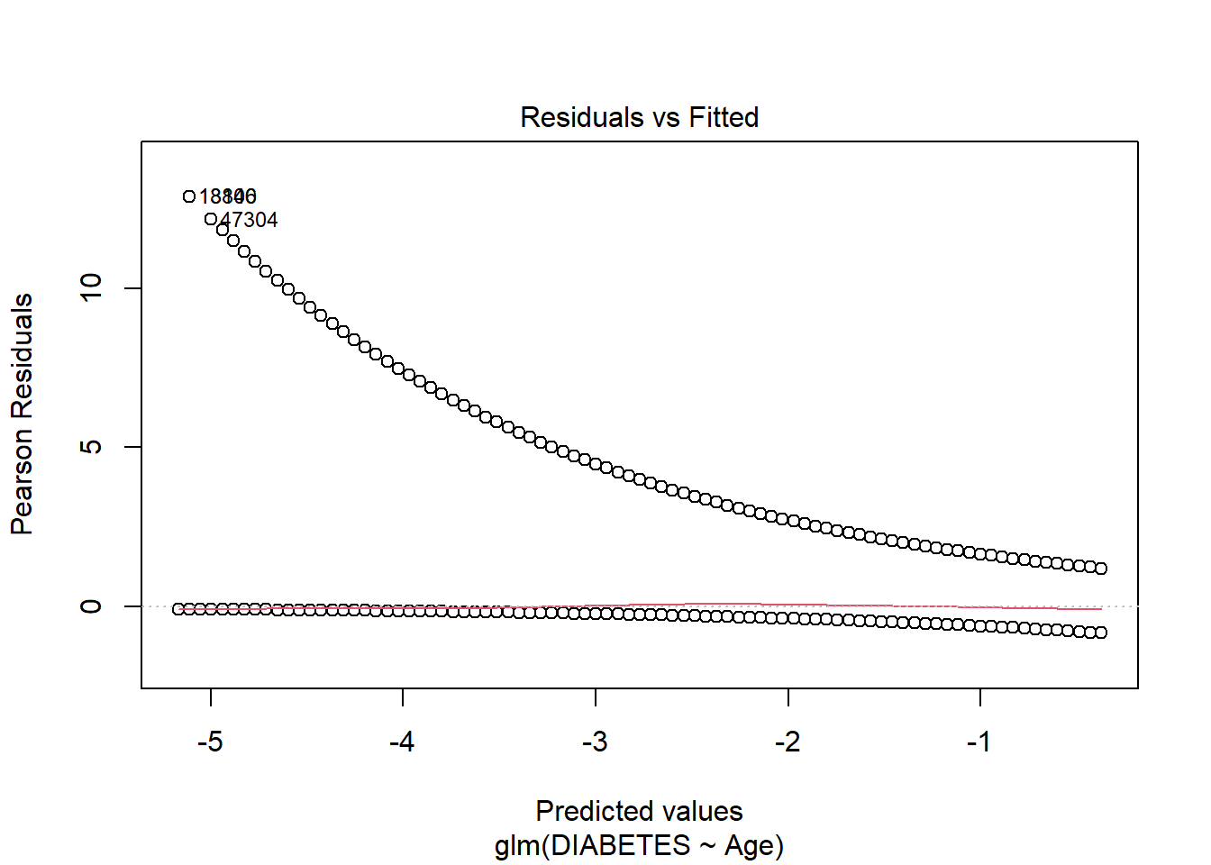
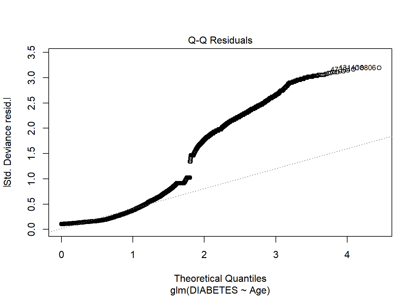
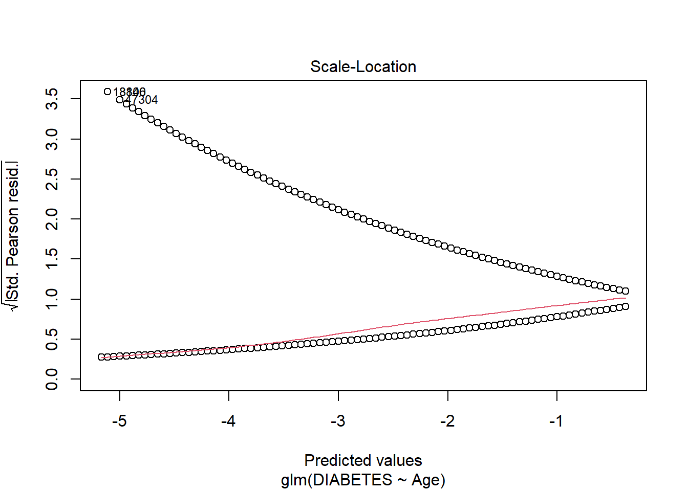
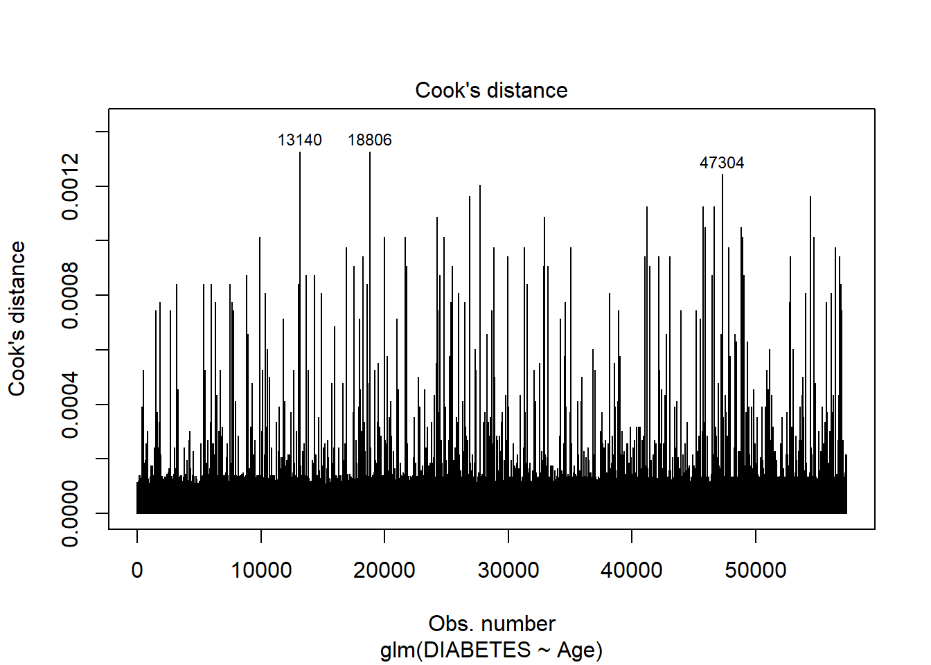
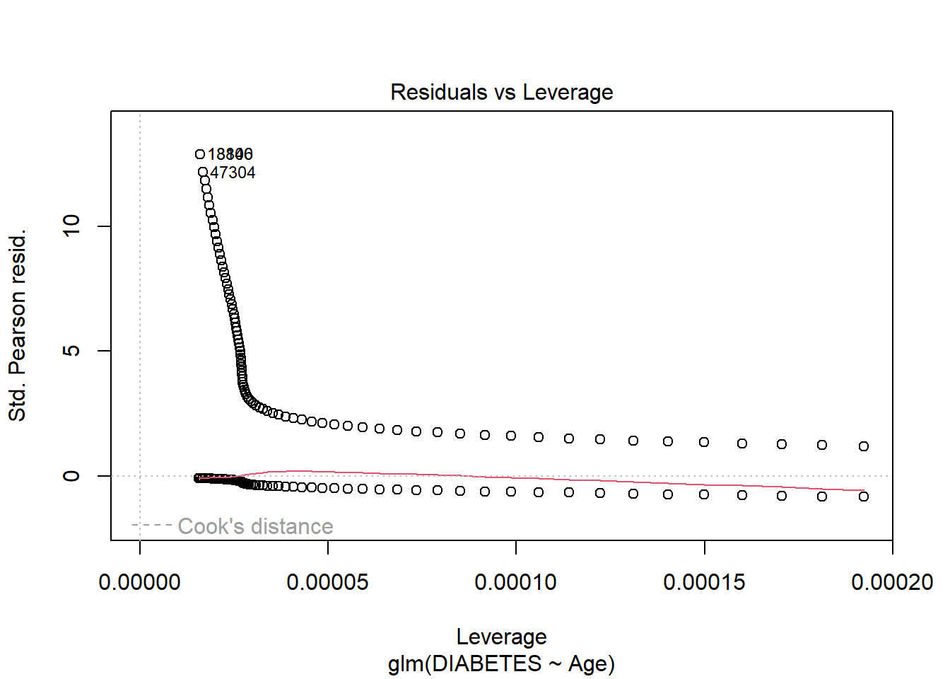
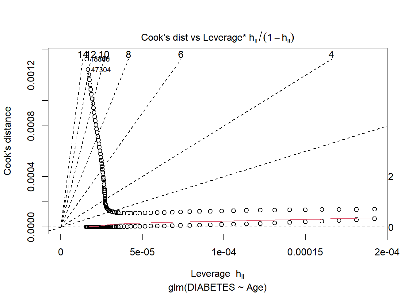
6.6.1 Logistic Regression Model Outputs
When we call the model we get a subset of output including:
the call to glm including the formula
Coefficients Table
Estimate for coefficients (\(\beta_j\))
Degrees of Freedom; Residual
Null Deviance
Residual Deviance / AIC
Code
logit.dm2_age
Call:  glm(formula = DIABETES ~ Age, family = "binomial", data = A_DATA.train)

Coefficients:
(Intercept)          Age
   -5.22504      0.05707

Degrees of Freedom: 57327 Total (i.e. Null);  57326 Residual
Null Deviance:      29700
Residual Deviance: 23350    AIC: 23350
When we call summary on model object we often get some different out-put, in the case of glm:
Call:
glm(formula = DIABETES ~ Age, family = "binomial", data = A_DATA.train)

Coefficients:
              Estimate Std. Error z value Pr(>|z|)
(Intercept) -5.2250430  0.0534194  -97.81   <2e-16 ***
Age          0.0570724  0.0008558   66.69   <2e-16 ***
---
Signif. codes:  0 '***' 0.001 '**' 0.01 '*' 0.05 '.' 0.1 ' ' 1

(Dispersion parameter for binomial family taken to be 1)

    Null deviance: 29698  on 57327  degrees of freedom
Residual deviance: 23350  on 57326  degrees of freedom
AIC: 23354

Number of Fisher Scoring iterations: 6
We get the following
the call to glm including the formula
Deviance Residuals
Coefficients Table
Estimate for coefficients (\(\beta_j\))
Standard Error
z-value
p-value
Significance Level
Null Deviance
Residual Deviance
Akaike Information Criterion (AIC)
While this is all quite a lot of information, however, I find that the broom package does a much better job at collecting relevant information and parsing it out for review:
Going back to our interpretation of the Odds Ratio, for every 1 unit increase in Age our odds of getting Diabetes increases by about 5.8732448%
6.6.1.2 Training Errors
Measures such as AIC, BIC, and Adjusted R2 are normally thought of training error estimates so you could group those into a table if you wanted. The broom::glance function will provide a table of training errors but if you want Adjusted R2 you will have to compute it yourself:
After broom::glance converts the model training errors into a tibble we can use a mutate to add the additional column, then we use tidr::pivot_longer to transpose from a wide format to long, then we can use kable print it for review:
This is because compare_models comprises of two dataframes we stacked ontop of each other, one containing each of the results of scoring the test set under model logit.dm2_rand_age and logit.dm2_age with the bind_rows funciton.
This new dataset contains the scored results of both models on the test set, and a column model that specifies which model the result came from.
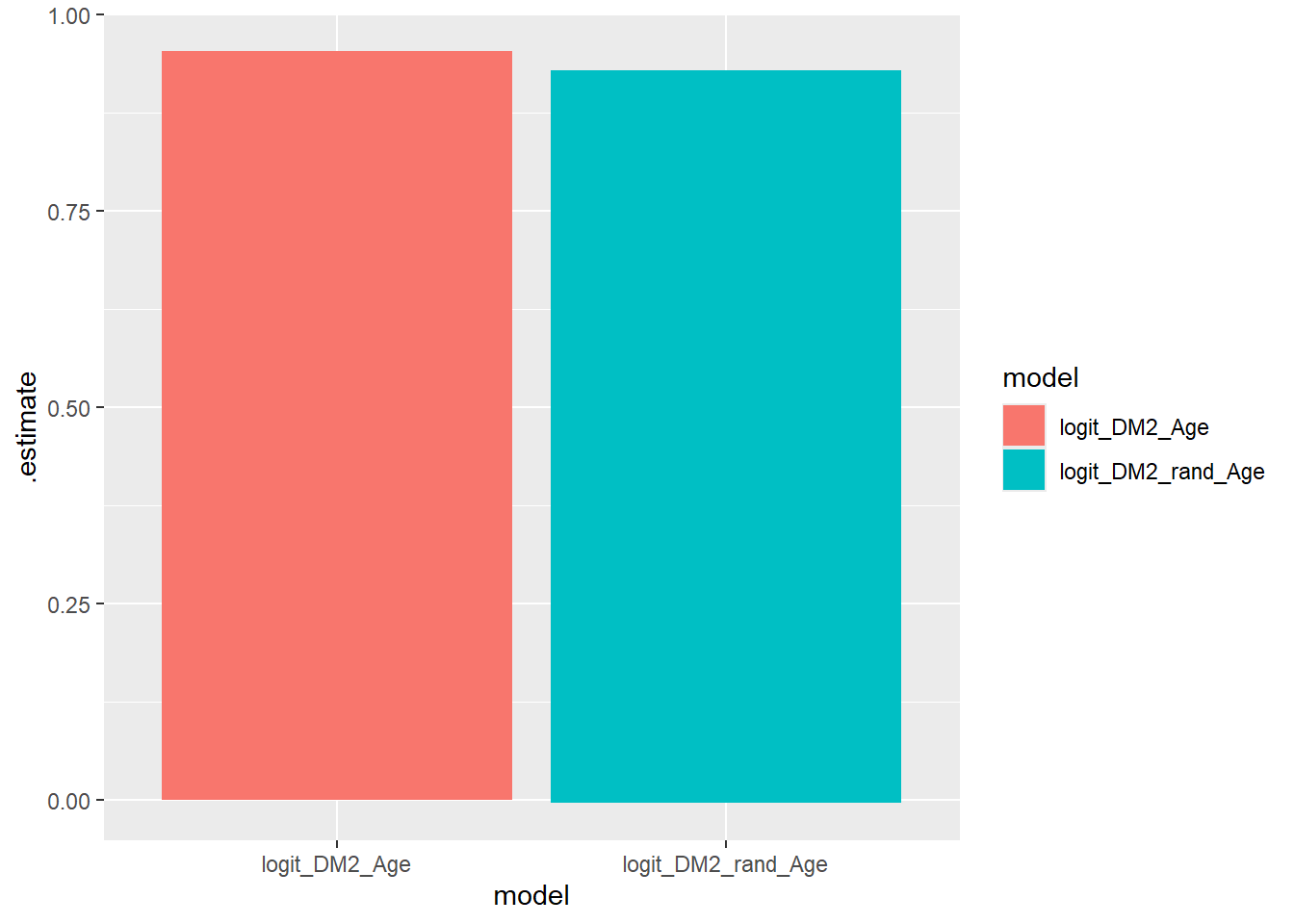
Recall that the return to roc_auc will be a tibble with columns: .metric.estimator and .estimate.
The data-set compare_models that we have set-up can be used with the rest of the tidy verse, and the yardstick package. The key now is that our analysis is grouped by the two models:
Notice in the above computation that the Model_AUCs returned was a tibble we used that to create a new column model_AUC where we made some nice text that will display in the graph below:
The join occurs, because model is in both tibbles, we then group by model_AUC which will be the new default display by autoplot to match our ROC graphs.
\(~\)
\(~\)
6.15 Precision-Recall curves
Precision is a ratio of the number of true positives divided by the sum of the true positives and false positives. It describes how good a model is at predicting the positive class. Precision is referred to as the positive predictive value or PPV.
Recall is calculated as the ratio of the number of true positives divided by the sum of the true positives and the false negatives. Recall is the same as sensitivity.
A precision-recall curve is a plot of the precision (y-axis) and the recall (x-axis) for different thresholds, much like the ROC curve.
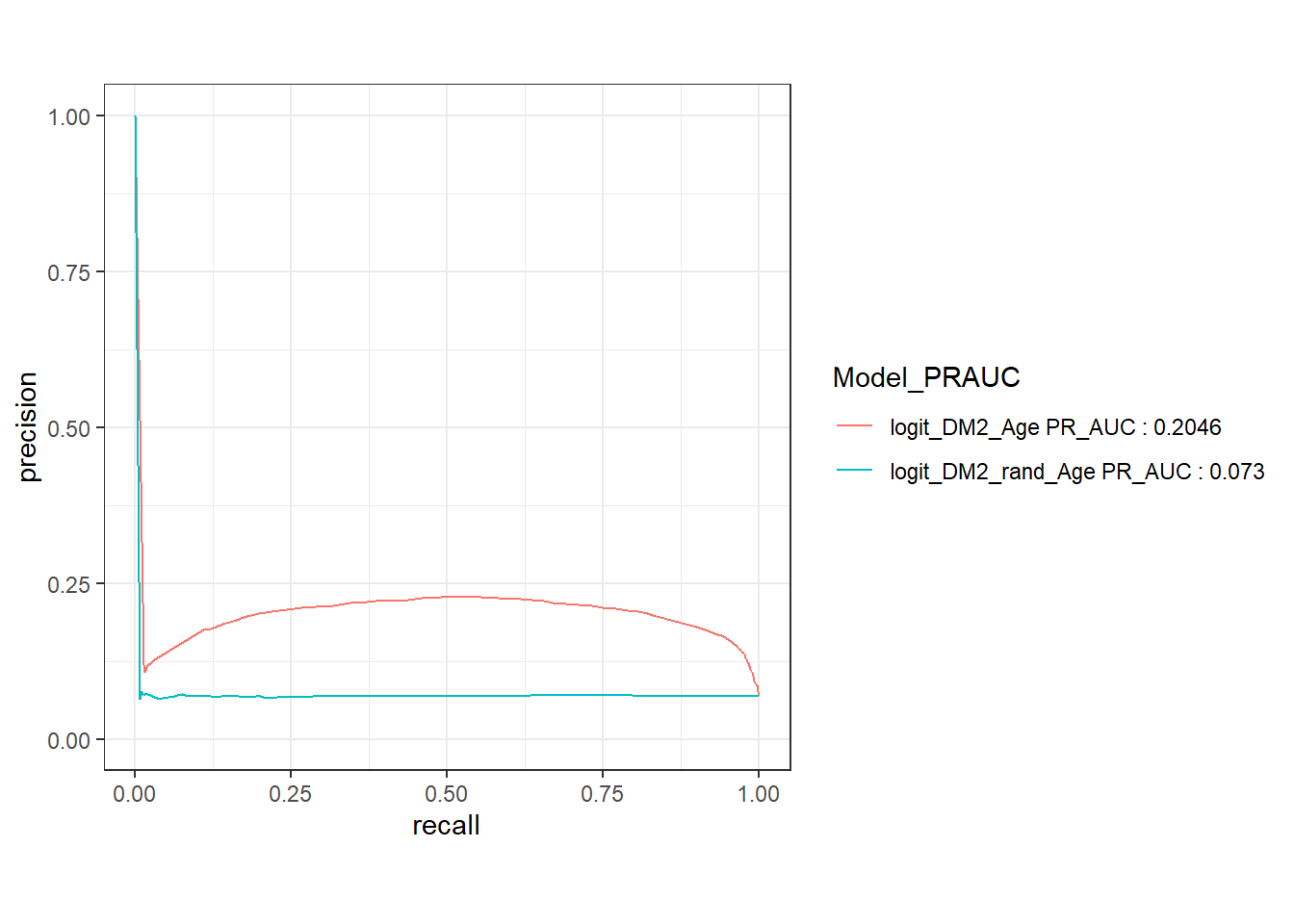
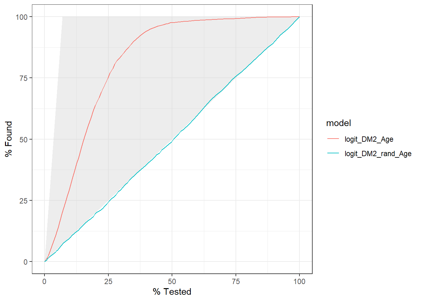
The gain curve below for instance showcases that we can review the top 25% of probabilities within the Age model and we will find 75% of the diabetic population.
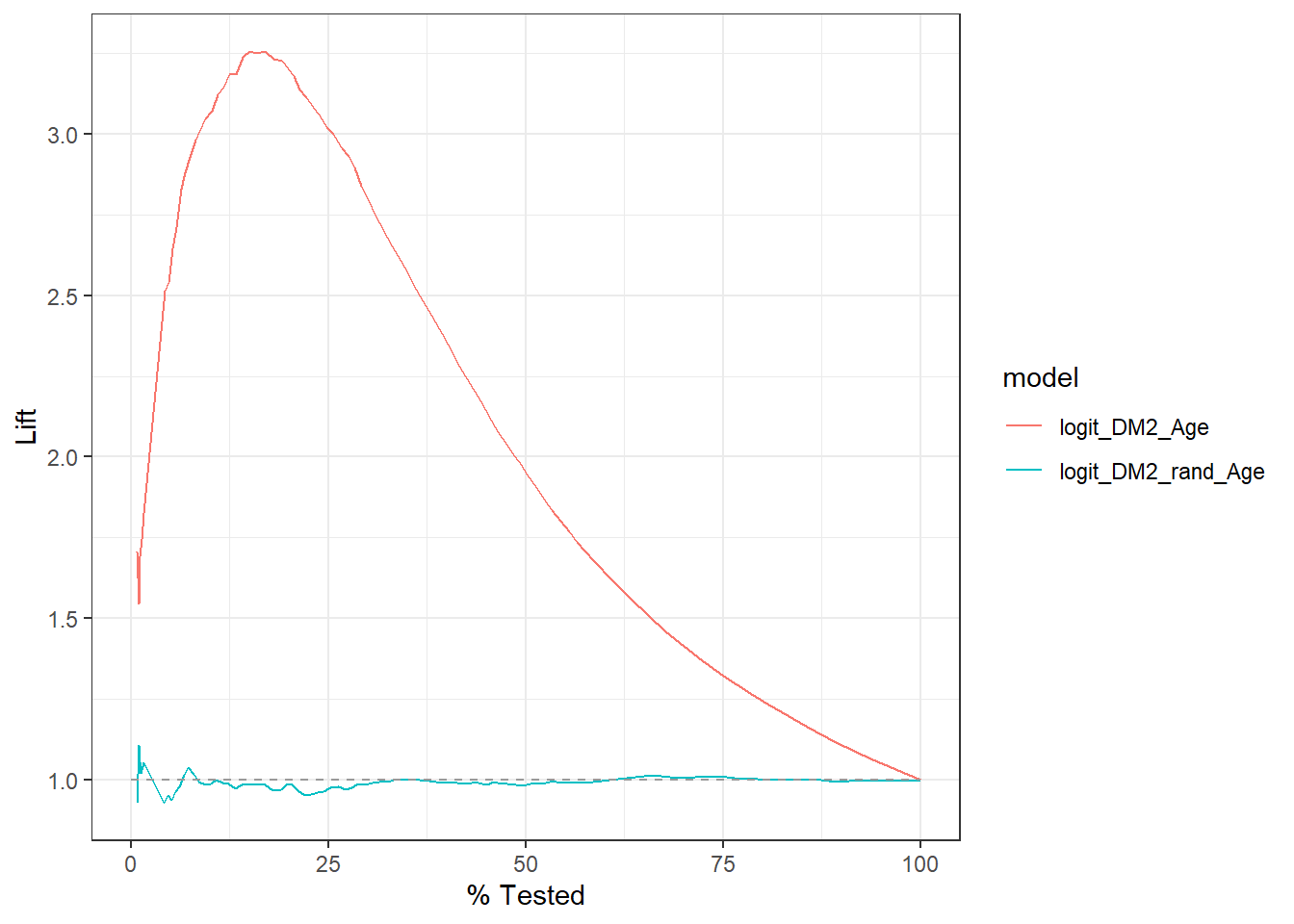
Similarly, this lift curve showcases that a review the top 25% of probabilities within the Age model and we will find 3 times more diabetics than searching at random:
# A tibble: 2 × 2
  model              conf_mat
  <chr>              <list>
1 logit_DM2_Age      <conf_mat>
2 logit_DM2_rand_Age <conf_mat>
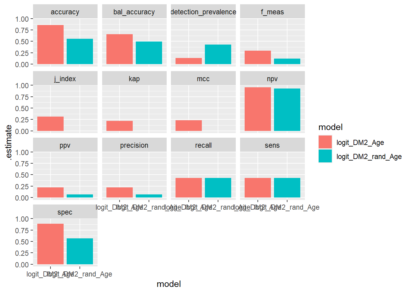
Note that the default return here is a tibble with columns: model which is from our group_by above and a column called conf_mat from the conf_mat function which is a list of <S3: conf_mat>.
Above sum_conf_mat is defined by map which is from the purrr library; map will always returns a list. A typical call looks like map(.x, .f, ...) where:
.x - A list or atomic vector (conf_mat - column)
.f - A function (summary)
... - Additional arguments passed on to the mapped function
In this case we need to pass in the option event_level='second' into the function .f = summary
We see that sum_conf_mat is a list of tibbles.
Now apply the next layer, the unnest(sum_conf_mat) layer:
compare_models%>%group_by(model)%>%conf_mat(truth =DIABETES_factor, pred_factor)%>%mutate(sum_conf_mat =map(conf_mat,summary, event_level ="second"))%>%unnest(sum_conf_mat)%>%select(model, .metric, .estimate)%>%ggplot(aes(x =model, y =.estimate, fill =model))+geom_bar(stat='identity', position ='dodge')
What are the expected relationshiped between the p.values from the t, ks, ANOVA, and Wald statistical tests on an analytic dataset?
Dupont, William D. 2009. Statistical Modeling for Biomedical Researchers. 2nd ed. Cambridge, England: Cambridge University Press.
James, Gareth, Daniela Witten, Trevor Hastie, and Robert Tibshirani. 2021. An Introduction to Statistical Learning an Introduction to Statistical Learning. 2nd ed. Springer Texts in Statistics. New York, NY: Springer.
Kelleher, John D, Brian Mac Namee, and Aoife D’Arcy. 2015. Fundamentals of Machine Learning for Predictive Data Analytics. The MIT Press. London, England: MIT Press.
Kuhn, Max, and Kjell Johnson. 2013. Applied Predictive Modeling. 1st ed. New York, NY: Springer.
Source Code
# Two Factor Classification with a Single Continuous Feature {#sec-two-factor-classification-with-a-single-continuous-feature}In this Chapter we will go through some fundamentals of **Exploratory Data Analysis (EDA) process** of with two **single continuous** example features: `Age` and `rand_age`. In Section @sec-add-noise we define a new feature `rand_age` as by randomly sampling from the `Age` distribution.We will review the main assumptions of:- **t-test -** Section @sec-t-test- **ks-test -** Section @sec-ks-test- **ANOVA Review -** Section @sec-anova-reviewAnd discuss how these statistical analyses can be used to detect statistically significant differences between groups and the role they play in **Two Factor Classification** between our two primary groups: patient's with and without diabetes. We will also showcase some supportive graphics to accompany each of these statistical analysis.Our EDA will show that while `rand_age` and `Age` originate from the same distribution, that distribution is not the same across members with diabetes.In section Section @sec-logistic-regression We will review the **Logistic Regression classification model**. Along with associated correspondence between coefficients of the logistic regression and the the so called **Odds Ratio**. We will also review the **Wald test** in Section @sec-wald-test.In Section @sec-train-logistic-regression-with-age-feature we will use `R` to train a logistic regression to predicting Diabetes one with feature `Age`. We will perform an in-depth review of the `glm` logistic regression model outputs in Section @sec-logistic-regression-model-outputs and showcase how to utilize a model object to `predict` on unseen data in Section @sec-probability-scoring-test-data-with-logit-age-model.As a first example of a **Model Evaluation Metric** the **Receiver Operating Characteristic (ROC) Curve** in Section @sec-receiver-operating-characteristic-curve is created by plotting the **true positive rate (TPR)** against the **false positive rate (FPR)** at various **threshold settings**.In Section @sec-setting-a-threshold we use the model object and the training data to obtain a threshold estimate and define predicted classes. This will lead us to review the **Confusion Matrix** in Section @sec-confusion-matrix and a variety of **Model Evaluation Metrics** including: Accuracy, Precision, Recall, Sensitivity, Specificity, Positive Predictive Value (PPV), Negative Predicted Value (NPV), f1-statistic, and others we will showcase in Section @sec-model-evaluation-metrics.We will demonstrate that the difference between features distributions is what enables predictive models like logistic regression to effectively perform in two factor classification prediction tasks. While the p-value from the Wald statistic, is often used as an indication of feature importance within a logistic regression setting; the principals we will discuss over these next few Chapters of the EDA process will often be highly effective in determining feature selection for use in a variety of more sophisticated predictive modeling tasks going forward.We will train a second logistic regression model with the `rand_age` feature in Section @sec-train-logistic-regression-with-the-random-age-feature.Lastly, will again utilize the Confusion Matrix and a variety of Model Evaluation Metrics to measure model performance and develop an intuition by comparing and contrasting:- **ROC Curves** - Section @sec-roc-curves- **Precision-Recall Curves** - Section @sec-precision-recall-curves- **Gain Curves** - Section @sec-gain-curves- **Lift Curves** - Section @sec-lift-curves- **Model Evaluation Metrics Graphs** - Section @sec-model-evaluation-metrics-graphsbetween our two logistic regression model examples.Our goal primary goal with this chapter will be to compare and contrast these the logistic regression models and connect them back to our EDA analysis of the features to develop a functional working framework of the process that spans EDA and has impact on feature creation and selection selection, following this all the way down the line to feature impact (or lack thereof) on model performance.First, we will load our dataset from section @sec-save-week-2-analysis-data:```{r}A_DATA <-readRDS(here::here('DATA/Part_2/A_DATA.RDS'))library('tidyverse')A_DATA %>%glimpse()```### Add noise {#sec-add-noise}As a comparison, we are going to add a feature `rand_age` to the data-set. `rand_age` will be sampled from the `Age` column in the `A_DATA` dataframe with replacement.```{r}set.seed(8576309)A_DATA$rand_age <-sample(A_DATA$Age, size =nrow(A_DATA), replace =TRUE)A_DATA %>%glimpse()```Above `rand_age` is defined by randomly selecting values from `Age`; we will show that while `rand_age` and `Age` originate from the same distribution, that distribution is not the same across members with diabetes:### `dplyr` statistics```{r }A_DATA %>% group_by(DIABETES) %>% summarise(mean_age = mean(Age, na.rm = TRUE), sd_age = sd(Age, na.rm = TRUE), mean_rand_Age = mean(rand_age, na.rm=TRUE), sd_rand_Age = sd(rand_age, na.rm=TRUE)) ```We notice that the `mean_age` of the diabetics appears to be twice as much as the `mean_rand_Age`.We can perform some statistical analyses to confirm these two means are in-fact different, in this chapter we will review:1. The **t-test** may be used to test the hypothesis that **two** *normalish* sample distributions have the same mean.2. The **Kolmogorov--Smirnov** or **ks-test** may be used to test the hypothesis that two sample distributions were drawn from the same continuous distribution.3. Lastly, **Analysis of Variance (ANOVA)** also may be used to test if **two or more** *normalish* distributions have the same mean.$~$------------------------------------------------------------------------$~$## t-test {#sec-t-test}The **t-test** is two-sample statistical test which tests the **null hypothesis** that two **normal distributions** have the same mean.$$H_O: \mu_1 = \mu_2 $$where $\mu_i$ are the distribution means.The $t$-statistic is defined by:$$ t = \frac{\mu_1 - \mu_2}{\sqrt{S^{2}_{X_1}+S^{2}_{X_2}}}$$ where $S^{2}_{X_i}$ is the standard error, for a given sample standard deviation.Once the t value and degrees of freedom are determined, a p-value can be found using a table of values from a [t-distribution](https://en.wikipedia.org/wiki/Student%27s_t-distribution#Table_of_selected_values).If the calculated p-value is below the threshold chosen for statistical significance (usually at the 0.05, 0.10, or 0.01 level), then the null hypothesis is rejected in favor of the **alternative hypothesis**, the means are different.$~$Now we will use the t-test on `Age` between groups of `DIABETES`. First we can extract lists of `Age`s for each type of `DIABETES`:```{r}dm2_age <- (A_DATA %>%filter(DIABETES ==1))$Agenon_dm2_age <- (A_DATA %>%filter(DIABETES ==0))$Agemiss_dm2_age <- (A_DATA %>%filter(is.na(DIABETES)))$Age```Let's compare the mean ages between the Diabetic and non-Diabetic populations with the **t-test**:```{r}tt_age <-t.test(non_dm2_age, dm2_age, alternative ='two.sided', conf.level =0.95)```Here's a look at the output```{r}tt_age```The output displays that the means are: `r tt_age$estimate` and the p-value is `r tt_age$p.value`Recall the **p-value** of the **t-test** between two sample distributions.**Null and alternative hypotheses**1. The **null-hypothesis** for the t-test is that the two population means are equal.2. The **alternative hypothesis** for the t-test is that the two population means are not equal.If the p-value is1. **greater than .05** then we **accept the null-hypothesis** - we are 95% certain that the two samples have the same mean.2. **less than .05** then we **reject the null-hypothesis** - we are **not** 95% certain that the two samples have the same mean.Since the p-value is `tt_age$p.value =``r tt_age$p.value`\< .05 we **reject the null-hypothesis of the t-test.**::: {align="center"}**The sample mean ages of the Diabetic population is statistically significantly different from the sample mean ages of the non-Diabetic population.**:::Let's review the structure of the `t.test` output:```{r }str(tt_age)```We see that the default return is a list of 10 items including:1. statistic2. parameter3. p-value4. confidence interval5. estimate6. null.value7. stderr8. alternative9. method10. data namesHowever the output is a ```{r}class(tt_age)```and not a dataframe. We can `tidy`-up the results if we utilize the `broom` package. Recall that `broom::tidy` tells `R` to look in the `broom` package for the `tidy` function. The `tidy` function in the `broom` library converts many base `R` outputs to tibbles:```{r}broom::tidy(tt_age) %>%glimpse()```We see that `broom::tidy` has transformed our list output from the t-test and made it a tibble, since it has now become a tibble we can use any other `dplyr` function:```{r}library('broom')tibble_tt_age <-tidy(tt_age) %>%mutate(dist_1 ="non_dm2_age") %>%mutate(dist_2 ="dm2_age")```Above, we add variables to help us remember where the data came from, so the tibble has been transformed to:```{r }tibble_tt_age %>% glimpse()```A box pot or density plot can go along well with a t-test analysis:```{r}A_DATA %>%filter(!is.na(DIABETES)) %>%ggplot(aes(x = DIABETES, y=Age, fill=as.factor(DIABETES))) +geom_boxplot() +coord_flip() +labs(title ="Box Plot of Age by Diabetic Status", caption =paste0("t-test p-value = ", round(tibble_tt_age$p.value,4) ))```Let's contrast the above with the results we get from `rand_age`s between the Diabetic and non-Diabetic populations:```{r }dm2_rand_age <- (A_DATA %>% filter(DIABETES == 1))$rand_agenon_dm2_rand_age <- (A_DATA %>% filter(DIABETES == 0))$rand_agemiss_dm2_rand_age <- (A_DATA %>% filter(is.na(DIABETES)))$rand_age``````{r }tt_rand_age <- t.test(non_dm2_rand_age, dm2_rand_age, alternative = 'two.sided', conf.level = 0.95)tt_rand_age``````{r }tibble_tt_rand_age <- tt_rand_age %>% broom::tidy() tibble_tt_rand_age ```The story here is different, since `tibble_tt_rand_age$p.value =``r tibble_tt_rand_age$p.value` is greater than .05 we accept the **null-hypothesis** and assume the sample mean of `rand_age` is the same for both the Diabetic and non-Diabetic populations.```{r}A_DATA %>%filter(!is.na(DIABETES)) %>%mutate(DIABETES_factor =as.factor(DIABETES)) %>%ggplot(aes(x= rand_age, fill=DIABETES_factor)) +geom_boxplot() +labs(title ="Box Plot - Diabetic status by rand_age", caption =paste0("t-test p-value = ", round(tibble_tt_rand_age$p.value, 4) )) ```## ks-test {#sec-ks-test}The two-sample **Kolmogorov-Smirnov Test** or **ks-test** will test the **null-hypothesis** that the two samples were drawn from the same continuous distribution.The **alternative hypothesis** is that the samples were not drawn from the same continuous distribution. The ks-test can be called in a similar fashion to the `t.test` in section @sec-t-test. Additionally, while the default output type of `ks.test` is a list again the `tidy` function in the `broom` library can be used to convert to a tibble.```{r }#| warning: falsetibble_ks_age <- ks.test(non_dm2_age, dm2_age, alternative = 'two.sided') %>% broom::tidy()tibble_ks_age```Since the `p.value` is less than .05 we **accept the alternative hypothesis**, that the Age of Members with Diabetes was not drawn from the same distribution as Age of Members with-out Diabetes.We can see the difference between the distributions, most clearly by the density plot:```{r}A_DATA %>%filter(!is.na(DIABETES))%>%mutate(DIABETES_factor =as.factor(DIABETES)) %>%ggplot(aes(x=Age, fill=DIABETES_factor)) +geom_density() +labs(title ="Density Plot - non-missing Diabetic status by Age",caption =paste0("ks-test p-value :" , round(tibble_ks_age$p.value, 4)))```The ks-statistic quantifies a distance between the empirical distribution functions (ECDF) of the two samples, and this is the plot of the two ECDFs:```{r}A_DATA %>%filter(!is.na(DIABETES))%>%mutate(DIABETES_factor =as.factor(DIABETES)) %>%ggplot(aes(x=Age, color=DIABETES_factor)) +stat_ecdf() +labs(title ="K-S Test: Age - Diabetics Vs non-Diabetics",caption =paste0("ks-test p-value :" , round(tibble_ks_age$p.value, 4)))```As we did with the t-test, we will contrast the results of the `ks.test` test for `rand_age`:```{r }#| warning: falsetibble_ks_rand_age <- ks.test(non_dm2_rand_age, dm2_rand_age, alternative = 'two.sided') %>% broom::tidy()tibble_ks_rand_age```Furthermore, since the `p.value` of the `ks.test` is `r tibble_ks_rand_age$p.value` we accept the **null-hypothesis**; and assume the distributions of `rand_age` of both the diabetics and non-diabetics were sampled from the same continuous distributionWe can see in the density plot the distributions are not much different:```{r }A_DATA %>% filter(!is.na(DIABETES))%>% mutate(DIABETES_factor = as.factor(DIABETES)) %>% ggplot(aes(x=rand_age, fill=DIABETES_factor)) + geom_density() + labs(title = "Density Plot - rand_age by Diabetes", caption = paste0('ks-test p-value : ' , round(tibble_ks_rand_age$p.value,4)))```And here two ECDFs are almost on top of each other:```{r}A_DATA %>%filter(!is.na(DIABETES))%>%mutate(DIABETES_factor =as.factor(DIABETES)) %>%ggplot(aes(x=rand_age, color=DIABETES_factor)) +stat_ecdf() +labs(title ="K-S Test: rand_age - Diabetics Vs non-Diabetics",caption =paste0("ks-test p-value :" , round(tibble_ks_rand_age$p.value,4)))```### Discussion Question> For distributions `x` and `y` is it possible that:>> > 1. `t.test(x,y)$p.value > .05 & ks.test(x,y)$p.value < .05` ?> > 2. What about for `t.test(x,y)$p.value < .05 & ks.test(x,y)$p.value > .05` ?<!-- $~$ --><!-- #### Compare "Missing" Diabetic class among `Age` and `rand_age` --><!-- ##### Histograms --><!-- Histograms can sometimes be helpful in getting started: --><!-- ```{r } --><!-- hist_plot_1 <- A_DATA %>% --><!-- mutate(DIABETES_factor = as.factor(DIABETES)) %>% --><!-- ggplot(aes(x=Age, fill=DIABETES_factor)) + --><!-- geom_histogram(alpha=0.6, position = 'identity' , binwidth = 5 ) + --><!-- labs(title = "Histogram - Diabetic status by Age") --><!-- hist_plot_1 --><!-- ``` --><!-- We will once again review t-test analysis: --><!-- ##### t-test --><!-- ```{r} --><!-- tibble_t_test.Age.Non_Dm2.Miss_DM2 <- broom::tidy(t.test( miss_dm2_age, non_dm2_age)) %>% --><!-- mutate(dist_1 = "miss_dm2_age") %>% --><!-- mutate(dist_2 = "non_dm2_age") --><!-- ``` --><!-- ```{r} --><!-- tibble_t_test.Age.Dm2.Miss_DM2 <- broom::tidy(t.test(dm2_age, miss_dm2_age)) %>% --><!-- mutate(dist_1 = "dm2_age") %>% --><!-- mutate(dist_2 = "miss_dm2_age") --><!-- ``` --><!-- ```{r } --><!-- tibble_ttests <- bind_rows(tibble_tt_age, --><!-- tibble_t_test.Age.Non_Dm2.Miss_DM2, --><!-- tibble_t_test.Age.Dm2.Miss_DM2) --><!-- tibble_ttests %>% --><!-- select(dist_1, dist_2, p.value, estimate1, estimate2, conf.low, estimate, conf.high) --><!-- ``` --><!-- ###### box-plots --><!-- We can see the difference between each of the three `Age` means at once we can make the plots interactive if we utilize `plotly::ggplotly`, a good supporting plot to go along with the above table might be the box-plot: --><!-- ```{r } --><!-- box_plot_1 <- A_DATA %>% --><!-- mutate(DIABETES_factor = as.factor(DIABETES)) %>% --><!-- ggplot(aes(x=DIABETES_factor, y=Age , fill=DIABETES_factor)) + --><!-- geom_boxplot() + --><!-- coord_flip() + --><!-- labs(title = "Box Plot - Diabetic status by Age") --><!-- box_plot_1 --><!-- ``` --><!-- ##### ks-test --><!-- ```{r} --><!-- #| warning: false --><!-- tibble_ks_test.Age.Non_Dm2.DM2 <- ks.test(non_dm2_age, dm2_age, alternative = 'two.sided') %>% --><!-- broom::tidy() %>% --><!-- mutate(dist_1 = "non_dm2_age") %>% --><!-- mutate(dist_2 = "dm2_age") --><!-- tibble_ks_test.Age.Non_Dm2.Miss_DM2 <- ks.test( miss_dm2_age, non_dm2_age , alternative = 'two.sided') %>% --><!-- broom::tidy() %>% --><!-- mutate(dist_1 = "miss_dm2_age") %>% --><!-- mutate(dist_2 = "non_dm2_age") --><!-- tibble_ks_test.Age.Dm2.Miss_DM2 <- ks.test(dm2_age, miss_dm2_age , alternative = 'two.sided') %>% --><!-- broom::tidy() %>% --><!-- mutate(dist_1 = "dm2_age") %>% --><!-- mutate(dist_2 = "miss_dm2_age") --><!-- ``` --><!-- ```{r } --><!-- tibble_ks.tests <- bind_rows(tibble_ks_test.Age.Non_Dm2.DM2, --><!-- tibble_ks_test.Age.Non_Dm2.Miss_DM2, --><!-- tibble_ks_test.Age.Dm2.Miss_DM2) --><!-- tibble_ks.tests %>% --><!-- select(dist_1, dist_2, p.value) --><!-- ``` --><!-- ###### density plots --><!-- Density plots are a great option to accompany a ks-test. --><!-- ```{r} --><!-- density_plot_1 <- A_DATA %>% --><!-- mutate(DIABETES_factor = as.factor(DIABETES)) %>% --><!-- ggplot(aes(x=Age, fill=DIABETES_factor)) + --><!-- geom_density() + --><!-- labs(title = "Density Plot - Age by Diabetic status") --><!-- density_plot_1 --><!-- ``` --><!-- $~$ -->## Non-missing DataWe can use `Amelia::missmap` to get a sense for how much of our data is missing:```{r}Amelia::missmap(as.data.frame(A_DATA))```For some analyses and models we need to remove missing data to prevent errors from `R`, for the reminder of this chapter, we will work with only the records that have non-missing values for `SEQN`, `DIABETES`, `Age`, and `rand_age`:```{r}A_DATA.no_miss <- A_DATA %>%select(SEQN, DIABETES, Age, rand_age) %>%mutate(DIABETES_factor =as.factor(DIABETES)) %>%mutate(DIABETES_factor =fct_relevel(DIABETES_factor, c('0','1') ) ) %>%na.omit()```Notice now there are no missing values:```{r}Amelia::missmap(as.data.frame(A_DATA.no_miss))```## ANOVA Review {#sec-anova-review}Much like the t-test, **Analysis of Variance (ANOVA)** is used to determine whether there are any statistically significant differences between the means of two or more independent (unrelated) groups.ANOVA compares the means between two or more groups you that are interested in and determines whether any of the means of those groups are statistically significantly different from each other. Specifically, ANOVA tests the **null hypothesis**:$$H_0 : \mu_1 = \mu_2 = \mu_2 = \cdots = \mu_f$$where $\mu_i =$ are the group means and $f =$ number of groups.If, however, the one-way ANOVA returns a statistically significant result ($<.05$ normally), we accept the **alternative hypothesis**, which is that there are at least two group means that are **statistically significantly different** from each other.```{r}res.aov <-aov(DIABETES ~ Age, data = A_DATA.no_miss)res.aov.sum <-summary(res.aov)res.aov.sum``````{r}#| include: falseanova_pvalue1 <- res.aov.sum[[1]]$`Pr(>F)`[1]```Since this p-value is `r anova_pvalue1` $<.05$ we accept the alternative hypothesis, there is a statistically significantly difference between the two `Age` groups, just as we found when we performed the t-test.When we perform ANOVA for `rand_age` on the data-set we find:```{r}aov(DIABETES ~ rand_age, data = A_DATA.no_miss) %>% broom::tidy()```and, yes, `broom::tidy` also transformed our ANOVA output into a tibble```{r}#| include: falseanova_pvalue2 <- (aov(DIABETES ~ rand_age, data = A_DATA.no_miss) %>% broom::tidy())$p.value```this p-value for ANOVA with `rand_age` is `r anova_pvalue2` $>.05$; therefore, we accept the null hypothesis that the two group means are approximately the same, and, again; this matches with what we found when we performed the t-test.### Split DataTo test different models it is standard practice [@Kelleher2015-ga, @Kuhn2013-pk] to split your data into at least two sets. training set and a testing set, where:- the **training set** will be used to **train the model** and- the **testing set** or **hold-out** set will be used to evaluate model performance.While, we could also compute **model evaluation metrics** on the training set, the results will be overly-optimistic as the training set was used to train the model.In this example, we will `sample` 60% of the non-missing data's member-ids without replacement:```{r}set.seed(123)sample.SEQN <-sample(A_DATA.no_miss$SEQN, size =nrow(A_DATA.no_miss)*.6, replace =FALSE)# we can check that we got approximately 60% of the data:length(sample.SEQN)/nrow(A_DATA.no_miss)```Recall that the `set.seed` is there to ensure we get the same training and test set from run to run. We can always randomize if we use `set.seed(NULL)` or `set.seed(Sys.time())`The training set will consist of those `r length(sample.SEQN)` the 60% we chose at random:```{r}A_DATA.train <- A_DATA.no_miss %>%filter(SEQN %in% sample.SEQN)```And the testing set will consist of the remaining 40% of members not in `sample.SEQN`:```{r}A_DATA.test <- A_DATA.no_miss %>%filter(!(SEQN %in% sample.SEQN))```## Logistic Regression {#sec-logistic-regression} Let's suppose our data-set contains a binary column $y$, where $y$ has two possible values: 1 and 0. **Logistic Regression** \index{Logistic Regression} assumes a linear relationship between the features or predictor variables and the log-odds (also called logit) of a binary event. This linear relationship can be written in the following mathematical form:$$ \ell = \ln \left( \frac{p}{1-p} \right) = \beta_0 + \beta_1x_1 + \beta_2x_2 + \cdots + \beta_kx_k $$Where $\ell$ is the **log-odds**, $\ln()$ is the **natural logarithm**, and $\beta_i$ are coefficients for the features ($x_i$) of the model. We can solve the above equation for $p$:$$\frac{p}{1-p} = e^{\beta_0 + \beta_1x_1 + \beta_2x_2 + \cdots + \beta_kx_k}$$$$ p = (1-p)(e^{\beta_0 + \beta_1x_1 + \beta_2x_2 + \cdots + \beta_kx_k}) $$$$ p = e^{\beta_0 + \beta_1x_1 + \beta_2x_2 + \cdots + \beta_kx_k} - p \cdot e^{\beta_0 + \beta_1x_1 + \beta_2x_2 + \cdots + \beta_kx_k}$$$$ p + p \cdot e^{\beta_0 + \beta_1x_1 + \beta_2x_2 + \cdots + \beta_kx_k} = e^{\beta_0 + \beta_1x_1 + \beta_2x_2 + \cdots + \beta_kx_k}$$$$ p(1 + e^{\beta_0 + \beta_1x_1 + \beta_2x_2 + \cdots + \beta_kx_k}) = e^{\beta_0 + \beta_1x_1 + \beta_2x_2 + \cdots + \beta_kx_k} $$$$ p = \frac{e^{\beta_0 + \beta_1x_1 + \beta_2x_2 + \cdots + \beta_kx_k}}{1 + e^{\beta_0 + \beta_1x_1 + \beta_2x_2 + \cdots + \beta_kx_k}} $$$$ p = \frac{1}{1+e^{-(\beta_0 + \beta_1x_1 + \beta_2x_2 + \cdots + \beta_kx_k)}} $$The above formula shows that once $\beta_i$ are known, we can easily compute either the log-odds that $y=1$ for a given observation, or the probability that $y=1$ for a given observation. See also, [@James2021-ka]### Odds RatioThe **odds** of the dependent variable equaling a case ($y=1$), given some linear combination the features $x_i$ is equivalent to the exponential function of the linear regression expression.$$odds = e^{\beta_0 + \beta_1x_1 + \beta_2x_2 + \cdots + \beta_kx_k}$$This illustrates how the logit serves as a link function between the probability and the linear regression expression.For a continuous independent variable the **odds ratio** can be defined as:$$OddsRatio = \frac{odds(x_j+1)}{odds(x_j)} $$Since we know what the odds are we can compute this as:$$OddsRatio = \frac{e^{\beta_0 + \beta_1x_1 + \cdots + \beta_j(x_j+1) + \cdots + \beta_kx_k}}{e^{\beta_0 + \beta_1x_1 + \cdots + \beta_j(x_j) + \cdots + \beta_kx_k}}$$$$OddsRatio = \frac{e^{\beta_0}\cdot e^{\beta_1x_1}\cdots e^{\beta_j(x_j+1)}\cdots e^{\beta_kx_k}}{e^{\beta_0}\cdot e^{\beta_1x_1}\cdots e^{\beta_j(x_j)}\cdots e^{\beta_kx_k}} $$$$OddsRatio = \frac{e^{\beta_j(x_j+1)}}{e^{\beta_jx_j}}$$$$OddsRatio = e^{\beta_j}$$This exponential relationship provides an interpretation for the coefficients $\beta_j$:::: {align="center"}**For every 1-unit increase in** $x_j$**, the odds multiply by** $e^{\beta_j}$**.**:::### Wald Statistic {#sec-wald-test}The **Wald Statistic** is used to assess the **significance of coefficients**. [@Dupont2009-ho]The Wald statistic measures the ratio of the estimated coefficient to its standard error and tests whether this ratio is significantly different from zero. If the ratio is significantly different from zero, then we can conclude that the predictor is associated with the response variable and is important in predicting the response.To calculate the Wald statistic, we first estimate the coefficients of the logistic regression model. Next, we compute the standard errors of the coefficients. Finally, we divide the coefficient estimate by its standard error to obtain the test statistic.The Wald statistic is the ratio of the square of the regression coefficient to the square of the standard error of the coefficient; it is asymptotically distributed as a $\chi^2$ distribution:$$ W_i = \frac{\beta_i}{SE_{\beta_i}^2} $$The Wald statistic is a commonly used test in logistic regression analysis to assess the significance of individual predictors. This test is based on the maximum likelihood estimates of the coefficients and their standard errors.The Wald statistic follows a chi-squared distribution with degrees of freedom equal to the number of coefficients being tested. We can use this distribution to determine the p-value for each predictor. A small p-value indicates that the predictor is significantly associated with the response, while a large p-value suggests that the predictor is not significant.It is important to note that the Wald test assumes that the logistic regression model is correctly specified and that the data are independent and identically distributed. Violations of these assumptions can lead to incorrect results. Therefore, it is important to carefully assess the validity of these assumptions before interpreting the results of the Wald test.The Wald statistic is a useful tool in logistic regression analysis for testing the significance of individual predictors. It provides a quick and straightforward way to determine the importance of predictors in predicting the response and to identify those predictors that are most relevant for further study.## Train logistic regression with Age feature {#sec-train-logistic-regression-with-age-feature}In this example we will use the `glm` (General Linear Model) function, to train a logistic regression. A typical call to `glm` might include:```{r}#| eval: falseglm(formula, data,intercept =TRUE,family ="#TODO" , ...)```Where:- `formula` - an object of class "formula" EX ( `y ~ m*x + b` , `y ~ a + c + m*g + x^2`)- `data` - dataframe- `intercept` - should an intercept be fit? `TRUE`/ `FALSE`- `…` - `glm` has many other options see `?glm` for others- `family` - a description of the error distribution and link function to be used in the model. For `glm` this can be a character string naming a family function, a family function or the result of a call to a family function. Family objects provide a convenient way to specify the details of the models used by functions such as `glm`. Options include: - `binomial(link = "logit")` - the `binomial` family also accepts the `links` (as names): `logit`, `probit`, `cauchit`, (corresponding to logistic, normal and Cauchy CDFs respectively) `log` and `cloglog` (complementary log-log); - `gaussian(link = "identity")` - the `gaussian` family also accepts the links: `identity`, `log` , and `inverse` - `Gamma(link = "inverse")` - the `Gamma` family the links `inverse`, `identity`, and `log` - `inverse.gaussian(link = "1/mu^2")` - the inverse Gaussian family the links `"1/mu^2"`, `inverse`, `identity`, and `log`. - `poisson(link = "log")` - the poisson family the links log, identity, and sqrt; and the inverse - `quasi(link = "identity", variance = "constant")` - `quasibinomial(link = "logit")` - `quasipoisson(link = "log")` - And the `quasi` family accepts the links `logit`, `probit`, `cloglog`, `identity`, `inverse`, `log`, `1/mu^2` and `sqrt`, and the function `power` can be used to create a power link function.Below we fit our Logistic Regression with `glm````{r}toc <-Sys.time()logit.dm2_age <-glm(DIABETES ~ Age, data = A_DATA.train, family ="binomial")tic <-Sys.time()cat("Logistic Regression with 1 feature Age \n") cat(paste0("Dataset has ", nrow(A_DATA.train), " rows \n")) cat(paste0("trained in ", round(tic - toc, 4) , " seconds \n"))```### Logistic Regression Model Outputs {#sec-logistic-regression-model-outputs}When we call the model we get a subset of output including:1. the call to `glm` including the formula2. Coefficients Table - Estimate for coefficients ($\beta_j$)3. Degrees of Freedom; Residual4. Null Deviance5. Residual Deviance / AIC```{r}logit.dm2_age```When we call `summary` on model object we often get some different out-put, in the case of `glm`:```{r}summary(logit.dm2_age)```We get the following1. the call to `glm` including the formula2. Deviance Residuals3. Coefficients Table - Estimate for coefficients ($\beta_j$) - Standard Error - z-value - p-value - Significance Level4. Null Deviance5. Residual Deviance6. Akaike Information Criterion (AIC)While this is all quite a lot of information, however, I find that the `broom` package does a much better job at collecting relevant information and parsing it out for review:#### CoefficientsAs a default you could use```{r}coef(logit.dm2_age)```In other words,```{r}#| results: asis# equatiomatic::extract_eq(logit.dm2_age)# equatiomatic::extract_eq(logit.dm2_age, use_coefs = TRUE)```however, if we use `broom::tidy` then the results will be a tibble, and we can easily add information such as the odds-ratio:```{r}logit.dm2_age.Coeff <- logit.dm2_age %>% broom::tidy() %>%mutate(model ="Age") %>%mutate(odds_ratio =if_else(term !='(Intercept)',exp(estimate),as.double(NA)))```We can use the `kable` function from the `knitr` package to print out a table for review```{r}logit.dm2_age.Coeff %>% knitr::kable()``````{r}library(knitr)``````{r}#| include: falselogit_age_odds_ratio <- (logit.dm2_age.Coeff %>%filter(term =='Age'))$odds_ratio```Going back to our interpretation of the Odds Ratio, for every 1 unit increase in Age our odds of getting Diabetes increases by about `r (logit_age_odds_ratio-1)*100`%#### Training ErrorsMeasures such as AIC, BIC, and Adjusted R^2^ are normally thought of training error estimates so you could group those into a table if you wanted. The `broom::glance` function will provide a table of training errors but if you want Adjusted R^2^ you will have to compute it yourself:```{r}adj_r2 <- rsq::rsq(logit.dm2_age)adj_r2```After `broom::glance` converts the model training errors into a tibble we can use a mutate to add the additional column, then we use `tidr::pivot_longer` to transpose from a wide format to long, then we can use `kable` print it for review:```{r}logit.dm2_age %>% broom::glance() %>%mutate(adj_r2 = adj_r2) %>% tidyr::pivot_longer(cols =everything(), names_to ="training_error", values_to ="value") %>%mutate(value =prettyNum(value)) %>%kable()```##### PlotsThese are default return plots for `glm`###### Residuals Vs Fitted```{r}plot(logit.dm2_age,1)```###### Q-Q Plot```{r}plot(logit.dm2_age,2)```###### Scale-Location```{r}plot(logit.dm2_age,3)```###### Cook's distance```{r}plot(logit.dm2_age,4)```###### Leverage```{r}plot(logit.dm2_age,5)```###### Cooks's Vs Leverage```{r}plot(logit.dm2_age,6)```## Probability scoring Test Data with logit Age model {#sec-probability-scoring-test-data-with-logit-age-model}```{r}A_DATA.test.scored.dm2_age <- A_DATA.test %>%mutate(model ="logit_DM2_Age")A_DATA.test.scored.dm2_age$probs <-predict(logit.dm2_age, A_DATA.test.scored.dm2_age,"response")A_DATA.test.scored.dm2_age %>%glimpse()```## Receiver Operating Characteristic Curve {#sec-receiver-operating-characteristic-curve}The **ROC curve** is created by plotting the **true positive rate (TPR)** against the **false positive rate (FPR)** at various **threshold settings**.The **true-positive rate** is also known as **sensitivity**, **recall** or **probability of detection**.The **false-positive rate** is also known as **probability of false alarm** and can be calculated as $(1 − specificity)$.```{r}library('yardstick')```**NOTICE** the following information that we get when we load the `yardstick` package:> For binary classification, the first factor level is assumed to be the event. Use the argument `event_level = "second"` to alter this as needed.Recall that our levels for `DIABETES_factor` are:```{r}levels(A_DATA.no_miss$DIABETES_factor)```::: {align="center"}In other words, currently our **event-level** is the second option, 1!:::Note that the return of `roc_curve` is a tibble containing: `.threshold` , `specificity`, `sensitivity`:```{r}A_DATA.test.scored.dm2_age %>%roc_curve(truth= DIABETES_factor, probs, event_level ="second")```The **Area Under the ROC Curve** or **c-statistic** or **AUC** is the area under the the ROC curve can also be computed.```{r}AUC.dm2_age <- A_DATA.test.scored.dm2_age %>%roc_auc(truth = DIABETES_factor, probs, event_level ="second")AUC.dm2_age```in this case our **AUC** is `r AUC.dm2_age$.estimate`. Notice that the return to `roc_auc` is a tibble with columns: `.metric``.estimator` and `.estimate`.We could graph the ROC curve using `ggplot2`:```{r }A_DATA.test.scored.dm2_age %>% roc_curve(truth = DIABETES_factor, probs, event_level = "second") %>% mutate(FPR = 1-specificity) %>% mutate(TPR = sensitivity) %>% ggplot(aes(x=FPR, y=TPR, color=.threshold)) + geom_point() + scale_colour_gradientn(colours=rainbow(4)) + geom_abline(slope = 1) + labs(title = "ROC Curve " , subtitle = 'test set scored on logistic regression with Age feature', caption = paste0("AUC : ", round(AUC.dm2_age$.estimate,3)))```However, many metrics within the `yardstick` package can call to a pre-specified `autoplot` function so a call to an ROC curve can be as easy as:```{r }A_DATA.test.scored.dm2_age %>% roc_curve(truth = DIABETES_factor, probs, event_level = "second") %>% autoplot() + labs(title = "ROC Curve " , subtitle = 'test set scored on logistic regression with Age feature', caption = paste0("AUC : ", round(AUC.dm2_age$.estimate,3)))```The dotted diagonal line above represents the ROC curve of a **"Coin-flip" model**, in general the higher AUCs are indicative of better performing models.## Setting a ThresholdWe will set our threshold to be the mean probability of Diabetes population in the **training set**:```{r}A_DATA.train.scored <- A_DATA.trainA_DATA.train.scored$probs <-predict(logit.dm2_age, A_DATA.train,"response")``````{r}A_DATA.train.scored %>%ggplot(aes(x=Age,y=probs, color=DIABETES_factor)) +geom_point() +geom_line()``````{r}dm2_age.prob_sum <- A_DATA.train.scored %>%group_by(DIABETES_factor) %>%summarise(min_prob =min(probs),mean_prob =mean(probs),max_prob =max(probs))threshold_value <- (dm2_age.prob_sum %>%filter(DIABETES_factor ==1))$mean_probdm2_age.prob_sum```In the scoring set, if the probability is greater than our threshold of `r threshold_value` then we will predict a label of `1` otherwise `0`:```{r}A_DATA.test.scored.dm2_age <- A_DATA.test.scored.dm2_age %>%mutate(pred =if_else(probs > threshold_value, 1, 0)) %>%mutate(pred_factor =as.factor(pred)) %>%mutate(pred_factor =fct_relevel(pred_factor, c('0','1') )) %>%mutate(correct_guess =if_else(pred_factor == DIABETES_factor,TRUE,FALSE))``````{r}A_DATA.test.scored.dm2_age %>%ggplot(aes(x=Age , y=probs, color=correct_guess)) +geom_point() +geom_hline(yintercept = threshold_value) +facet_wrap(DIABETES_factor ~ .)```To further evaluate the above we will make use of a confusion matrix.## Confusion Matrix {#sec-confusion-matrix}A **confusion matrix** is a table consisting of counts of **predicted versus actual classes**:```{r}knitr::include_graphics(here::here('images/Confusion_Matrix.png'))``````{r }conf_mat.Age <- A_DATA.test.scored.dm2_age %>% conf_mat(truth = DIABETES_factor, pred_factor)conf_mat.Age```Above we see that we have:```{r}TP <- conf_mat.Age$table[2,2]TN <- conf_mat.Age$table[1,1]FP <- conf_mat.Age$table[2,1]FN <- conf_mat.Age$table[1,2]```- True Positives : `r prettyNum(TP, big.mark=",")`- True Negatives : `r prettyNum(TN, big.mark=",")`- False Positive / False Alarm: `r prettyNum(FP, big.mark=",")`- False Negative : `r prettyNum(FN, big.mark=",")`so we could fill in this confusion matrix:+---------------+--------------------+---------------------+---------------------+---------------------+---------------------------------------------+-------------------------------------------------------+| | | True | Condition | | | |+===============+====================+=====================+=====================+=====================+=============================================+=======================================================+| | Total Population | Condition Positive | Condition Negative | Prevalence | Accuracy | Balanced Accuracy || | | | | | | || | | | | | `accuracy <- (TP + TN)/(TP + TN + FP + FN)` | `bal_accuracy <- (TPR + TNR)/2` |+---------------+--------------------+---------------------+---------------------+---------------------+---------------------------------------------+-------------------------------------------------------+| **Predicted** | Predicted Positive | True Positive | False Positive | PPV, Precision | FDR | || | | | | | | || | | `TP` | `FP` | `PPV <- TP/(TP+FP)` | | |+---------------+--------------------+---------------------+---------------------+---------------------+---------------------------------------------+-------------------------------------------------------+| **Condition** | Predicted Negative | False Negative | True Negative | FOR | NPV | || | | | | | | || | | `FN` | `TN` | | | |+---------------+--------------------+---------------------+---------------------+---------------------+---------------------------------------------+-------------------------------------------------------+| | | TPR, Recall | FPR | LR_P | DOR | MCC || | | | | | | || | | `TPR <- TP/(TP+FN)` | | | | |+---------------+--------------------+---------------------+---------------------+---------------------+---------------------------------------------+-------------------------------------------------------+| | | FNR | TNR | LR_N | | F1 || | | | | | | || | | | `TNR <- TN/(TN+FP)` | | | `f1 <- 2*((Precision * Recall)/(Precision + Recall))` |+---------------+--------------------+---------------------+---------------------+---------------------+---------------------------------------------+-------------------------------------------------------+: Confusion MatrixThere are a few `autoplots` associated with the confusion matrix worth noting. A heatmap plot:```{r}conf_mat.Age %>%autoplot('heatmap')```And a mosaic plot:```{r}conf_mat.Age %>%autoplot('mosaic')```$~$------------------------------------------------------------------------$~$## Model Evaluation Metrics {#sec-model-evaluation-metrics}From a review of the various **Model Evaluation Metrics** formula we can code corresponding model metrics of interest for this confusion matrix:```{r}accuracy <- (TP + TN)/(TP + TN + FP + FN)Prevalence <- (TP + FN)/(TP + TN + FP + FN)#TPR = Recall, SensitivityTPR <- TP/(TP+FN)#SpecificityTNR <- TN/(TN+FP)Precision <- TP/(TP+FP)Recall <- TP/(TP+FN)bal_accuracy <- (TPR + TNR)/2f1 <-2*((Precision*Recall)/(Precision+Recall))tibble(TPR, Recall, TNR, Precision, accuracy , Prevalence , bal_accuracy, f1)```The `summary` function however, can assist us and easily compute a number standard of model evaluation metrics from an associated confusion matrix:```{r}conf_mat.Age %>%summary(event_level ="second") %>%kable()```$~$------------------------------------------------------------------------$~$## Train logistic regression with the Random Age feature {#sec-train-logistic-regression-with-the-random-age-feature}```{r}logit.dm2_rand_age <-glm(DIABETES ~ rand_age,data= A_DATA.train,family ='binomial')```$~$------------------------------------------------------------------------$~$### Review Model OutputsLet's briefly review some of the main outputs of logistic regression again.#### Training Errors```{r}logit.dm2_rand_age %>%glance() %>%kable()```#### Coefficent Table```{r}logit.dm2_rand_age.Coeff <- logit.dm2_rand_age %>% broom::tidy() %>%mutate(model ='rand_age') %>%mutate(odds_ratio =if_else(term !='(Intercept)',exp(estimate),as.double(NA)))logit.dm2_rand_age.Coeff %>% knitr::kable()```In other words,```{r}#| results: asis# equatiomatic::extract_eq(logit.dm2_rand_age)# equatiomatic::extract_eq(logit.dm2_rand_age, use_coefs = TRUE)```#### Logistic Regression PlotsIf we call plot on a `glm` model object then only 4 plots are returned:1. Residuals Vs Fitted2. Normal Q-Q3. Scale-Location4. Residuals Vs Leverage```{r}plot(logit.dm2_rand_age)```$~$------------------------------------------------------------------------$~$### Setting a Threshold {#sec-setting-a-threshold}```{r}A_DATA.train.scored <- A_DATA.trainA_DATA.train.scored$probs <-predict(logit.dm2_rand_age, A_DATA.train.scored,"response")DM2_rand_Age.prob_sum <-A_DATA.train.scored %>%group_by(DIABETES_factor) %>%summarise(min_prob =min(probs),mean_prob =mean(probs),max_prob =max(probs))threshold_value_query <- DM2_rand_Age.prob_sum %>%filter(DIABETES_factor ==1)threshold_value <- threshold_value_query$mean_prob```$~$------------------------------------------------------------------------$~$### Scoring Test Data {#sec-scoring-test-data}```{r}A_DATA.test.scored.DM2_rand_Age <- A_DATA.test %>%mutate(model ="logit_DM2_rand_Age")A_DATA.test.scored.DM2_rand_Age$probs <-predict(logit.dm2_rand_age, A_DATA.test.scored.DM2_rand_Age,"response")A_DATA.test.scored.DM2_rand_Age <- A_DATA.test.scored.DM2_rand_Age %>%mutate(pred =if_else(probs > threshold_value, 1, 0)) %>%mutate(pred_factor =as.factor(pred)) %>%mutate(pred_factor =fct_relevel(pred_factor,c('0','1')))```$~$------------------------------------------------------------------------$~$### Review ROC Cuvre```{r }AUC.DM2_rand_Age <- (A_DATA.test.scored.DM2_rand_Age %>% roc_auc(truth = DIABETES_factor, probs, event_level = "second"))$.estimate``````{r }A_DATA.test.scored.DM2_rand_Age %>% roc_curve(truth = DIABETES_factor, probs) %>% autoplot() + labs(title = "ROC Curve " , subtitle = 'test set scored on logistic regression with rand_age feature', caption = paste0("AUC : ", round(AUC.DM2_rand_Age,3)))```Above we see that our logistic regression model with the `rand_age` feature performs about as well as the coin-flip model.$~$------------------------------------------------------------------------$~$### Confusion Matrix ```{r }A_DATA.test.scored.DM2_rand_Age %>% conf_mat(truth = DIABETES_factor, pred_factor)```#### Model Metrics```{r}A_DATA.test.scored.DM2_rand_Age %>%conf_mat(pred_factor, truth = DIABETES_factor) %>%summary(event_level ="second")```$~$------------------------------------------------------------------------$~$## Comparing `Age` to `rand_age` modelsNote that```{r}nrow(A_DATA.test.scored.dm2_age)``````{r}compare_models <-bind_rows(A_DATA.test.scored.dm2_age, A_DATA.test.scored.DM2_rand_Age)```and```{r}nrow(compare_models) ==2*nrow(A_DATA.test.scored.DM2_rand_Age)```This is because `compare_models` comprises of two dataframes we stacked ontop of each other, one containing each of the results of scoring the test set under model `logit.dm2_rand_age` and `logit.dm2_age` with the `bind_rows` funciton.This new dataset contains the scored results of both models on the test set, and a column `model` that specifies which model the result came from.```{r}compare_models %>%glimpse()```$~$------------------------------------------------------------------------$~$## ROC Curves {#sec-roc-curves}Recall that the return to `roc_auc` will be a tibble with columns: `.metric``.estimator` and `.estimate`.The data-set `compare_models` that we have set-up can be used with the rest of the tidy verse, and the `yardstick` package. The key now is that our analysis is grouped by the two models:```{r}Model_AUCs <- compare_models %>%group_by(model) %>%roc_auc(truth = DIABETES_factor, probs, event_level ="second") %>%select(model, .estimate) %>%rename(AUC_estimate = .estimate) %>%mutate(model_AUC =paste0(model, " AUC : ", round(AUC_estimate,4)))Model_AUCs```Notice in the above computation that the `Model_AUCs` returned was a tibble we used that to create a new column `model_AUC` where we made some nice text that will display in the graph below:```{r}compare_models %>%left_join(Model_AUCs) %>%group_by(model_AUC) %>%roc_curve(truth = DIABETES_factor, probs, event_level ="second") %>%autoplot()```The join occurs, because model is in both tibbles, we then group by `model_AUC` which will be the new default display by `autoplot` to match our ROC graphs.$~$------------------------------------------------------------------------$~$## Precision-Recall curves {#sec-precision-recall-curves}**Precision** is a ratio of the number of true positives divided by the sum of the true positives and false positives. It describes how good a model is at predicting the positive class. **Precision** is referred to as the **positive predictive value** or **PPV**.**Recall** is calculated as the ratio of the number of true positives divided by the sum of the true positives and the false negatives. **Recall** is the same as **sensitivity**.A **precision-recall curve** is a plot of the **precision** (y-axis) and the **recall** (x-axis) for different thresholds, much like the ROC curve.```{r}Model_PRAUC <- compare_models %>%group_by(model) %>%pr_auc(truth = DIABETES_factor, probs, event_level ="second") %>%select(model, .estimate) %>%rename(pr_estimate = .estimate) %>%mutate(Model_PRAUC=paste0(model, " PR_AUC : ", round(pr_estimate,4)))Model_PRAUC```Notice how similar this computation is to the ROC above.```{r}compare_models %>%left_join(Model_PRAUC) %>%group_by(Model_PRAUC) %>%pr_curve(truth = DIABETES_factor, probs, event_level ="second") %>%autoplot()```## Gain Curves {#sec-gain-curves}The gain curve below for instance showcases that we can review the top 25% of probabilities within the `Age` model and we will find 75% of the diabetic population.```{r}compare_models %>%group_by(model) %>%gain_curve(truth = DIABETES_factor, probs, event_level ="second") %>%autoplot()```## Lift Curves {#sec-lift-curves}Similarly, this lift curve showcases that a review the top 25% of probabilities within the `Age` model and we will find 3 times more diabetics than searching at random:```{r}compare_models %>%group_by(model) %>%lift_curve(truth = DIABETES_factor, probs, event_level ="second") %>%autoplot()```Of additional note, a review the top 25% of probabilities within the `rand_age` model performs slightly worse than selecting at random.## Model Evaluation Metrics Graphs {#sec-model-evaluation-metrics-graphs}Lastly, we might want to compare the various model metrics:```{r}compare_models %>%group_by(model) %>%conf_mat(truth = DIABETES_factor, pred_factor) %>%mutate(sum_conf_mat =map(conf_mat,summary, event_level ="second")) %>%unnest(sum_conf_mat) %>%select(model, .metric, .estimate) %>%ggplot(aes(x = model, y = .estimate, fill = model)) +geom_bar(stat='identity', position ='dodge') +facet_wrap(.metric ~ .)```Some details on various steps, first have a look at this output:```{r}compare_models %>%group_by(model) %>%conf_mat(truth = DIABETES_factor, pred_factor)```Note that the default return here is a tibble with columns: `model` which is from our `group_by` above and a column called `conf_mat` from the `conf_mat` function which is a list of `<S3: conf_mat>`.Next we look at:```{r}compare_models %>%group_by(model) %>%conf_mat(truth = DIABETES_factor, pred_factor) %>%mutate(sum_conf_mat =map(conf_mat,summary, event_level ="second"))```Above `sum_conf_mat` is defined by `map` which is from the `purrr` library; `map` will always returns a list. A typical call looks like `map(.x, .f, ...)` where:- `.x` - A list or atomic vector (`conf_mat` - column)- `.f` - A function (`summary`)- `...` - Additional arguments passed on to the mapped function - In this case we need to pass in the option `event_level='second'` into the function `.f = summary`We see that `sum_conf_mat` is a list of tibbles.Now apply the next layer, the `unnest(sum_conf_mat)` layer:```{r}compare_models %>%group_by(model) %>%conf_mat(truth = DIABETES_factor, pred_factor) %>%mutate(sum_conf_mat =map(conf_mat,summary, event_level ="second")) %>%unnest(sum_conf_mat)```Above `unnest(sum_conf_mat)` extracted all the `.metric`s & `.estimate`s from the application of `summary` in the definition of `sum_conf_mat`.Then we just select the columns we want to plot:```{r}compare_models %>%group_by(model) %>%conf_mat(truth = DIABETES_factor, pred_factor) %>%mutate(sum_conf_mat =map(conf_mat,summary, event_level ="second")) %>%unnest(sum_conf_mat) %>%select(model, .metric, .estimate)```From there we add in a `ggplot + geom_bar`:```{r}compare_models %>%group_by(model) %>%conf_mat(truth = DIABETES_factor, pred_factor) %>%mutate(sum_conf_mat =map(conf_mat,summary, event_level ="second")) %>%unnest(sum_conf_mat) %>%select(model, .metric, .estimate) %>%ggplot(aes(x = model, y = .estimate, fill = model)) +geom_bar(stat='identity', position ='dodge')```And we finally add on the `facet_wrap`,```{r}compare_models %>%group_by(model) %>%conf_mat(truth = DIABETES_factor, pred_factor) %>%mutate(sum_conf_mat =map(conf_mat,summary, event_level ="second")) %>%unnest(sum_conf_mat) %>%select(model, .metric, .estimate) %>%ggplot(aes(x = model, y = .estimate, fill = model)) +geom_bar(stat='identity', position ='dodge') +facet_wrap(.metric ~ . )```## Question:> What are the expected relationshiped between the `p.value`s from the t, ks, ANOVA, and Wald statistical tests on an analytic dataset?