Code
data %>%
ggplot(aes(x = map data components to graph components)) +
  geom_xxx(arguments to modify the appearance of the geom) +
  ... +
  theme_xxx(arguments to change the overall appearance) +
labs(add axis-labels and a title)ggplotIn a work-flow we might expect a call to ggplot to appear something like:
data %>%
ggplot(aes(x = map data components to graph components)) +
geom_xxx(arguments to modify the appearance of the geom) +
... +
theme_xxx(arguments to change the overall appearance) +
labs(add axis-labels and a title)where aes(...) stands for aesthetics.
Data Set variables are inside the aes() function, which in return is inside of a ggplot().
After we ggplot are done we are going to start adding (+) additional geom or other layers, in general we have several options:
aes(),aes(),We will now explain these six considerations with our example data-set:
── Attaching core tidyverse packages ──────────────────────── tidyverse 2.0.0 ──
✔ dplyr     1.1.4     ✔ readr     2.1.5
✔ forcats   1.0.0     ✔ stringr   1.5.1
✔ ggplot2   3.5.1     ✔ tibble    3.2.1
✔ lubridate 1.9.3     ✔ tidyr     1.3.1
✔ purrr     1.0.2
── Conflicts ────────────────────────────────────────── tidyverse_conflicts() ──
✖ dplyr::filter() masks stats::filter()
✖ dplyr::lag()    masks stats::lag()
ℹ Use the conflicted package (<http://conflicted.r-lib.org/>) to force all conflicts to become errorsStart by defining the variables, e.g., ggplot(aes(x = var1, y = var2)):
That gives us a grid of the results - notice, no, points, because we didn’t add (+) any!
Your work flow may look like:
data %>%
filter(...) %>%
mutate(...) %>%
ggplot(aes(...)) +The lines that come before the ggplot() function are piped, whereas from ggplot() on-wards you have to use + to signify we are now adding different layers and customization to the same plot:
Let’s ask ggplot() to draw a point for each observation by adding geom_point():
A_DATA %>%
ggplot(aes(x = AGE_AT_DIAG_DM2 , y = Age)) +
geom_point()Warning: Removed 94638 rows containing missing values or values outside the scale range
(`geom_point()`).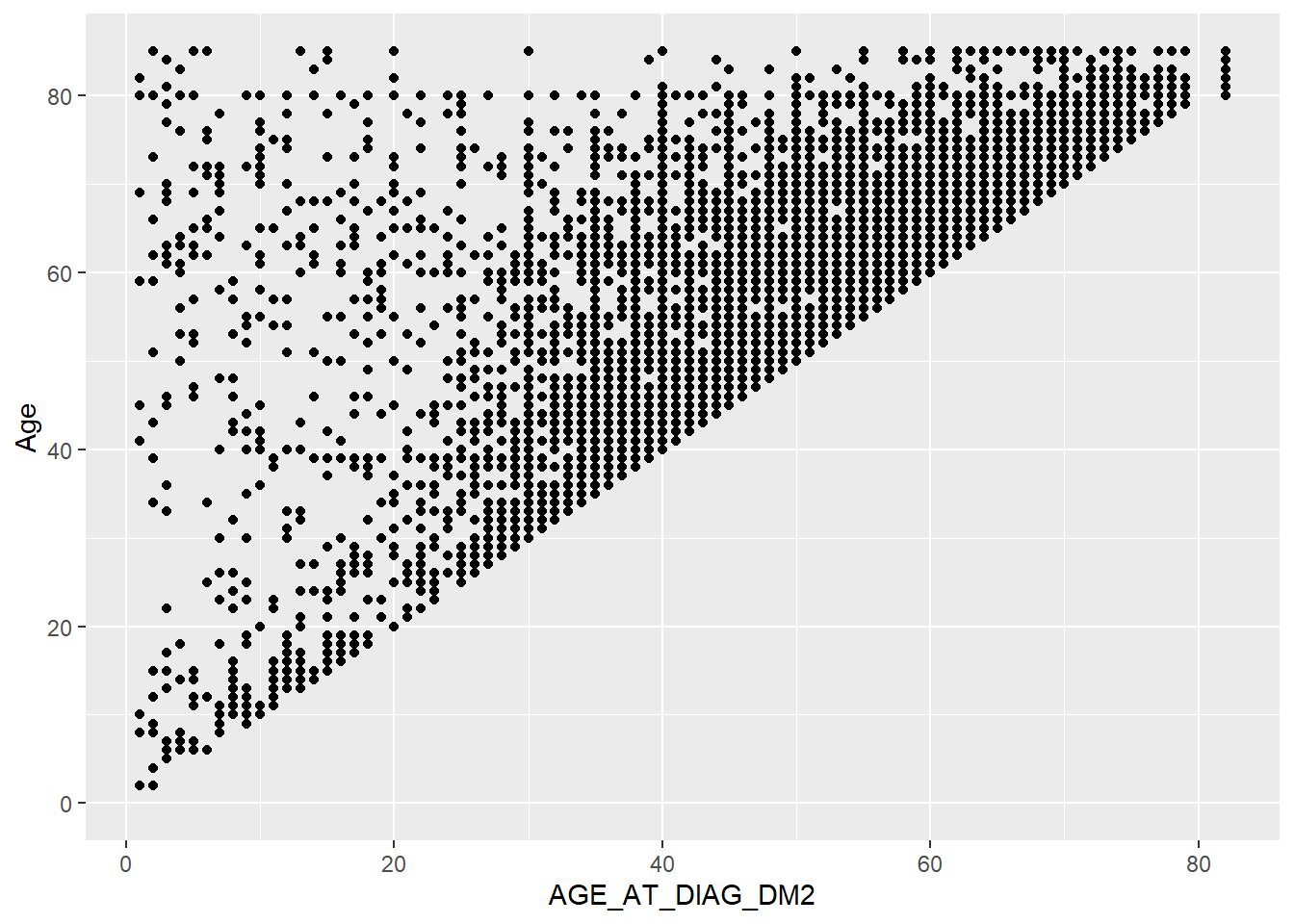
We have now created a scatter plot in Figure 5.2.
If we copy the above code and change just one thing - the x variable from AGE_AT_DIAG_DM2 to Gender (which is a categorical variable) - we get what’s called a strip plot as in Figure 5.3.
This means we are now plotting a continuous variable (Age) against a categorical one (Gender). But the thing to note is that the rest of the code stays exactly the same, all we did was change the x = argument
A_DATA %>%
  ggplot(aes(x = Gender, y = Age)) +
  geom_point()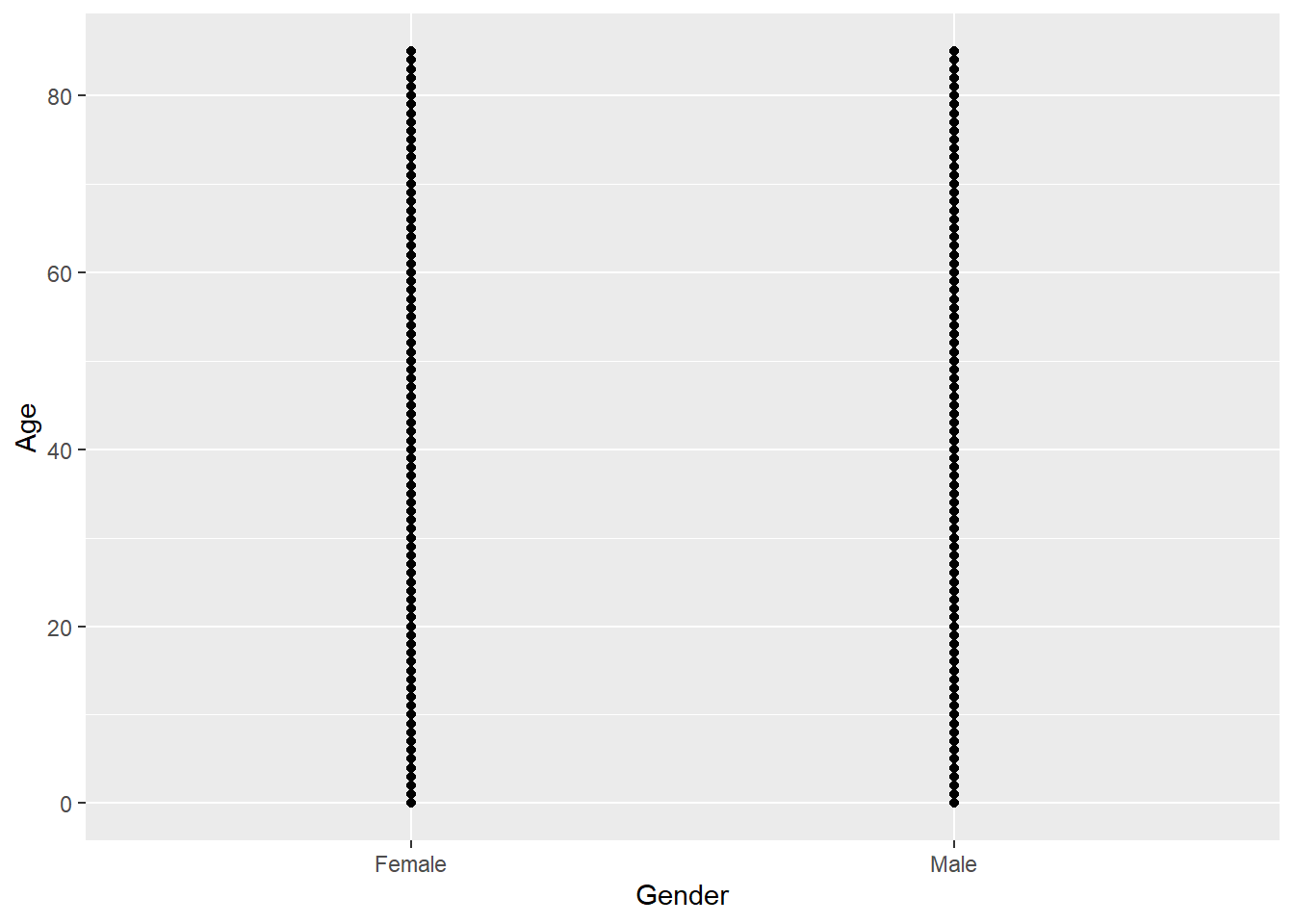
As an alternative we could also use geom_jitter() which adds a small amount of random variation to the location of each point, and is a useful way of handling overplotting, an equivalent way to call this would be to pass the “jitter” option into the position parameter of the geom_point function i.e. geom_point(position = "jitter")
A_DATA %>%
  ggplot(aes(x = Gender, y = Age)) +
  geom_jitter()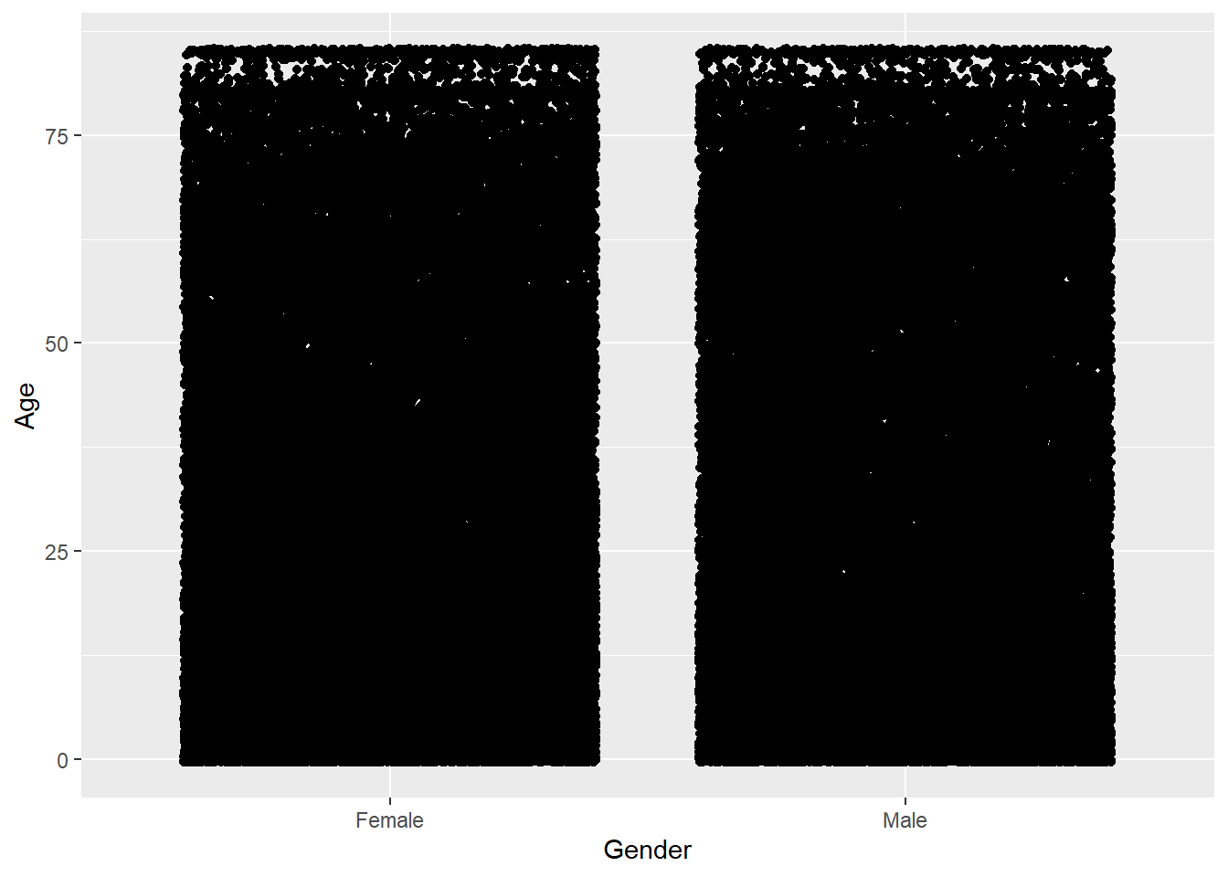
aes()
Let’s use DIABETES to give the points some color. We can do this by adding color = DIABETES inside the aes():
A_DATA %>%
  ggplot(aes(x = Gender, y = Age, color = DIABETES)) +
  geom_point()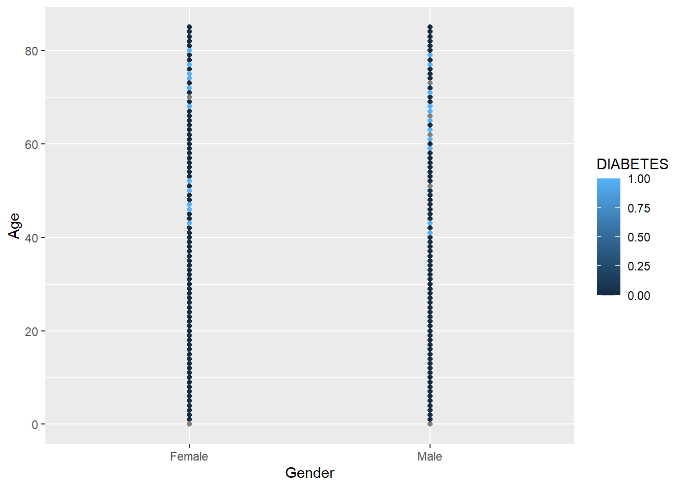
It uses the default color scheme and will automatically include a legend.
Notice that since R thinks of DIABETES as numerical it is plotting it on that scale we can force R to think of it as a factor:
A_DATA %>%
  ggplot(aes(x = Gender, y = Age, color = as.factor(DIABETES))) +
  geom_point()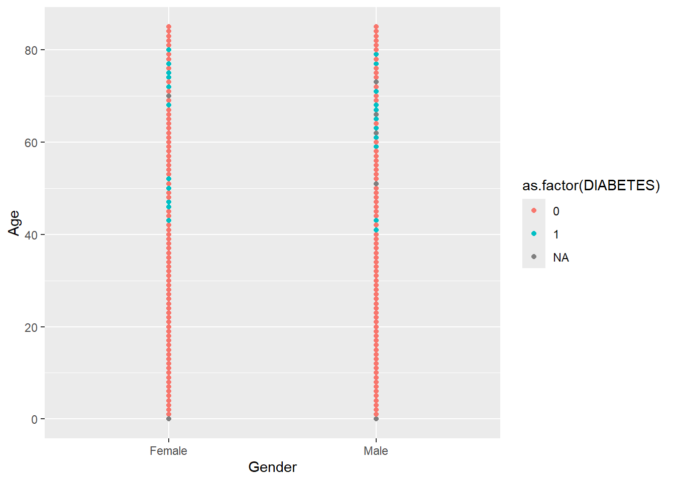
There are other geom_* types, some commonly used ones are:
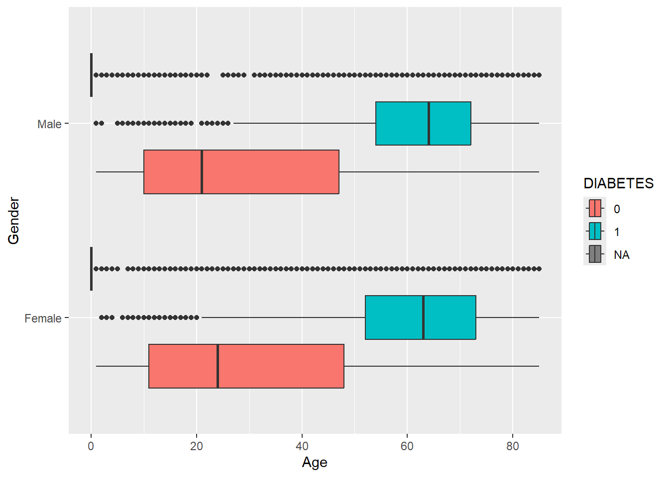
geom_boxplot
Notice here, we added a mutate statement to change DIABETES to a factor in front of the ggplot and this makes the legend more readable:
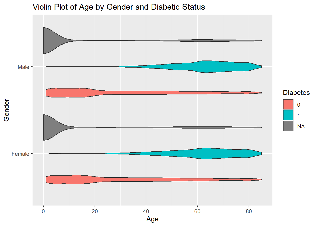
geom_violin()
geom_bar
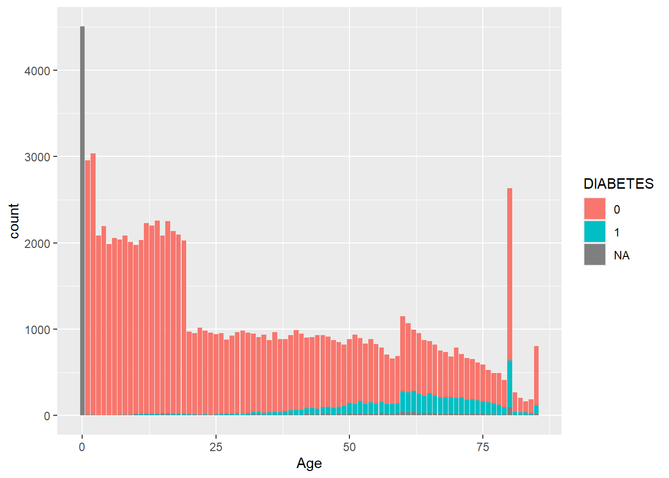
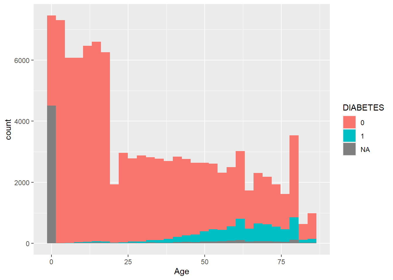
geom_histogram
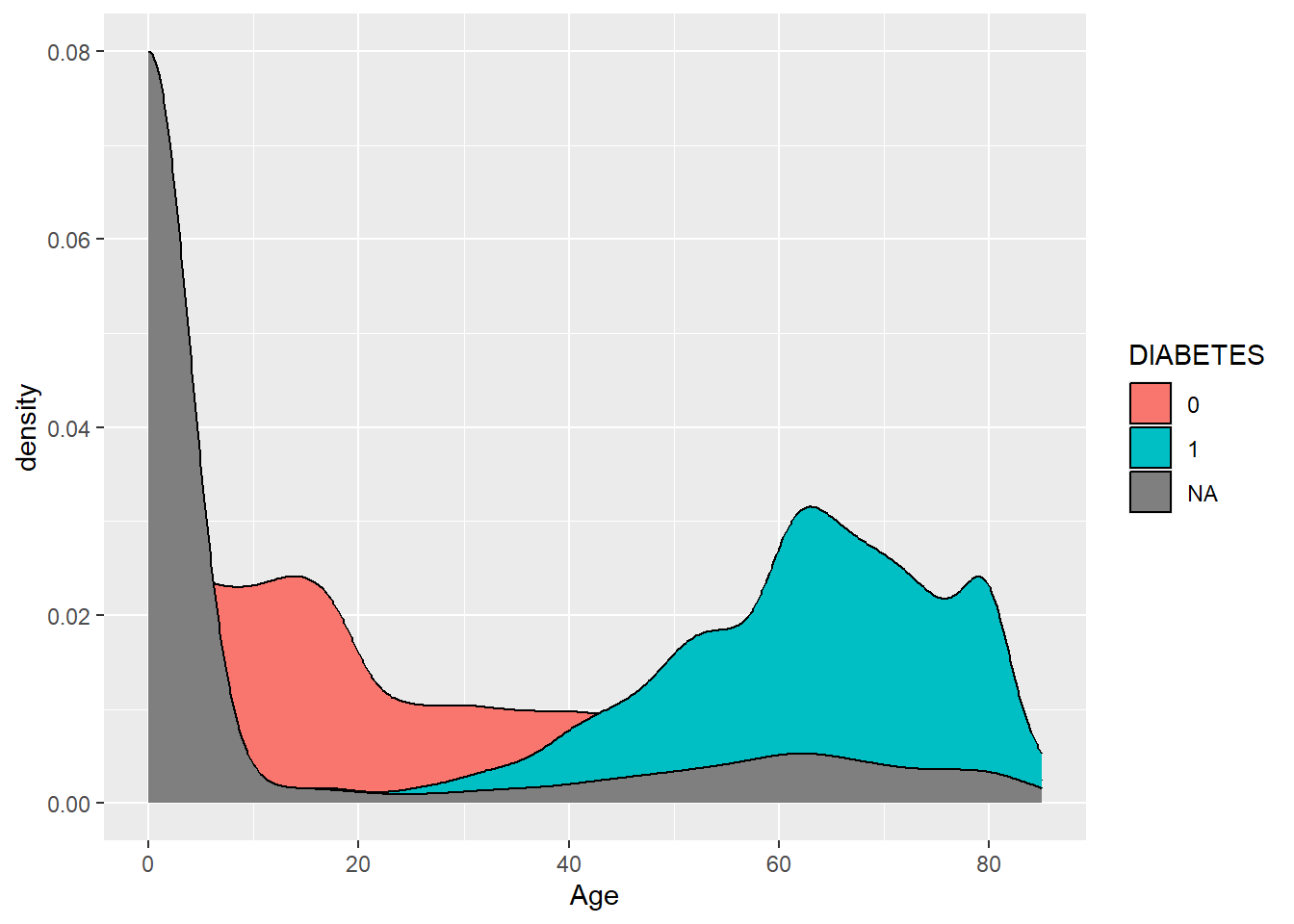
geom_density
aes()
It is very important to understand the difference between including ggplot arguments inside or outside of the aes() function.
The main aesthetics (things we can see) are: x, y, color, fill, shape, size, and any of these could appear inside or outside the aes() function. Use ?geom_point geom_point(), to see the full list of aesthetics that can be used with this geom.
Variables (or columns of your data set) have to be defined inside aes(). Whereas to apply a modification on everything, we can set an aesthetic to a constant value outside of aes().
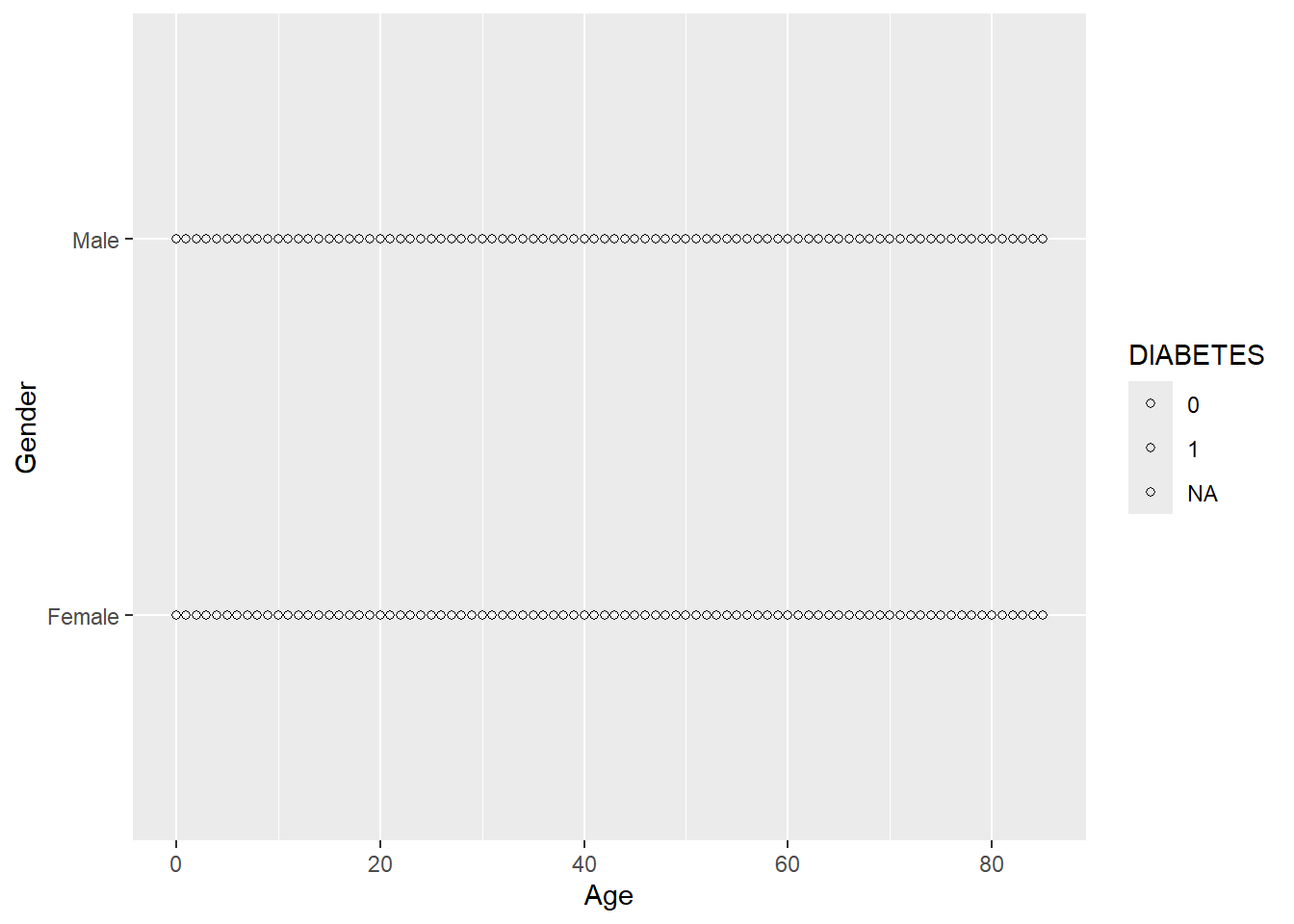
The default shape used by geom_point() is number 16.
To make all of the points in our figure hollow, let’s set their shape to 1. We do this by adding shape = 1 inside the geom_point():
Let’s get a picture for some of the other shapes in ggplot, while there are 26 total possible shapes, often having too many on a graph can be confusing, R will recommend fewer than 6
Any more and R believes you’re getting out of control (you Rebel) and need to rethink what you are trying to display:
Warning: The shape palette can deal with a maximum of 6 discrete values because more
than 6 becomes difficult to discriminate
ℹ you have requested 7 values. Consider specifying shapes manually if you need
  that many have them.
Warning: Removed 14473 rows containing missing values or values outside the scale range
(`geom_point()`).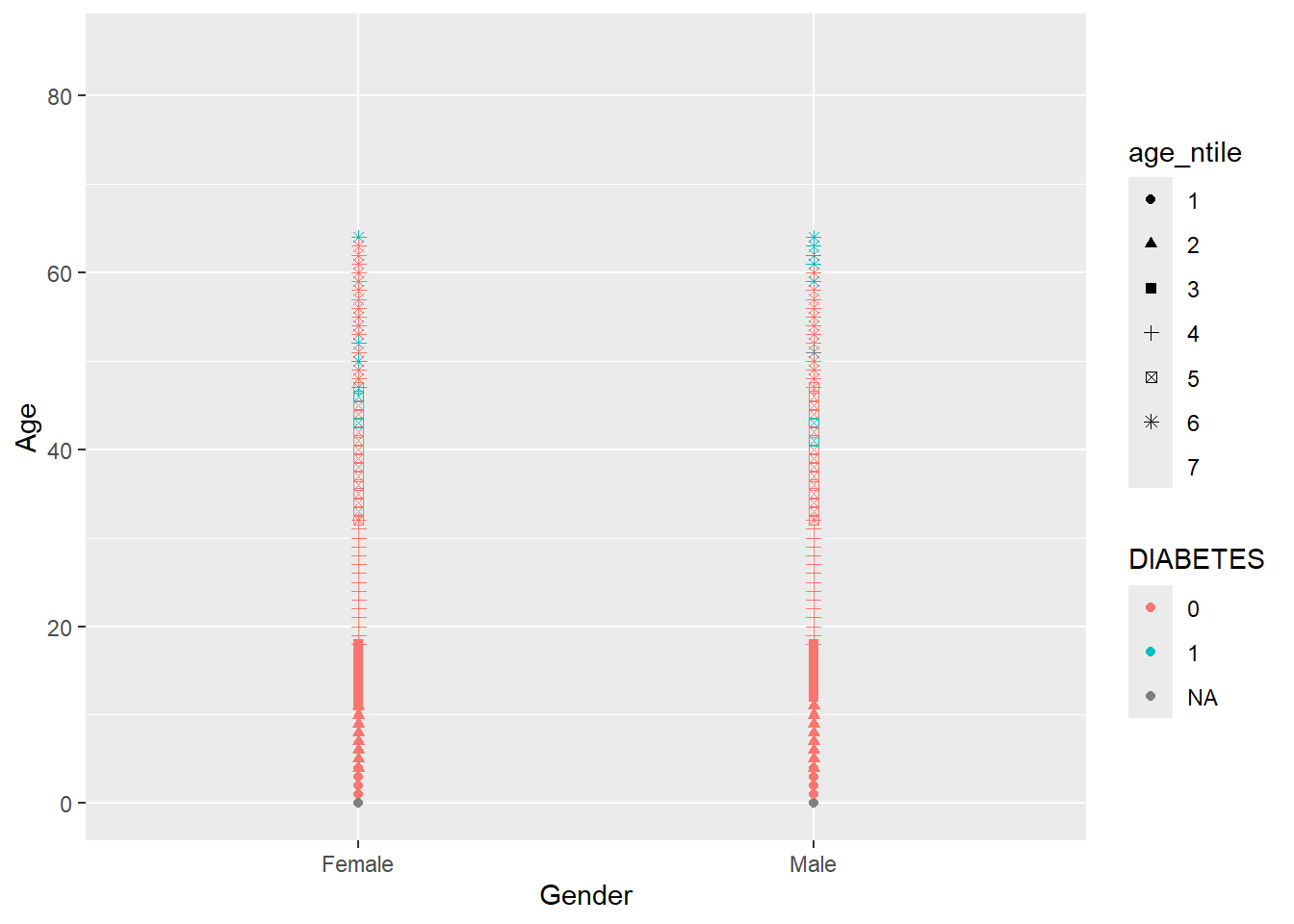
It did not add a 7th shape and provided a friendly warning,
The shape palette can deal with a maximum of 6 discrete values because more than 6 becomes difficult to discriminate; you have X. Consider specifying shapes manually if you must have them.
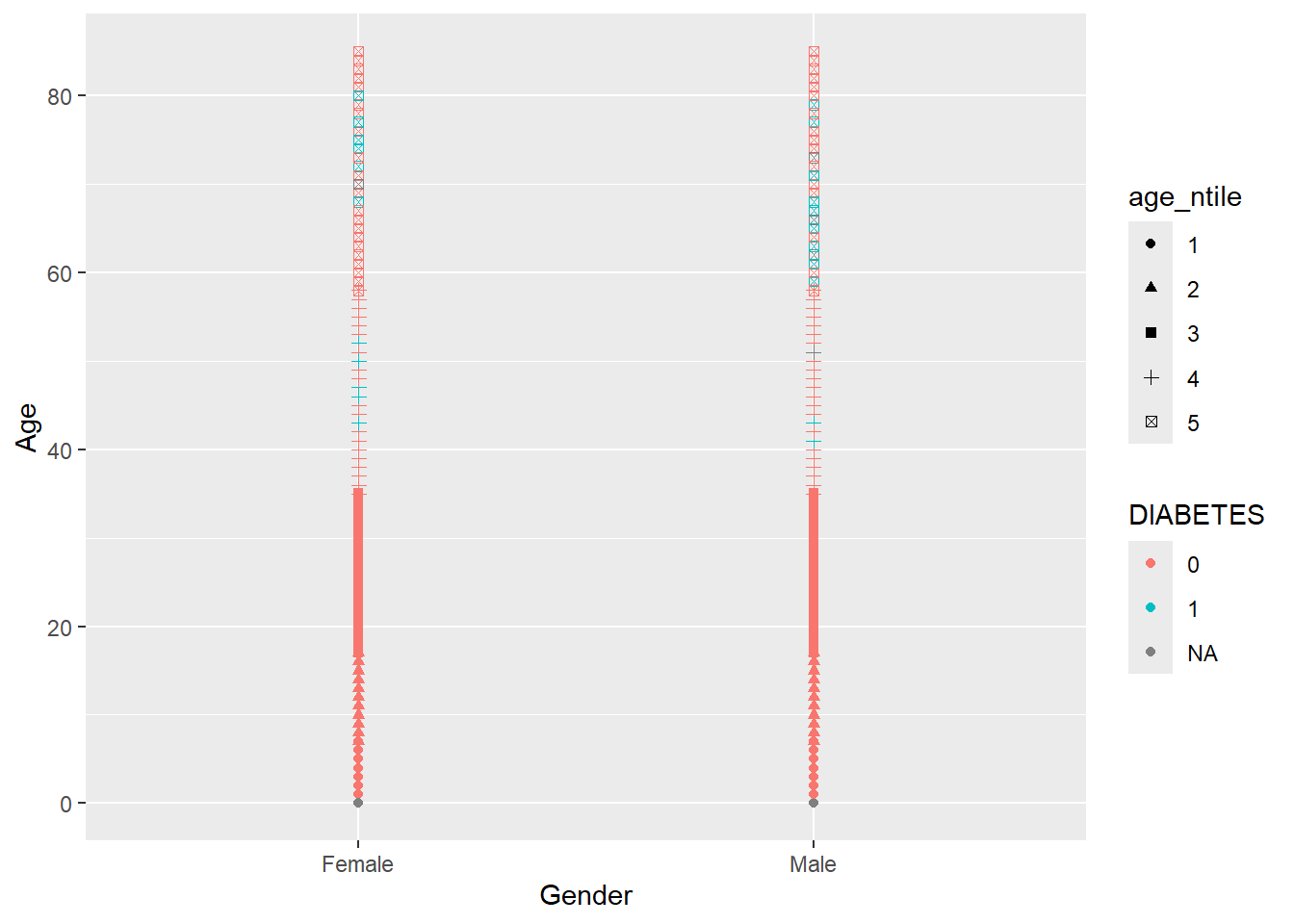
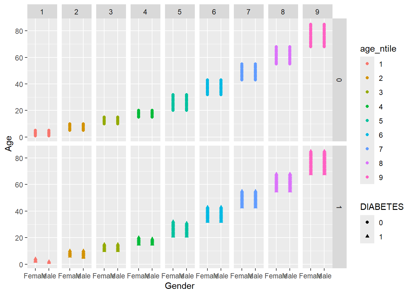
So instead we will change shape = DIABETES and now make color = age_ntile
Warning: Removed 5769 rows containing missing values or values outside the scale range
(`geom_point()`).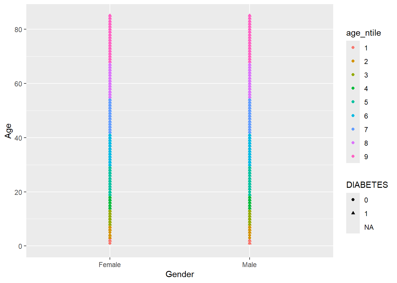
Faceting is a way to efficiently create the same plot for subgroups within the data set. For example, we can separate each continent into its own facet by adding facet_wrap(~DIABETES) to our plot:
Warning: Removed 5769 rows containing missing values or values outside the scale range
(`geom_point()`).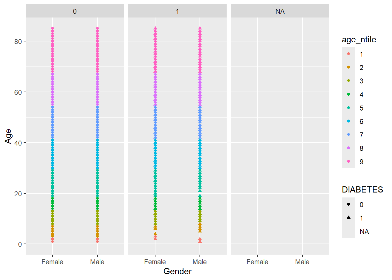
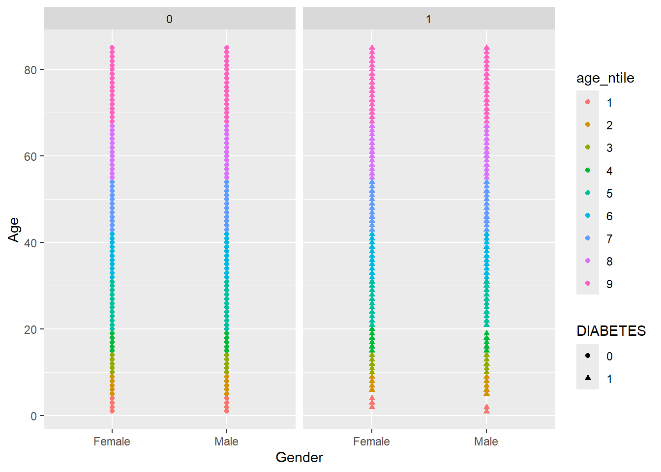
Let’s remove the missing group of Diabetics, note where we insert filter(!is.na(DIABETES)) %>% from above:
Note that we have to use the tilde (~) in facet_wrap().
The tilde (~) in R denotes dependency. It is mostly used by statistical models formula (y ~ m*x + b) to define dependent and explanatory variables and you will see it a lot in the second part of this book.
There is a similar function called facet_grid() that will create a grid of plots based on two grouping variables, e.g., facet_grid(var1~var2):
We can customize every single thing on a ggplot. Font type, color, size or thickness or any lines or numbers, background, you name it. But a very quick way to change the appearance of a ggplot is to apply a different theme. The signature ggplot theme has a light grey background and white grid lines.
Some of the built-in ggplot themes (1) default (2) theme_bw(), (3) theme_dark(), (4) theme_classic().
As a final step, we are adding theme_bw() (“background white”) to give the plot a different look.
A_DATA %>%
  filter(!is.na(DIABETES)) %>%
  mutate(age_ntile = as.factor(ntile(Age,10))) %>%
  mutate(Diabetic_Status = if_else(DIABETES == 1, "Diabetic", "Not Diabetic")) %>%
  ggplot(aes(x = Gender, y = Age, shape  =  Diabetic_Status, color = age_ntile)) +
  geom_point() +
  facet_grid(DIABETES ~ age_ntile) +
  theme_bw() +
  theme(axis.text.x  = element_text(angle=90)) +
  guides(color=guide_legend(title="Age Decile"))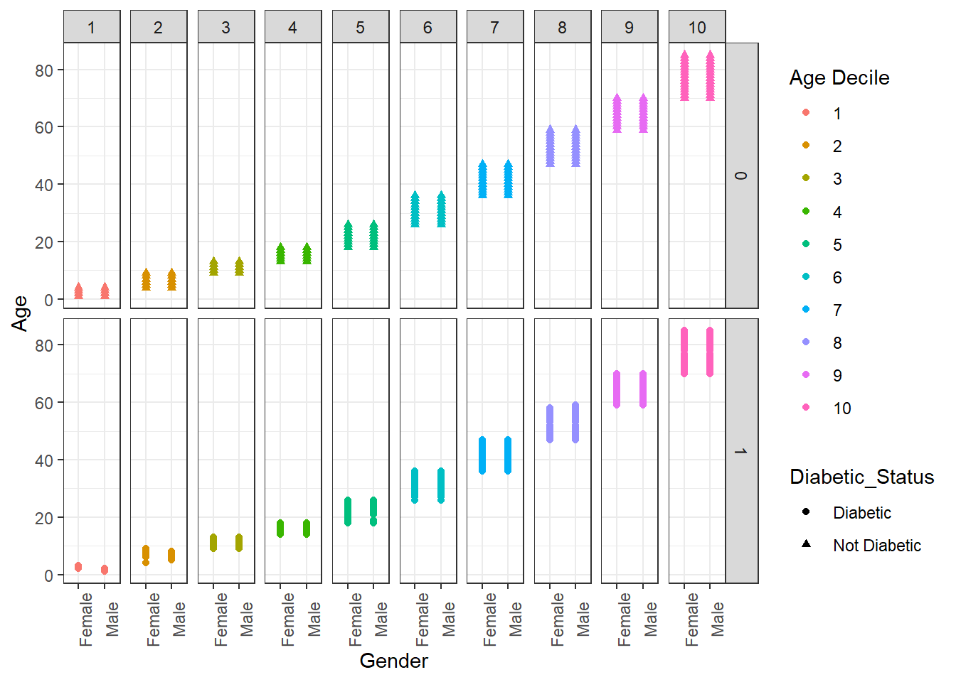
There are additional themes that are available from CRAN install.packages('ggthemes') or you can customize your own theme as in this example https://rpubs.com/mclaire19/ggplot2-custom-themes.
Let’s see if we can improve on Figure 5.2, we can add a trend line with:
Warning: Removed 129 rows containing non-finite outside the scale range
(`stat_smooth()`).
Warning: Removed 129 rows containing missing values or values outside the scale range
(`geom_point()`).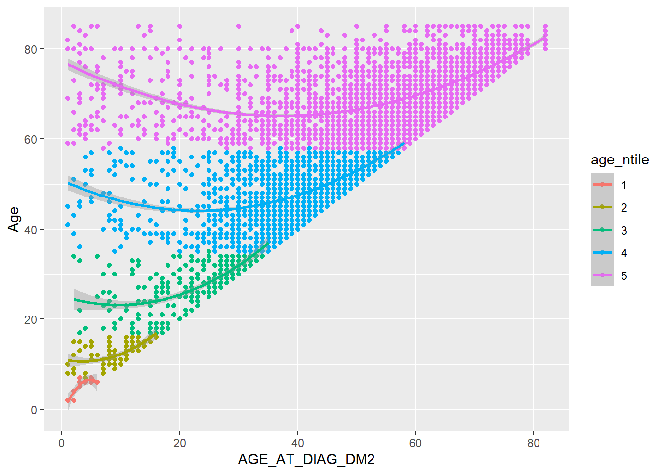
This is a brief introduction to how ggplot2 works - you can build a plot by adding or modifying things one by one. For further details on ggplot2 we refer you to (Wickham 2016) written by the author of the package Hadley Wickham1.
Hadley Wickham is the Chief Scientist at RStudio, and an Adjunct Professor of Statistics at the University of Auckland, Stanford University, and Rice University. Hadley Wickham is the lead developer on many of the tidyverse packages and framework.↩︎