In this Chapter we will use the same dataset and will only consider non-missing values of Age, Gender, and Diabetic status.
We will follow much the same process of EDA with categorical features and making connections between the p-value of the chi square test and feature importance in logistic regression.
In addition, we will also have a more in-depth discussion around re-leveling logistic regression analysis and the impact it has on model interpret-ability.
This time we will have 3 primary model examples to compare:
Logistic regression with rand_class feature
Logistic regression with binned age and Gender features
Logistic regression with Age interacted with Gender
# A tibble: 10 × 4
   age_bucket mean_age median_age age_range
   <fct>         <dbl>      <dbl> <chr>
 1 1              2.22          2 1 <= Age <= 4
 2 2              6.52          7 4 <= Age <= 9
 3 3             11.2          11 9 <= Age <= 13
 4 4             15.6          16 13 <= Age <= 18
 5 5             21.2          21 18 <= Age <= 26
 6 6             31.0          31 26 <= Age <= 36
 7 7             41.4          41 36 <= Age <= 47
 8 8             52.4          52 47 <= Age <= 59
 9 9             63.9          64 59 <= Age <= 70
10 10            77.3          78 70 <= Age <= 85
7.2 Add noise feature
Additionally, we add a variable rand_class to the data-set. rand_class will be sampled from the options of Rand_A or Rand_B. We will then randomly sort the data, and for every 5th row we will assign Rand_C to rand_class. Our reasons for adding this random feature will be to compare and contrast a random information to information that is linked with the issue at hand.
Suppose that \(n\) observations in a random sample from a population are classified into \(k\) mutually exclusive classes with respective observed numbers \(O_i\) (for \(i = 1, 2, \ldots, k\)).
The null hypothesis in the chi-square test assumes \(p_i\) is the probability that an observation falls into the \(i\)-th class.
Therefore, for all \(i\), we have an expected frequencies: \[E_{i} = n \cdot p_{i}\]
Note since the \(p_i\) are probabilities we have that:
\[\sum_{i=1}^k p_i = 1 \] Since there are \(n\) observations we have:
\[ n = n \sum_{i=1}^k p_i = \sum_{i=1}^k n \cdot p_i = \sum_{i=1}^k E_{i} \]
However, we have observed values:
\[ \sum_{i=1}^k O_i = n \]
Therefore, under the null hypothesis of the chi-square we have that:
\[ \sum_{i=1}^k E_{i} = n \sum_{i=1}^kp_i = \sum_{i=1}^kO_i \] For the chi-squared test statistic We define :
where \(\chi^2\) is the chi-square distribution with:
\(k-1\) degrees of freedom
\(O_{i}\) = the number of observations of type \(i\).
\(E_{i} = n \cdot p_{i}\) = the expected (theoretical) frequency of type \(i\), asserted by the null hypothesis that the fraction of type \(i\) in the population is \(p_{i}\)
7.5Gender
In this section we will compare t-tests on Gender between groups of DIABETES.
First we can create a table of Gender and DIABETES:
Review the p-value of the chi-square test between two groups.
The null hypothesis is that each person’s gender is independent of the person’s diabetic status.
If the p-value is
greater than .05 then we accept the null-hypothesis
less than .05 then we reject the null-hypothesis
7.5.2broom
We can tidy-up the results if we utilize the broom package. Recall that broom::tidy tells R to look in the broom package for the tidy function. The tidy function in the broom library converts many base R outputs to tibbles.
Our current p-value is tibble_chisq.tbl_DM2_Gender$p.value = 0.0269089, since the p-value is less than .05 we reject the null-hypothesis, Gender is not independent of the person’s diabetic status.
7.6 Associated \(\chi^2\) Plots
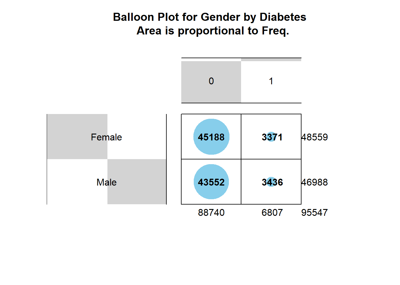
7.6.1 Balloon Plot
This balloon plot shows the frequency table, now the area of the circle is proportional to the frequency counts.
Code
gplots::balloonplot(tbl_DM2_Gender,
                    main ="Balloon Plot for Gender by Diabetes \n Area is proportional to Freq.")
Figure 7.1: Balloon Plot for Gender by Diabetes where area is proportional to Freq.
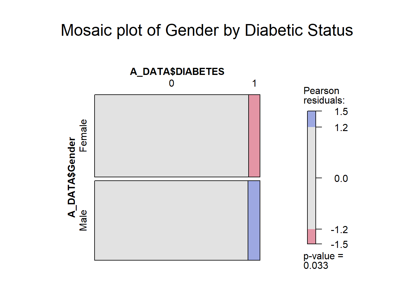
7.6.2vcd::mosaic
With the vcd::mosaic function you get another “area graph” this time with the groups highlighted by color:
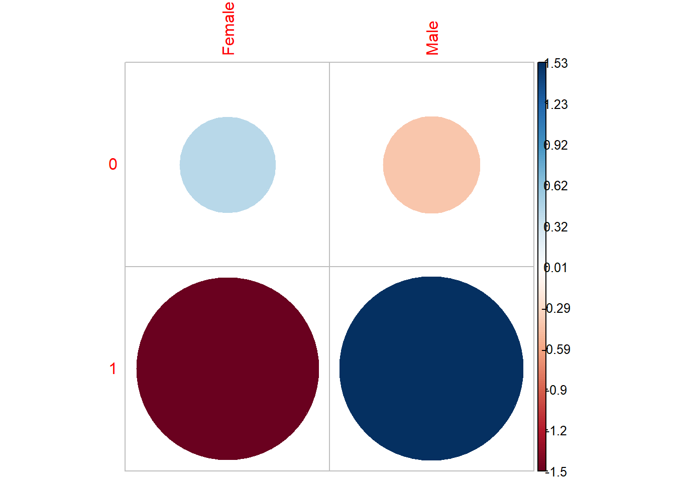
Positive residuals are in blue. Positive values specify an attraction (positive association) between the corresponding row and column variables. In the image above, we can see there are an association between DIABETES and being a Male.
Negative residuals are in red. This implies a repulsion (negative association) between the corresponding row and column variables. For example the DIABETICs are negatively associated (or “not associated”) with the Females.
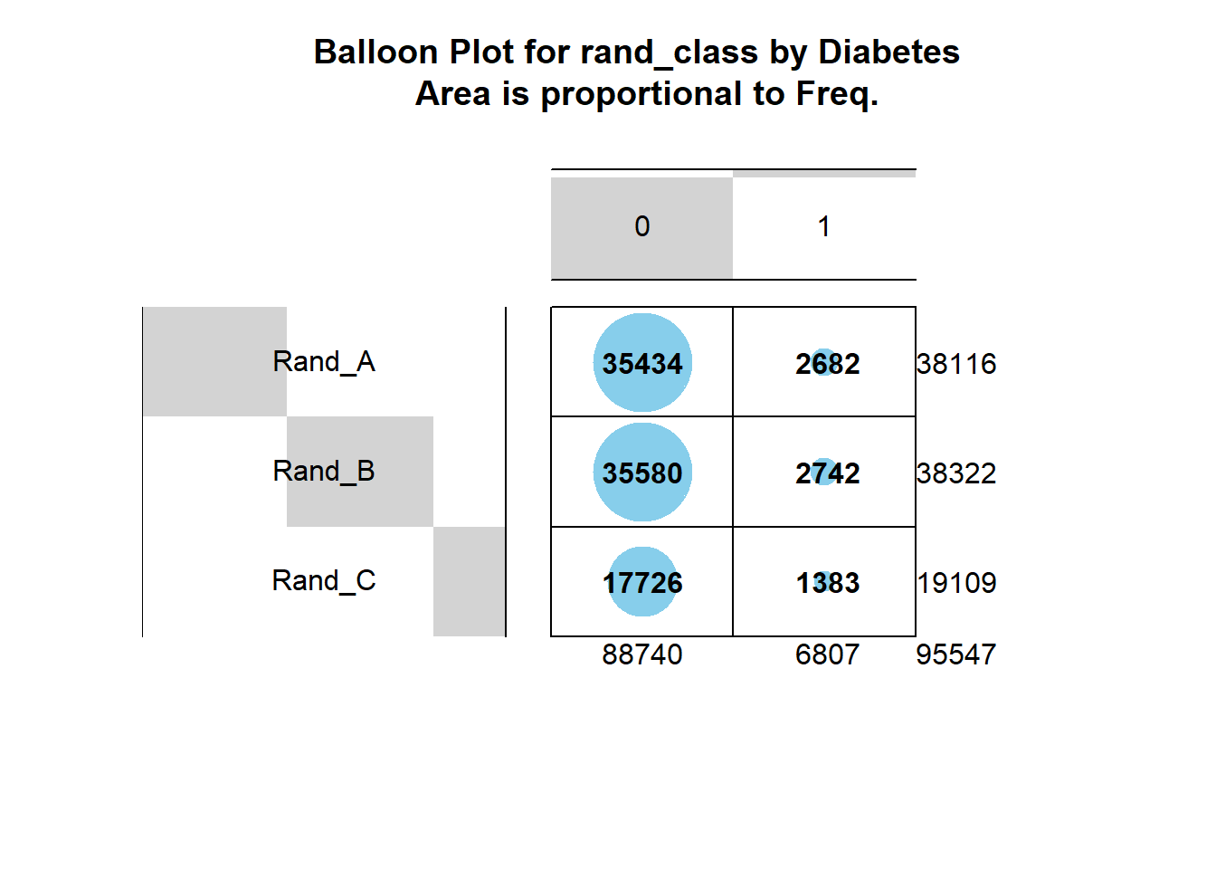
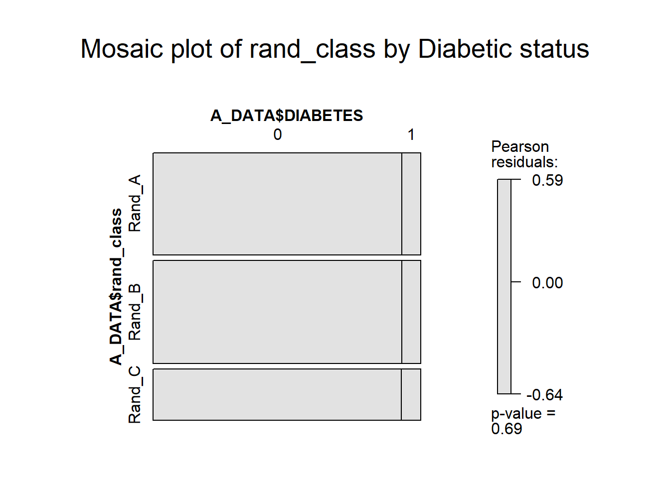
7.7rand_classchisq.test
As we did with Gender above, we can extract lists of rand_classs for each type of DIABETES:
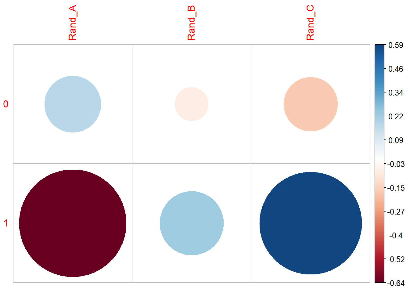
We can see there are an association between DIABETES and being in Rand_C, however, it’s not a strong enough to give us a statistically significant chi-square p-value.
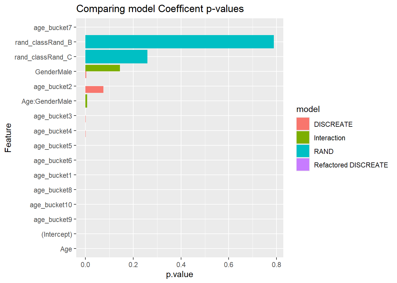
We see that the p.value is near 0 for Gender but close to 1 for rand_class, our interpretation is that Gender has a statistically significant impact on Diabetic status whereas rand_class does not.
`summarise()` has grouped output by 'DIABETES_factor', 'Gender', 'rand_class'.
You can override using the `.groups` argument.
Code
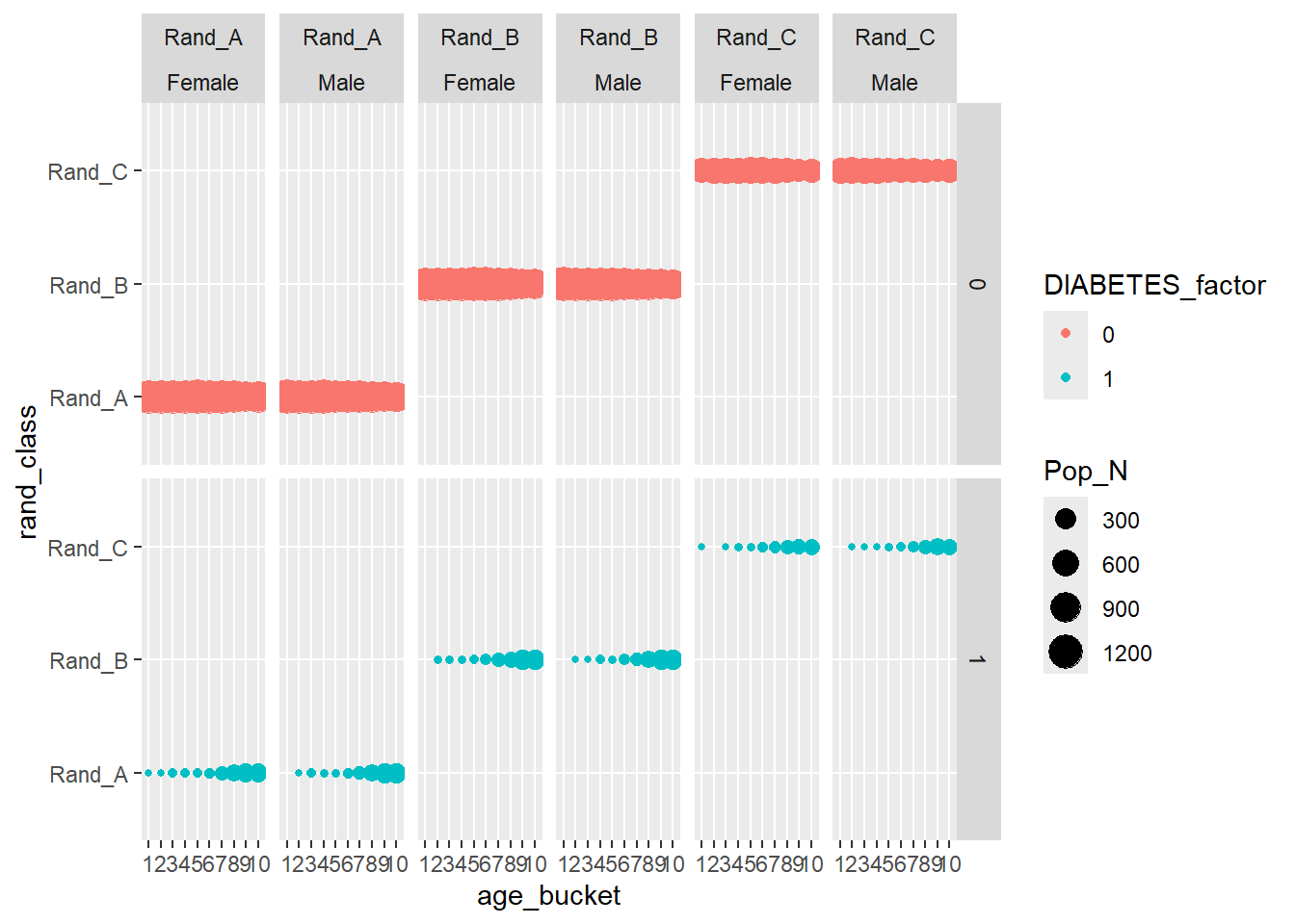
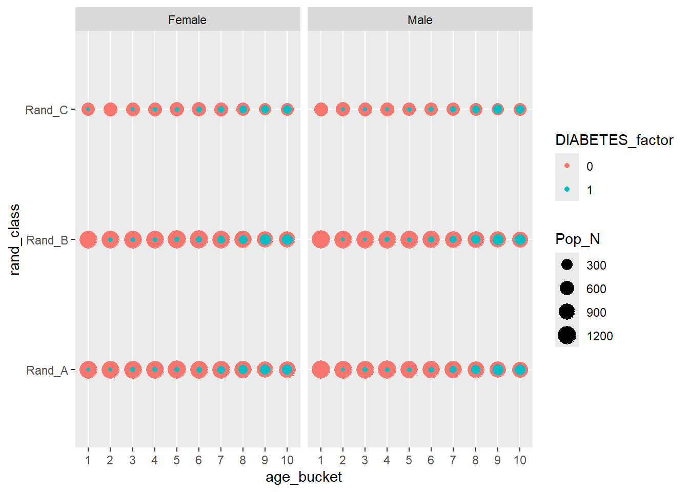
Interactive_DISCREATE
Most evident from the above graphs is the effect the age_bucket has on the number of diabetics, we can see that as the age buckets increase from 1 to 10 the size of the population bubble also increases.
We can run an anova test on these features:
Code
aov(DIABETES~rand_class+age_bucket+Gender, data =A_DATA.no_miss)%>%summary()
As we expected, as you get older your risk of diabetes, increases.
Warning: Unknown or uninitialised column: `age_rang`.
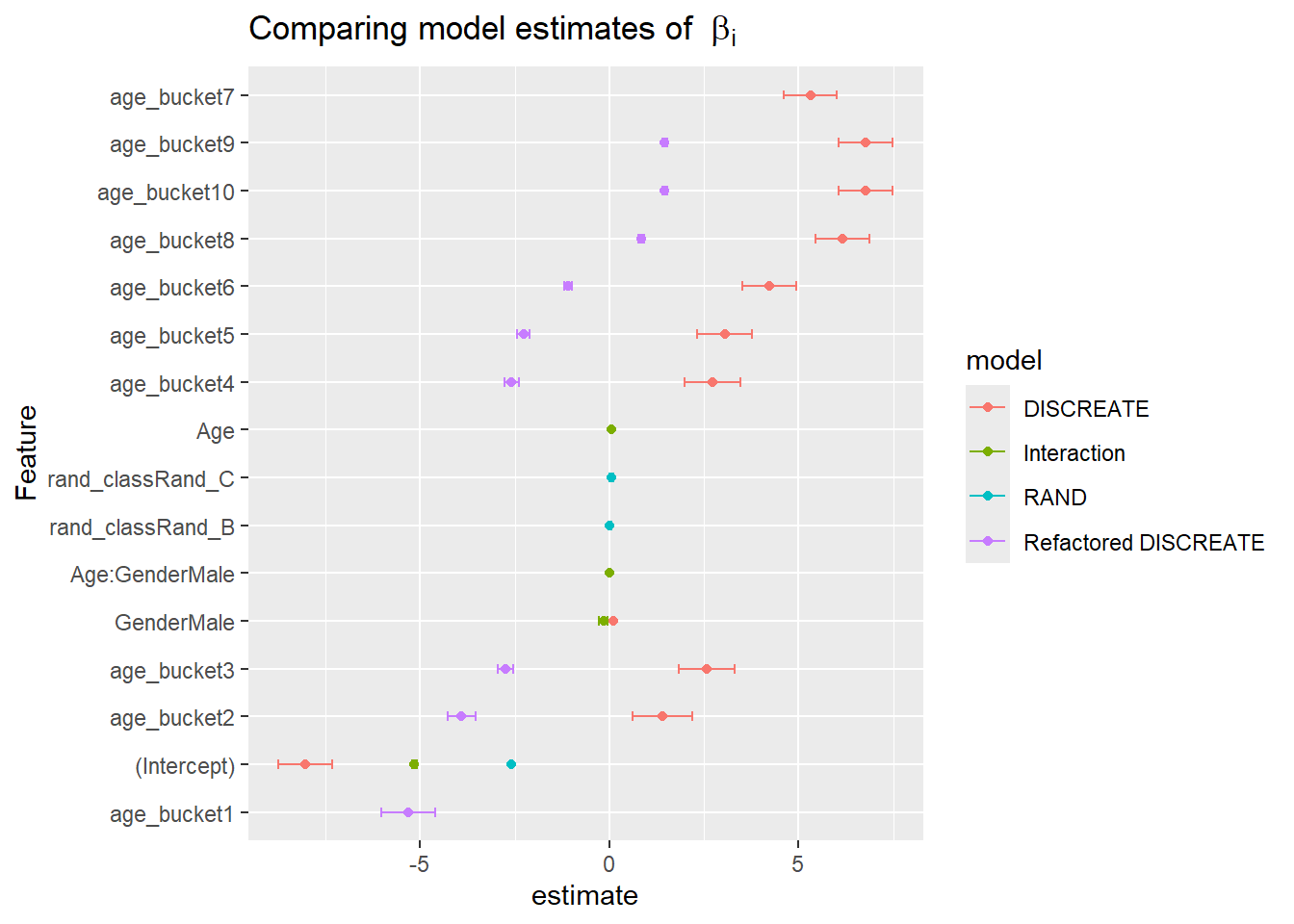
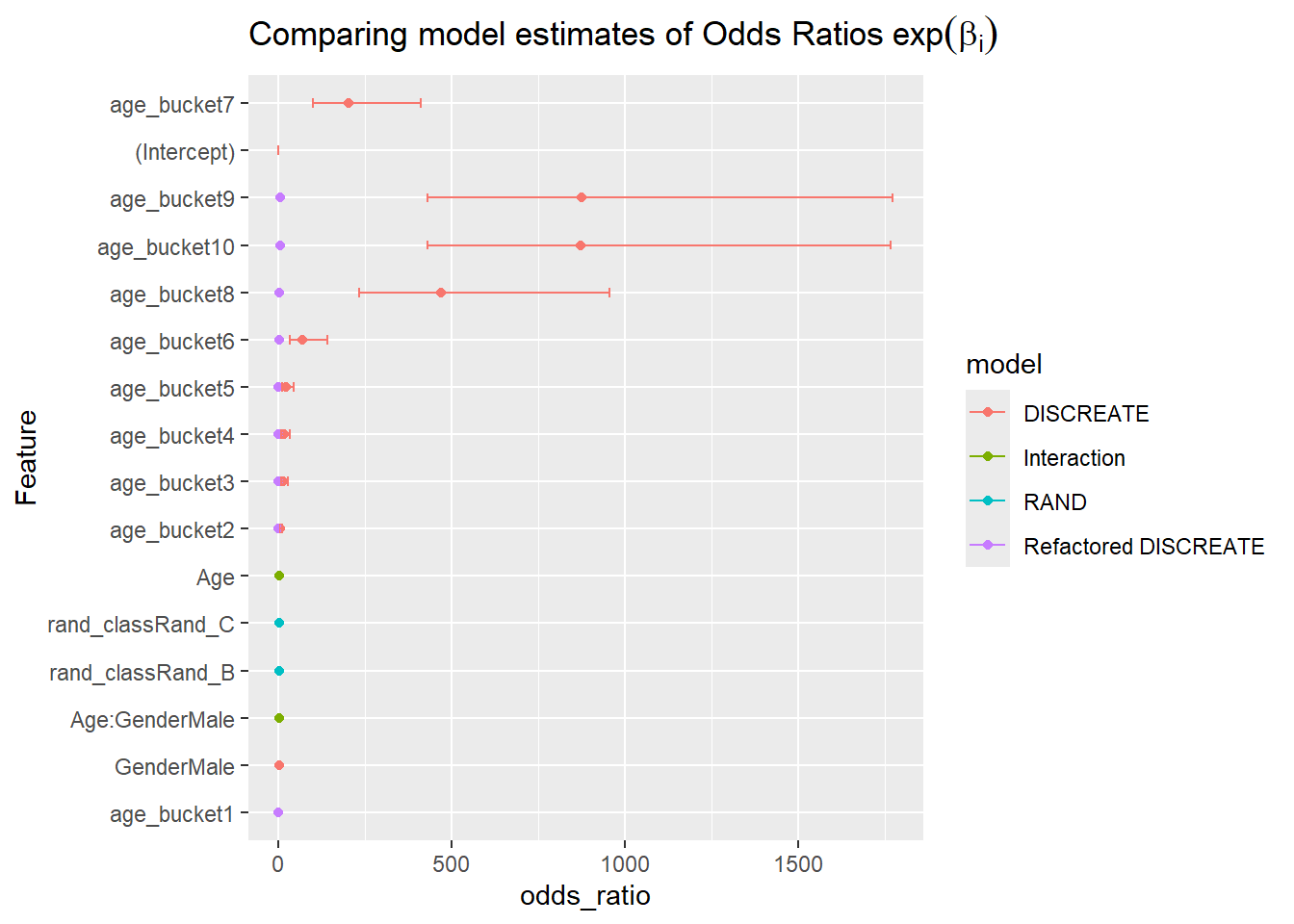
However, these odds ratios may not be as helpful as we would like them to be for interpretation. For instance, right now we can say that when a patient is in the highest age bucket (70 <= Age <= 85) then the odds of having a diabetes increases by 870.9788 times compared to patients in the lowest age bucket ; so having this as the basis of comparison is not as helpful as it could be.
7.9.2.2 re-leveling factors in the DISCREATE model
Sometimes it is helpful to re-leveling factors in R; within the context of logistic regression we will be able to reset our comparison group so that we have a more even basis of comparison - let’s re-level right on the 36 <= Age <= 47 age bucket:
Notice that age_bucket7 is missing from the above coefficient table and now we have age_bucket1 this is because we re-factored to level 7, so now all of the odds ratios are computed relative to the age group 36 <= Age <= 47.
When the odds ratio is 1, this means the coefficient in the logistic regression model is ln(1) = 0; meaning changes in the feature has no impact on the outcome.
If a patient is in the highest age bucket, then the odds of having an diabetes increases by 4.3117 times compared to patients aged 36 <= Age <= 47.
In addition to looking for large coefficients or odds ratios we can also review for odds ratios which are between 1 and 0 - these features will have the opposite effect; in that having them reduces the odds of the outcome compared to the baseline group.
So for this example, patient’s in the lowest age bracket decreases their likelihood of having diabetes by 99.5% compared to patients aged 36 <= Age <= 47.
7.9.3 INTERACTION
We can get interaction terms by using * notion:
Code
INTERACTION<-glm(DIABETES_factor~Age+Age*Gender , data=A_DATA.train, family ="binomial")
7.9.3.1 INTERACTION Coefficent Table
Code
INTERACTION
Call:  glm(formula = DIABETES_factor ~ Age + Age * Gender, family = "binomial",
    data = A_DATA.train)

Coefficients:
   (Intercept)             Age      GenderMale  Age:GenderMale
     -5.148106        0.054292       -0.156792        0.004703

Degrees of Freedom: 57327 Total (i.e. Null);  57324 Residual
Null Deviance:      29270
Residual Deviance: 23090    AIC: 23100
Warning: Removed 4 rows containing missing values or values outside the scale range
(`geom_point()`).
Warning: Removed 1 row containing missing values or values outside the scale range
(`geom_errorbarh()`).
Code
CoEff_Compare%>%mutate(Feature =reorder(term, p.value))%>%ggplot(aes( y =Feature, x =p.value , fill=model))+geom_bar(stat ='identity', position ='dodge')+labs(title ="Comparing model Coefficent p-values")
Warning: Removed 1 row containing missing values or values outside the scale range
(`geom_bar()`).
Compare Object

Function Call:
arsenal::comparedf(x = A_DATA.train, y = RAND$data)

Shared: 7 non-by variables and 57328 observations.
Not shared: 0 variables and 0 observations.

Differences found in 0/7 variables compared.
0 variables compared have non-identical attributes.
Rather than performing the same operation 3x in a row we will use that fact the training data exists within the glm model output below to functionalize our scoring procedure from the last chapter, we encourage you to review sections Section 6.12.2 and Section 6.12.3; notice the changes made from there to the function below.
We create a function logit_model_scorer as follows:
Code
logit_model_scorer<-function(my_model, my_data){# extracts models name my_model_name<-deparse(substitute(my_model))# store model name into a new column called modeldata.s<-my_data%>%mutate(model =my_model_name)# store the training data someplacetrain_data.s<-my_model$data# score the training data train_data.s$probs<-predict(my_model, train_data.s, 'response')# threshold querythreshold_value_query<-train_data.s%>%group_by(DIABETES_factor)%>%summarise(mean_prob =mean(probs, na.rm=TRUE))%>%ungroup()%>%filter(DIABETES_factor==1)# threshold value threshold_value<-threshold_value_query$mean_prob# score test datadata.s$probs<-predict(my_model, data.s, 'response')# use threshold to make prediction data.s<-data.s%>%mutate(pred =if_else(probs>threshold_value, 1,0))%>%mutate(pred_factor =as.factor(pred))%>%mutate(pred_factor =relevel(pred_factor, ref='0'))# return scored data return(data.s)}
In the function above we take in two parameters my_model a logistic regression model and my_data an analytical dataset from there we define data.s is the “new data” we wish to make a prediction on and train_data.s is the training data stored within in the model object.
We then follow the steps outlined in the previous chapter to:
Compute a threshold value as the mean probability of the DIABETIC class on the training set.
Use the threshold to make a predicted class on the “new data”.
What does my_model_name <- deparse(substitute(my_model)) do?
Here is the R help for substitute & deparse:
substitute - returns the parse tree for the (unevaluated) expression expr, substituting any variables bound in env.
deparse - Turn unevaluated expressions into character strings.
Let’s explore what happens when we pass our stored model RAND:
turns the unevaluated expressions into character string the character sting "RAND" (Note existance of quote) that we need for the input in the mutate step for the model = my_model_name.
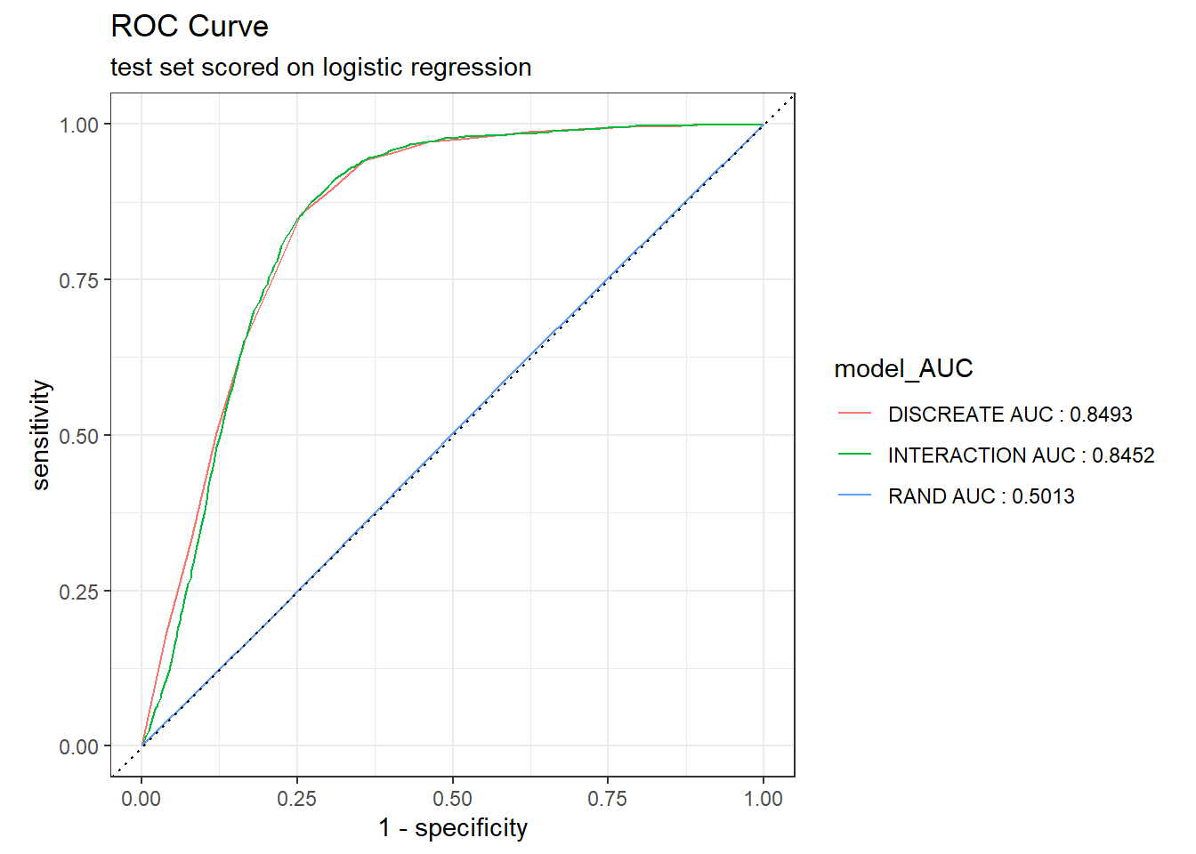
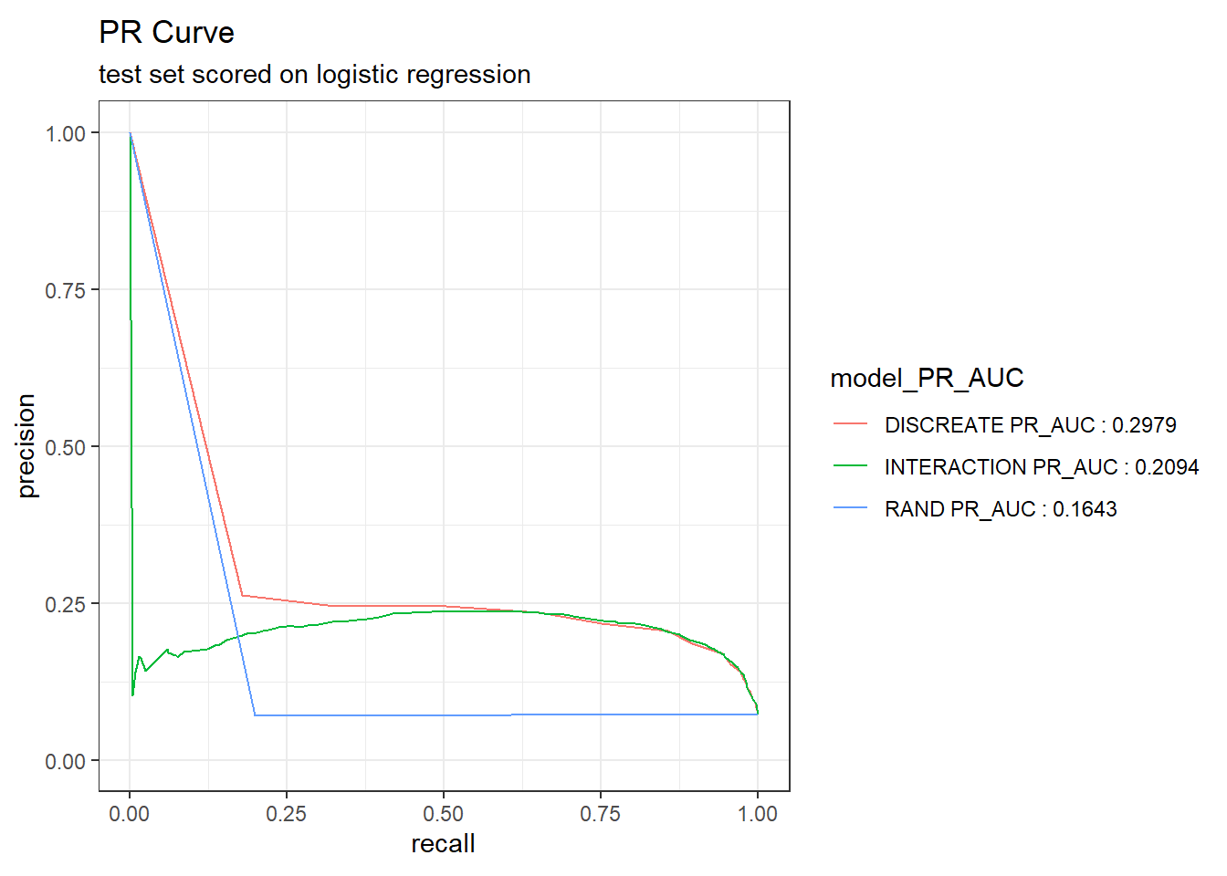
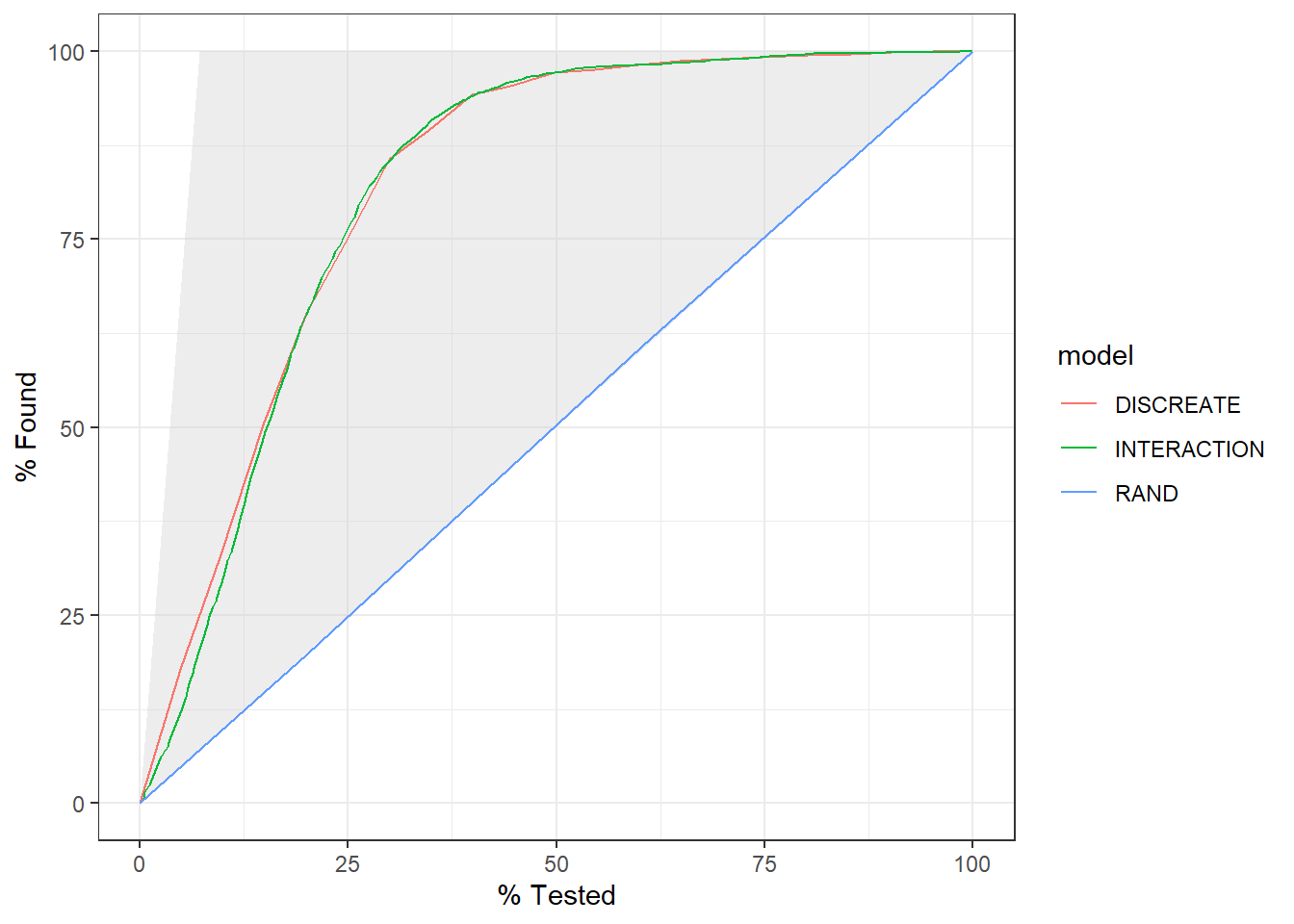
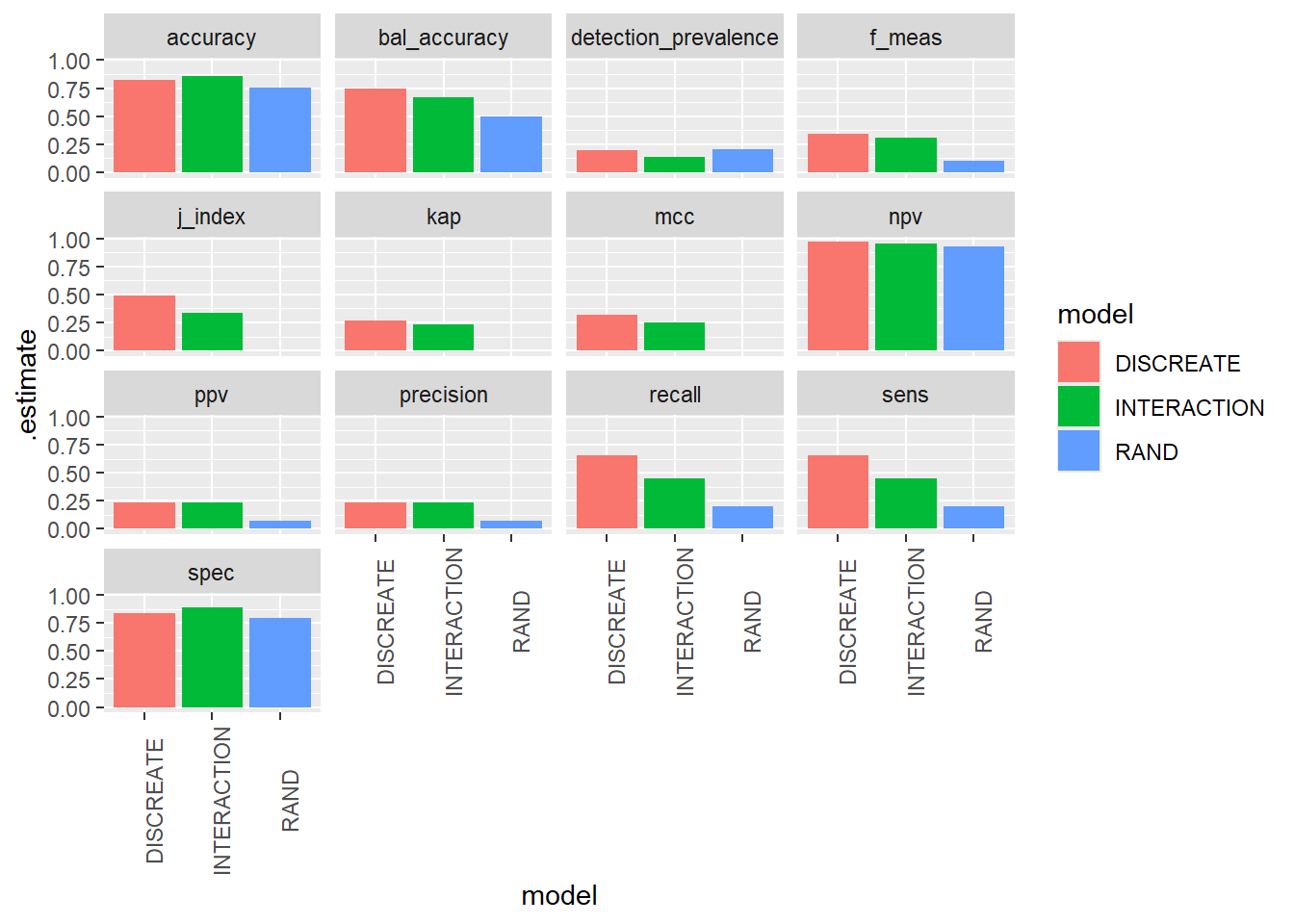
The gain curve below for instance showcases that we can review the top 25% of probabilities within the DISCREATE and INTERACTION models and we will find roughtly 75% of the diabetic population.
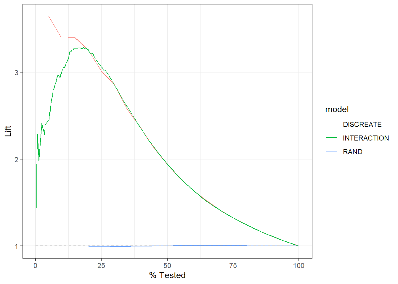
DISCRETE lift curve is nearly monotonically decreasing from 3.5 to about 3.0 in the the top 25% of probabilities in the model.
INTERACTION lift curve appears “the mode is much less than the mean in that normal distribution”, the DISCREATE model only seems to benefit for the top 12.5% of high probability DISCRETE scores, after that graphs are nearly identical.
RAD appears to perform sightly worse than selecting members at random.
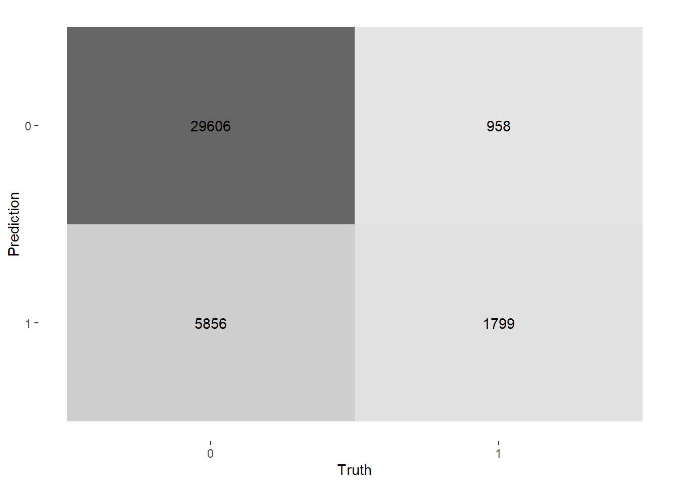
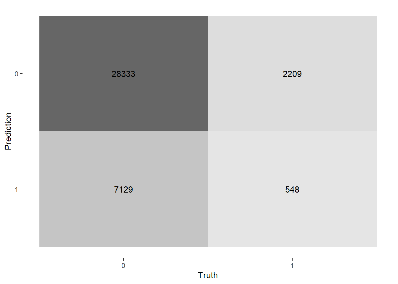
Let’s get heat maps for the 3 confusion matrices, below the map function at work again; recall a typical call to map looks like map(.x, .f, ...) here:
.x - A list or atomic vector (CM$conf_mat - list of confusion matrices)
.f - A function (autoplot)
... - Additional arguments passed on to the mapped function
In this case type = "heatmap" are the additional arguments passed into the function .f = autoplot
Notice also, this is not inside a mutate function as we are not adding any variables to our data-frame. We will discuss other functions from purrr in the next chapter.
# Two Factor Classification with Categorical and Continuous Interactions {#sec-two-factor-classification-with-categorical-and-continuous-interactions}In this Chapter we will use the same dataset and will only consider non-missing values of Age, Gender, and Diabetic status.We will follow much the same process of EDA with categorical features and making connections between the p-value of the chi square test and feature importance in logistic regression.In addition, we will also have a more in-depth discussion around re-leveling logistic regression analysis and the impact it has on model interpret-ability.This time we will have 3 primary model examples to compare:1. Logistic regression with rand_class feature2. Logistic regression with binned age and Gender features3. Logistic regression with Age interacted with Gender```{r}A_DATA <-readRDS(here::here('DATA/Part_2/A_DATA.RDS'))library('tidyverse')A_DATA <- A_DATA %>%select(SEQN, Age, Gender, DIABETES) %>%mutate(DIABETES_factor =as.factor(DIABETES)) %>%na.omit() A_DATA %>%glimpse()```## Bin AgeAdditionally, we will create deciles for the Age range:```{r}A_DATA <- A_DATA %>%mutate(age_bucket =as.factor(ntile(Age,10)))A_DATA %>%head()```Here's a nice summary table of the various Age buckets we created:```{r}Age_bucket_Table <- A_DATA %>%select(Age, age_bucket) %>%group_by(age_bucket) %>%summarise(min_age =min(Age),mean_age =round(mean(Age),2),median_age =median(Age),max_age =max(Age),.groups ='keep') %>%ungroup() %>%mutate(age_range =paste0(min_age, ' <= Age <= ', max_age )) %>%select(-min_age, -max_age) %>%arrange(age_bucket)Age_bucket_Table %>%print(n=10)```## Add noise feature {#sec-add-noise-feature}Additionally, we add a variable `rand_class` to the data-set. `rand_class` will be sampled from the options of `Rand_A` or `Rand_B`. We will then randomly sort the data, and for every 5th row we will assign `Rand_C` to `rand_class`. **Our reasons for adding this random feature will be to compare and contrast a random information to information that is linked with the issue at hand.** ```{r}set.seed(8675309)A_DATA$rand_class <-sample(c('Rand_A','Rand_B'), size =nrow(A_DATA), replace =TRUE)A_DATA$rand_sort <-runif(nrow(A_DATA))A_DATA <- A_DATA %>%arrange(rand_sort) %>%mutate(rn =row_number()) %>%mutate(rn_mod_5 = rn %%5 ) %>%mutate(rand_class =if_else( rn_mod_5 ==0, "Rand_C", rand_class)) %>%select(-rn, -rn_mod_5, -rand_sort) %>%mutate(rand_class =as.factor(rand_class))``````{r}A_DATA %>%head()```## `dplyr` statisticsFor categorical data we are typically reviewing counts between various groups:```{r }A_DATA %>% group_by(DIABETES, Gender) %>% tally() %>% pivot_wider(names_from = Gender, values_from = n)``````{r }A_DATA %>% group_by(DIABETES, rand_class) %>% tally() %>% pivot_wider(names_from = rand_class, values_from = n)```## `chisq.test`Suppose that $n$ observations in a random sample from a population are classified into $k$ mutually exclusive classes with respective observed numbers $O_i$ (for $i = 1, 2, \ldots, k$).The **null hypothesis** in the **chi-square test** assumes $p_i$ is the probability that an observation falls into the $i$-th class.Therefore, for all $i$, we have an expected frequencies: $$E_{i} = n \cdot p_{i}$$Note since the $p_i$ are probabilities we have that:$$\sum_{i=1}^k p_i = 1 $$ Since there are $n$ observations we have:$$ n = n \sum_{i=1}^k p_i = \sum_{i=1}^k n \cdot p_i = \sum_{i=1}^k E_{i} $$However, we have observed values:$$ \sum_{i=1}^k O_i = n $$Therefore, under the null hypothesis of the chi-square we have that:$$ \sum_{i=1}^k E_{i} = n \sum_{i=1}^kp_i = \sum_{i=1}^kO_i $$ For the **chi-squared test statistic** We define :$$ \chi^2 \sim \sum_{i=1}^k\frac{(O_i - E_i)^2}{E_i} = n \cdot \sum_{i=1}^k \frac{ \left( \frac{O_i}{n} - p_i \right)^2 }{p_i}$$where $\chi^2$ is the **chi-square distribution** with:- $k-1$ degrees of freedom- $O_{i}$ = the number of observations of type $i$.- $E_{i} = n \cdot p_{i}$ = the expected (theoretical) frequency of type $i$, asserted by the **null hypothesis** that the fraction of type $i$ in the population is $p_{i}$## `Gender`In this section we will compare t-tests on `Gender` between groups of `DIABETES`.First we can create a table of `Gender` and `DIABETES`:```{r}tbl_DM2_Gender <-table(A_DATA$DIABETES, A_DATA$Gender)tbl_DM2_Gender```Notice this gives the same result as our dplyr query.Let's compare the mean ages between the Diabetic and non-Diabetic populations, here's a look at the output:```{r}chisq.tbl_DM2_Gender <-table(A_DATA$DIABETES, A_DATA$Gender) |>chisq.test()``````{r}chisq.tbl_DM2_Gender```let's review the structure```{r }str(chisq.tbl_DM2_Gender,1)```For instance here are the `observed`:```{r}chisq.tbl_DM2_Gender$observed```Note this is the same as `tbl_DM2_Gender````{r}tbl_DM2_Gender == chisq.tbl_DM2_Gender$observed```The `expected` distribution should be:```{r}chisq.tbl_DM2_Gender$expected```The `residulas` are Person residuals and are defined as `(observed - expected) / sqrt(expected)`:```{r}chisq.tbl_DM2_Gender$residuals ``````{r}(chisq.tbl_DM2_Gender$observed - chisq.tbl_DM2_Gender$expected) /sqrt(chisq.tbl_DM2_Gender$expected ) == chisq.tbl_DM2_Gender$residuals ```### **p-value review**Review the **p-value** of the **chi-square test** between two groups.The **null hypothesis** is that each person's gender is independent of the person's diabetic status.If the p-value is1. **greater than .05** then we **accept the null-hypothesis**2. **less than .05** then we **reject the null-hypothesis**### `broom`We can `tidy`-up the results if we utilize the `broom` package. Recall that `broom::tidy` tells `R` to look in the `broom` package for the `tidy` function. The `tidy` function in the `broom` library converts many base `R` outputs to tibbles.```{r}tibble_chisq.tbl_DM2_Gender <- broom::tidy(chisq.tbl_DM2_Gender) %>%mutate(dist_1 ="Non_DM2.Gender") %>%mutate(dist_2 ="DM2.Gender")```the `broom::tidy` transforms the list return of `chisq.test` output into a tibble we can also add variable to help us remember where the data came from.```{r }tibble_chisq.tbl_DM2_Gender %>% glimpse()```Our current p-value is `tibble_chisq.tbl_DM2_Gender$p.value =``r tibble_chisq.tbl_DM2_Gender$p.value`, since the p-value is less than .05 we **reject the null-hypothesis**, Gender is **not independent** of the person's diabetic status.## Associated $\chi^2$ Plots### Balloon PlotThis balloon plot shows the frequency table, now the area of the circle is proportional to the frequency counts.```{r}#| label: fig-chisq.tbl_DM2_Gender-ballon#| fig-cap: Balloon Plot for Gender by Diabetes where area is proportional to Freq.gplots::balloonplot(tbl_DM2_Gender,main ="Balloon Plot for Gender by Diabetes \n Area is proportional to Freq.") ```### `vcd::mosaic`With the `vcd::mosaic` function you get another "area graph" this time with the groups highlighted by color:```{r}#| label: fig-chisq.tbl_DM2_Gender-vcd#| fig-cap: Mosaic plot of Gender by Diabetic Status.library(vcd)mosaic(A_DATA$DIABETES ~ A_DATA$Gender,gp = shading_max,main ="Mosaic plot of Gender by Diabetic Status")```In the **`vcd::mosaic`** plot:- **Blue** indicates that the observed value is **higher than the expected** value if the data were random.- **Red** color specifies that the observed value is **lower than the expected** value if the data were random.For example, from this mosaic plot, it can be seen that the number of Diabetic males is higher than expected.### `corrplot::corrplot````{r}#| label: fig-chisq.tbl_DM2_Gender-corrplot#| fig-cap: graphical display of a correlation matrix we set is.cor = FALSE to tell R this is a general matrix corrplot::corrplot(chisq.tbl_DM2_Gender$residuals,is.cor =FALSE)```In the **`corrplot::corrplot`** plot:- **Positive residuals are in blue.** Positive values specify an attraction (**positive association**) between the corresponding row and column variables. In the image above, we can see there are an association between `DIABETES` and being a Male.- **Negative residuals are in red.** This implies a repulsion (**negative association**) between the corresponding row and column variables. For example the `DIABETIC`s are negatively associated (or "not associated") with the Females.## `rand_class` `chisq.test`As we did with `Gender` above, we can extract lists of `rand_class`s for each type of `DIABETES`:```{r }tbl_DM2_rand_class <- table(A_DATA$DIABETES, A_DATA$rand_class)tbl_DM2_rand_class```Let's compute `chisq.test` for `rand_class` and the Diabetic and non-Diabetic populations:```{r}chisq.test.tbl_DM2_rand_class <-chisq.test(tbl_DM2_rand_class)chisq.test.tbl_DM2_rand_class``````{r }tibble_chisq.test.tbl_DM2_rand_class <- broom::tidy(chisq.test.tbl_DM2_rand_class) %>% mutate(dist_1 = "Non_DM2.rand_class") %>% mutate(dist_2 = "DM2.rand_class")tibble_chisq.test.tbl_DM2_rand_class %>% glimpse()```### plots```{r}gplots::balloonplot(tbl_DM2_rand_class, main ="Balloon Plot for rand_class by Diabetes \n Area is proportional to Freq.")``````{r}mosaic(A_DATA$DIABETES ~ A_DATA$rand_class, gp = shading_max,main ="Mosaic plot of rand_class by Diabetic status")```Again, notice the lack of color and the p-value of `r chisq.test.tbl_DM2_rand_class$p.value````{r}corrplot::corrplot(chisq.test.tbl_DM2_rand_class$residuals, is.cor =FALSE)```We can see there are an association between `DIABETES` and being in `Rand_C`, however, it's not a strong enough to give us a statistically significant chi-square p-value.```{r}bind_rows(tibble_chisq.tbl_DM2_Gender, tibble_chisq.test.tbl_DM2_rand_class) %>%select(statistic, p.value, dist_1, dist_2) ```We see that the `p.value` is near 0 for `Gender` but close to 1 for `rand_class`, our interpretation is that `Gender` has a statistically significant impact on Diabetic status whereas `rand_class` does not.## Non-Missing Data```{r}A_DATA.no_miss <- A_DATA %>%select(SEQN, DIABETES, DIABETES_factor, Age, age_bucket, Gender, rand_class) %>%mutate(DIABETES_factor =fct_relevel(DIABETES_factor, c('0','1') ) ) %>%na.omit()```### ANOVA```{r}aov(DIABETES ~ age_bucket, data = A_DATA.no_miss) %>%summary()``````{r}aov(DIABETES ~ Gender, data = A_DATA.no_miss) %>%summary()``````{r}aov(DIABETES ~ rand_class, data = A_DATA.no_miss) %>%summary()``````{r}aov(DIABETES ~ rand_class + age_bucket + Gender, data = A_DATA.no_miss) %>%summary()```### split data```{r}sample.SEQN <-sample(A_DATA.no_miss$SEQN,size =nrow(A_DATA.no_miss)*.6,replace =FALSE)``````{r}A_DATA.train <- A_DATA.no_miss %>%filter(SEQN %in% sample.SEQN)A_DATA.test <- A_DATA.no_miss %>%filter(!(SEQN %in% sample.SEQN))```## Train Logistic Regression Models### RAND```{r}RAND <-glm(DIABETES_factor ~ rand_class,data= A_DATA.train,family ="binomial")```#### RAND Model Output```{r}library('broom')RANDsummary(RAND)```##### `RAND` training errors table```{r}RAND %>% broom::glance()```##### `RAND` coefficent table```{r}RAND.CoEff <- RAND %>% broom::tidy() %>%mutate(odds_ratio =if_else(term =='(Intercept)', as.numeric(NA),round(exp(estimate),4))) %>%mutate(model ="RAND")RAND.CoEff %>% knitr::kable()```Notice that when we filter for significant features we find only the intercept:```{r}RAND %>% broom::tidy() %>%filter(p.value <= .05) %>%mutate(odds_ratio =if_else(term =='(Intercept)', as.numeric(NA),round(exp(estimate),4))) ```### DISCREATE```{r}A_DATA.train %>%group_by(DIABETES_factor, Gender, rand_class, age_bucket) %>%summarise(Pop_N =n_distinct(SEQN)) %>%ggplot(aes(x = age_bucket , y = rand_class , size = Pop_N, color=DIABETES_factor)) +geom_point() +facet_grid(DIABETES_factor ~ rand_class + Gender)``````{r Interactive_DISCREATE}Interactive_DISCREATE <- A_DATA.train %>% group_by(DIABETES_factor, Gender, rand_class, age_bucket) %>% summarise(Pop_N = n_distinct(SEQN)) %>% ggplot(aes(x = age_bucket , y = rand_class , size = Pop_N, color=DIABETES_factor)) + geom_point() + facet_wrap(~Gender)Interactive_DISCREATE```Most evident from the above graphs is the effect the age_bucket has on the number of diabetics, we can see that as the age buckets increase from 1 to 10 the size of the population bubble also increases.We can run an anova test on these features:```{r}aov(DIABETES ~ rand_class + age_bucket + Gender, data = A_DATA.no_miss) %>%summary()```Again, our findings here indicated that Gender and age_bucket will have an effect on Diabetes but that rand_class will not.```{r}DISCREATE <-glm( DIABETES_factor ~ age_bucket + Gender,data= A_DATA.train,family ="binomial")```#### DISCREATE Model OutputLet's take a moment to review the coefficient table for this `DISCRETE` model:```{r}DISCREATE.coeff <- DISCREATE %>%tidy() %>%mutate(odds_ratio =if_else(term =='(Intercept)', as.numeric(NA),round(exp(estimate),4))) %>%mutate(model ="DISCREATE")DISCREATE.coeff %>% knitr::kable()```As we expected, as you get older your risk of diabetes, increases.```{r}#| echo: falsehighest_age_range <- (Age_bucket_Table %>%filter(age_bucket ==10))$age_rangelowest_age_range <- (Age_bucket_Table %>%filter(age_bucket ==1))$age_rangbucket_10_odds_ratio_compared_to_1 <- (DISCREATE.coeff %>%filter(term =='age_bucket10'))$odds_ratioage_bucket_7_age_range <- (Age_bucket_Table %>%filter(age_bucket ==7))$age_range```However, these odds ratios may not be as helpful as we would like them to be for interpretation. For instance, right now we can say that when a patient is in the highest age bucket (`r highest_age_range`) then the odds of having a diabetes increases by `r bucket_10_odds_ratio_compared_to_1` times compared to patients in the lowest age bucket `r lowest_age_range`; so having this as the basis of comparison is not as helpful as it could be.#### re-leveling factors in the DISCREATE modelSometimes it is helpful to re-leveling factors in `R`; within the context of logistic regression we will be able to reset our comparison group so that we have a more even basis of comparison - let's re-level right on the `r age_bucket_7_age_range` age bucket:```{r}discrete_releveled <- A_DATA.train %>%mutate(age_bucket =fct_relevel(age_bucket,'7'))```now we can fit a new logistic regression```{r}DISCREATE_r <-glm( DIABETES_factor ~ age_bucket + Gender,data= discrete_releveled,family ="binomial")``````{r}DISCREATE_r.coeff <- DISCREATE_r %>% broom::tidy() %>%mutate(odds_ratio =if_else(term =='(Intercept)', as.numeric(NA),round(exp(estimate),4))) %>%mutate(model ="Refactored DISCREATE")``````{r}DISCREATE_r.coeff <- Age_bucket_Table %>%mutate(term =paste0('age_bucket',age_bucket)) %>%left_join(DISCREATE_r.coeff) %>%mutate(model ="Refactored DISCREATE")``````{r}#| results: asisDISCREATE_r.coeff %>% knitr::kable()``````{r}#| echo: falseincrease_risk_value <-1-(DISCREATE_r.coeff %>%filter(age_bucket ==1))$odds_ratiodecrease_risk_value <- (DISCREATE_r.coeff %>%filter(age_bucket ==10))$odds_ratio```Notice that `age_bucket7` is missing from the above coefficient table and now we have `age_bucket1` this is because we re-factored to level 7, so now all of the odds ratios are computed relative to the age group `r age_bucket_7_age_range`.When the odds ratio is 1, this means the coefficient in the logistic regression model is `ln(1) = 0`; meaning changes in the feature has no impact on the outcome.If a patient is in the highest age bucket, then the odds of having an diabetes increases by `r decrease_risk_value` times compared to patients aged `r age_bucket_7_age_range`.In addition to looking for large coefficients or odds ratios we can also review for odds ratios which are between 1 and 0 - these features will have the opposite effect; in that having them reduces the odds of the outcome compared to the baseline group.So for this example, patient's in the lowest age bracket decreases their likelihood of having diabetes by `r increase_risk_value*100`% compared to patients aged `r age_bucket_7_age_range`.### INTERACTIONWe can get interaction terms by using `*` notion:```{r}INTERACTION <-glm(DIABETES_factor ~ Age + Age*Gender ,data= A_DATA.train,family ="binomial") ```#### INTERACTION Coefficent Table```{r}INTERACTIONINTERACTION.CoEff <- INTERACTION %>% broom::tidy() %>%mutate(odds_ratio =if_else(term =='(Intercept)', as.numeric(NA),round(exp(estimate),4))) %>%mutate(model="Interaction")INTERACTION.CoEff %>% knitr::kable()```## Compare Models### Coefficent Compairson```{r}CoEff_Compare <-bind_rows(RAND.CoEff, INTERACTION.CoEff, DISCREATE.coeff, DISCREATE_r.coeff)CoEff_Compare %>%glimpse()``````{r}CoEff_Compare %>%mutate(Feature =reorder(term, estimate)) %>%ggplot(aes(y=Feature, x=estimate, color=model)) +geom_point() +geom_errorbarh(aes(xmax = estimate + std.error, xmin = estimate - std.error, height = .2)) +ggtitle(expression("Comparing model estimates of "~ beta[i]))``````{r}CoEff_Compare %>%mutate(Feature =reorder(term, odds_ratio)) %>%ggplot(aes(y=Feature, x=odds_ratio, color=model)) +geom_point() +geom_errorbarh(aes(xmax =exp(estimate + std.error), xmin =exp(estimate - std.error), height = .2)) +ggtitle(expression("Comparing model estimates of Odds Ratios"~exp(beta[i])))``````{r}CoEff_Compare %>%mutate(Feature =reorder(term, p.value)) %>%ggplot(aes( y = Feature, x = p.value , fill=model)) +geom_bar(stat ='identity', position ='dodge') +labs(title ="Comparing model Coefficent p-values")```### Model Training Errors```{r}model_train_errors <-bind_rows( RAND %>%glance() %>%mutate(model ='RAND'), DISCREATE %>%glance() %>%mutate(model ='DISCREATE'), INTERACTION %>%glance() %>%mutate(model ='INTERACTION'))model_train_errors %>%select(model, AIC, BIC, logLik, colnames(model_train_errors)) %>%arrange(AIC)```## Logit Model Score Helper FunctionWe have three models (`RAND`, `DISCRETE`, & `INTERACTION`), and in each of the models we need to:1. score the training dataset2. find a threshold3. score the test data, and use threshold to make define predicted classesIf we review the `str` of the `RAND` model:```{r}str(RAND,1)```we notice that there is a `$data` this is the training data stored in the model object `RAND````{r}arsenal::comparedf(A_DATA.train, RAND$data)```Rather than performing the same operation 3x in a row we will use that fact the training data exists within the `glm` model output below to functionalize our scoring procedure from the last chapter, we encourage you to review sections @sec-setting-a-threshold and @sec-scoring-test-data; notice the changes made from there to the function below.We create a function `logit_model_scorer` as follows:```{r}logit_model_scorer <-function(my_model, my_data){ # extracts models name my_model_name <-deparse(substitute(my_model))# store model name into a new column called model data.s <- my_data %>%mutate(model = my_model_name)# store the training data someplace train_data.s <- my_model$data# score the training data train_data.s$probs <-predict(my_model, train_data.s, 'response')# threshold query threshold_value_query <- train_data.s %>%group_by(DIABETES_factor) %>%summarise(mean_prob =mean(probs, na.rm=TRUE)) %>%ungroup() %>%filter(DIABETES_factor ==1)# threshold value threshold_value <- threshold_value_query$mean_prob# score test data data.s$probs <-predict(my_model, data.s, 'response')# use threshold to make prediction data.s <- data.s %>%mutate(pred =if_else(probs > threshold_value, 1,0)) %>%mutate(pred_factor =as.factor(pred)) %>%mutate(pred_factor =relevel(pred_factor, ref='0')) # return scored data return(data.s)}```In the function above we take in two parameters `my_model` a logistic regression model and `my_data` an analytical dataset from there we define **`data.s`** is the "new data" we wish to make a prediction on and **`train_data.s`** is the training data stored within in the model object.We then follow the steps outlined in the previous chapter to:1. Compute a **threshold value** as the mean probability of the DIABETIC class on the training set.2. Use the threshold to make a predicted class on the "new data".**What does `my_model_name <- deparse(substitute(my_model))` do?**Here is the `R` help for **substitute** & **deparse**:`substitute` - returns the parse tree for the (unevaluated) expression expr, substituting any variables bound in env.`deparse` - Turn unevaluated expressions into character strings.Let's explore what happens when we pass our stored model `RAND`:```{r}substitute(RAND)```is telling `R` to parse the expression into an unevaluated expression, `RAND`; (Note lack of quotes) then```{r}deparse(substitute(RAND))```turns the unevaluated expressions into character string the character sting `"RAND"` (Note existance of quote) that we need for the input in the mutate step for the `model = my_model_name`.Similarly,```{r}substitute(INTERACTION)deparse(substitute(INTERACTION))```### Test FunctionIt's always good practice to try and test your function:```{r}logit_model_scorer(RAND , A_DATA.test) %>%glimpse()```We see that our function worked it has successfully run our protocol.### Make PredictionsWe can deploy our function as follows:```{r}A_DATA.test.scored.compare <-bind_rows(logit_model_scorer(RAND , A_DATA.test) ,logit_model_scorer(DISCREATE, A_DATA.test),logit_model_scorer(INTERACTION , A_DATA.test) )``````{r }A_DATA.test.scored.compare %>% glimpse()```## Evaluate models### ROC Curve```{r}library('yardstick')levels(A_DATA.test.scored.compare$DIABETES_factor)```::: {align="center"}Currently our **event-level** is the second option, 1!:::```{r}AUC.DM2_Gender <- A_DATA.test.scored.compare %>%group_by(model) %>%roc_auc(truth = DIABETES_factor, probs, event_level ="second") %>%select(model, .estimate) %>%rename(AUC_estimate = .estimate) %>%mutate(model_AUC =paste0(model, " AUC : ", round(AUC_estimate,4)))AUC.DM2_GenderA_DATA.test.scored.compare %>%left_join(AUC.DM2_Gender) %>%group_by(model_AUC) %>%roc_curve(truth= DIABETES_factor, probs, event_level ="second") %>%autoplot() +labs(title ="ROC Curve " ,subtitle ='test set scored on logistic regression')```### Precision-Recall Curve```{r }PR_AUC <- A_DATA.test.scored.compare %>% group_by(model) %>% pr_auc(DIABETES_factor, probs, event_level='second') %>% select(model, .estimate) %>% rename(PR_AUC_estimate = .estimate) %>% mutate(model_PR_AUC = paste0(model, " PR_AUC : ", round(PR_AUC_estimate,4)))A_DATA.test.scored.compare %>% left_join(PR_AUC) %>% arrange(PR_AUC_estimate) %>% group_by(model_PR_AUC) %>% pr_curve(DIABETES_factor, probs, event_level='second') %>% autoplot() + labs(title = "PR Curve " , subtitle = 'test set scored on logistic regression')```### Gain CurvesThe gain curve below for instance showcases that we can review the top 25% of probabilities within the `DISCREATE` and `INTERACTION` models and we will find roughtly 75% of the diabetic population.```{r}A_DATA.test.scored.compare %>%group_by(model) %>%gain_curve(truth = DIABETES_factor, probs, event_level ="second") %>%autoplot()```### Lift Curves1. `DISCRETE` lift curve is nearly monotonically decreasing from 3.5 to about 3.0 in the the top 25% of probabilities in the model.2. `INTERACTION` lift curve appears "the mode is much less than the mean in that normal distribution", the `DISCREATE` model only seems to benefit for the top 12.5% of high probability `DISCRETE` scores, after that graphs are nearly identical.3. `RAD` appears to perform sightly worse than selecting members at random.```{r}A_DATA.test.scored.compare %>%group_by(model) %>%lift_curve(truth = DIABETES_factor, probs, event_level ="second") %>%autoplot()```### Confusion Matrix```{r}CM <- A_DATA.test.scored.compare %>%group_by(model) %>%conf_mat(DIABETES_factor, pred_factor)CM %>%glimpse()```Here are the three confusion matrices:```{r}CM$conf_mat```Let's get heat maps for the 3 confusion matrices, below the `map` function at work again; recall a typical call to `map` looks like `map(.x, .f, ...)` here:- `.x` - A list or atomic vector (`CM$conf_mat` - list of confusion matrices)- `.f` - A function (`autoplot`)- `...` - Additional arguments passed on to the mapped function - In this case `type = "heatmap"` are the additional arguments passed into the function `.f = autoplot`Notice also, this is not inside a `mutate` function as we are not adding any variables to our data-frame. We will discuss other functions from `purrr` in the next chapter.```{r}map(CM$conf_mat, autoplot, type ="heatmap")```Above we see we get three graphs, one for each of the three confusion matrices.### Model Evaluation Metrics```{r}A_DATA.test.scored.compare %>%group_by(model) %>%conf_mat(truth = DIABETES_factor, pred_factor) %>%mutate(sum_conf_mat =map(conf_mat,summary, event_level ="second")) %>%unnest(sum_conf_mat) %>%select(model, .metric, .estimate) %>%ggplot(aes(x = model, y = .estimate, fill = model)) +geom_bar(stat='identity', position ='dodge') +facet_wrap(. ~ .metric) +theme(axis.text.x =element_text(angle =90))```